# Workspaces App
Source: https://docs.interop.io/browser/capabilities/windows/workspaces/workspaces-app/index.html
## Workspaces App
The Workspaces App (or [Frame](https://docs.interop.io/browser/capabilities/windows/workspaces/overview/index.md#workspaces_concepts-workspaces_app)) is mandatory for using any Workspaces functionality. For **io.Connect Browser** projects you have to create your own Workspaces App using the [`@interopio/workspaces-ui-react`](https://www.npmjs.com/package/@interopio/workspaces-ui-react) library which provides all functionalities necessary for building a Workspaces App as a single React component - ``. The `` component provides extensibility points for passing custom components to it and can also be wrapped in other components (see [Workspaces Component](#workspaces_component)). The library enables you to use custom system popups, create your own popups from HTML elements (see [Custom Popups](#custom_popups)) and compose the content of a Workspace (see [Composing Workspace Content](#composing_workspace_content)).
Hot module reloading is supported, but keep in mind that each refresh closes all apps and Workspaces in the Frame.
> ℹ️ *You can use the [Workspaces App template](https://github.com/InteropIO/templates/tree/main/workspaces-react) in GitHub as a startup skeleton to create and customize your own Workspaces App.*
## Header Elements
The Header Element of the Workspaces App isn't available as a single customizable component, but contains several customizable elements:
- Logo element;
- Add Workspace element;
- System Buttons element;
> ⚠️ *Note that, by default, there is a Move Area element located between the Add Workspace and the System Buttons elements. In an **io.Connect Desktop** project, this element allows the user to move the Workspaces App, but in an **io.Connect Browser** project, the browser prevents its default functionality.*
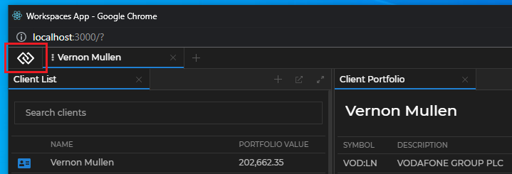
The Logo element is located at the leftmost part of the header area, to the left of the Workspace tabs, and hosts the `` component. By default, it renders the [**interop.io**](https://interop.io/) logo:
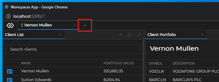
The Add Workspace element is located right after the Workspace tabs and hosts the `` component. By default, it renders the "+" button that opens the Add Workspace popup:
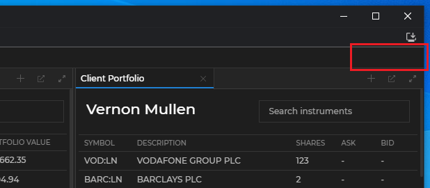
The System Buttons element is located at the rightmost part of the header area and can host any custom buttons. By default, this element is empty (there are no "Minimize", "Maximize" or "Close" buttons), because the browser prevents the default functionality of the system buttons:
The following demonstrates the default structure of the Header element:
```javascript
<>
<>
<>
```
## Group Header Elements
The Group Header element contains the header of a tab window group within a Workspace:
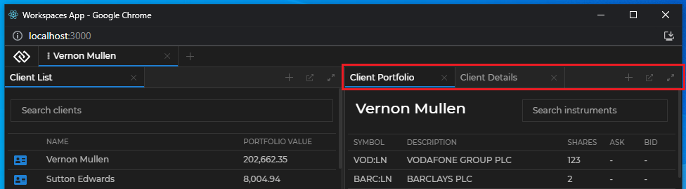
The Group Header element isn't available as a single customizable component, but contains several customizable elements and zones. One or more Workspace Window Tab elements hold the individual tabs and the Group Header Buttons element holds the standard buttons for a window group in a Workspace ("Add Window", "Eject", "Maximize", "Restore"). There are two additional customizable zones that are located before and after the tabs:
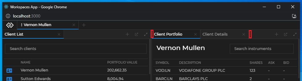
Each Workspace Window Tab element hosts an individual `` component. Each `` component contains the ``, `` and `` components. The Group Header Buttons element hosts the `` component. The following demonstrates the default structure of the `` and the `` components:
```javascript
```
## Using the Components
All default components can be reused and composed with custom code. If usage of such component has been detected, its default behavior will be applied. For instance, if you use the `` component, a popup will automatically appear when the button is clicked, without the need of custom code to induce this behavior. If you pass the same component more than once, an error will be thrown.
To remove a component and make the respective element empty, pass a `` component.
There are several prerequisites when creating a custom Workspaces App:
- The `` component accepts the size of its container. If it's nested in another component, the parent component must have its `height` style property set to `100%` in order for the `` component to be visible.
- The `@interopio/workspaces-ui-react` library depends on the `io` object returned by the [initialized](https://docs.interop.io/browser/developers/browser-client/javascript/index.md#initialization) [`@interopio/browser`](https://www.npmjs.com/package/@interopio/browser) library. If you have used the [io.Connect React Hooks](https://docs.interop.io/browser/developers/browser-client/react/index.md) wrapper to obtain the `io` object, or if you have attached the `io` object to the global `window` object, it will be automatically passed to the `` component as a prop. Otherwise, you must pass it manually.
- The CSS files must be added manually (see [Styles](#styles)).
## Workspaces Component
The `` component has two props - `io` and `components`. The `io` prop expects the `io` object returned by the initialized io.Connect library. The `components` prop is used to define the header components (see [Header Components](#header_components)), the system popup components or apps (see [Replacing the System Popups](#custom_popups-replacing_the_system_popups)) and the Workspace content to be rendered (see [Composing Workspace Content](#composing_workspace_content)).
> ⚠️ *Note that the `` component isn't meant to be used as a typical React component. Besides its rendering responsibilities, it also contains heavy logic. This component is meant to allow you to create a dedicated Workspaces App which must function as a standalone window - you must never use it as part of another app, as this will lead to malfunctioning. The Workspaces App should be customized only using the available extensibility points.*
Wrapping the Workspaces App in a single React component allows you to place custom components around it. The following example demonstrates how easy it's to customize the Workspaces App with your own toolbar:
```javascript
import Workspaces from "@interopio/workspaces-ui-react";
import MyCustomToolbar from "./MyCustomToolbar";
const App = () => {
return (
);
};
export default App;
```
## Header Components
Use the default components for the header of the Workspaces App, or replace them with your custom ones. Compose more than one component in a [header element](#header_elements) by passing a function that returns a `` component.
### Logo
The following example demonstrates composing the [**interop.io**](https://interop.io/) logo and a custom button in the Logo element:
```javascript
import Workspaces, { Logo } from "@interopio/workspaces-ui-react";
import CustomButton from "./CustomButton";
const App = () => {
return (
<>
}
}}
/>
);
};
export default App;
```
### Add Workspace
The following example demonstrates replacing the default Add Workspace component with a custom button:
```javascript
import Workspaces from "@interopio/workspaces-ui-react";
import CustomButton from "./CustomButton";
const App = () => {
return (
);
};
export default App;
```
### Workspace Tab
The contents of the `` component can be modified by replacing the default components it contains.
The following example demonstrates composing a custom Workspace Tab component using the default `` and `` components, as well as a custom title and a custom "Close" button for the Workspace tab. The example also shows how to hide and show conditionally the Workspace Tab contents based on whether the Workspace is pinned:
```javascript
import { useState } from "react";
import { WorkspaceIconButton, WorkspaceSaveButton } from "@interopio/workspaces-ui-react";
import CustomTitle from "./CustomTitle";
import CustomCloseButton from "./CustomCloseButton";
const CustomWorkspaceTab = ({ isPinned, title, onCloseClick, onSaveClick, icon, showSaveButton, showCloseButton }) => {
return (
);
};
export default CustomWorkspaceTab;
```
Use the props received by the `` component to:
- preserve the default component behavior (closing the Workspace tab, saving the Workspace Layout) or define a custom behavior;
- determine which components to show or hide based on whether the [Workspace is pinned](https://docs.interop.io/browser/capabilities/windows/workspaces/workspaces-api/index.md#workspace-pinning__unpinning_workspaces);
The following example demonstrates replacing the default Workspace Tab component:
```javascript
import Workspaces from "@interopio/workspaces-ui-react";
import CustomWorkspaceTab from "./CustomWorkspaceTab";
const App = () => {
return (
);
};
export default App;
```
### System Buttons
The following example demonstrates adding a custom button in the System Buttons element:
```javascript
import Workspaces from "@interopio/workspaces-ui-react";
import CustomButton from "./CustomButton";
const App = () => {
return (
}
}}
/>
);
};
export default App;
```
## Group Header Components
Use the default Group Header components or provide your own components to customize the Group Header elements and zones.
To customize the Group Header elements and zones, use the `groupHeader` property of the `components` object in the `` component.
### Workspace Window Tab
The following examples demonstrate creating a Workspace Window Tab component with customized "Close" button while keeping the default Channel Selector and title format.
When creating a custom "Close" button (or any custom element in the Workspace Window Tab that requires the user to click on it), you must consider preventing the `"mousedown"` and/or `"click"` events so that they won't be processed by the Workspaces framework. Otherwise, when the user holds down the mouse button on that element, the window tab will enter draggable mode.
Creating a custom "Close" button with the default closing functionality by using the respective prop:
```javascript
import { useEffect, useRef } from "react";
const CustomCloseButton = ({ close }) => {
const ref = useRef(null);
useEffect(() => {
if (!ref.current) { return };
// Stop the propagation of the `"mousedown"` event,
// in order to prevent the Workspaces framework from processing it.
ref.current.onmousedown = e => e.stopPropagation();
}, [ref]);
return
};
export default CustomCloseButton;
```
> ⚠️ *Note that due to the nature of the Workspaces App and the fact that React event handlers are always executed after the native DOM event handlers, you must use a direct reference to the DOM elements instead of React events when handling the `"mousedown"` and `"click"` events.*
Using the custom "Close" button in the Workspace Window Tab component. To preserve the default component functionalities, remember to pass the respective props to the components:
```javascript
import {
WorkspaceWindowChannelsLink,
WorkspaceWindowTabTitle,
WorkspaceWindowTabCloseButton
} from "@interopio/workspaces-ui-react";
import CustomCloseButton from "./CustomCloseButton";
const CustomWorkspaceWindowTab = ({ channels, title, close }) => {
return (
<>
{close.visible && }
);
};
export default CustomWorkspaceWindowTab;
```
Using the custom Workspace Window Tab component in the Group Header element of your custom Workspaces App:
```javascript
import Workspaces from "@interopio/workspaces-ui-react";
import CustomWorkspaceWindowTab from "./CustomWorkspaceWindowTab";
const App = () => {
return (
);
};
export default App;
```
### Group Header Buttons
The following example demonstrates creating a Group Header Buttons component containing a custom button and the standard tab window group buttons. To preserve the default component functionalities, remember to pass the respective props to the components:
```javascript
import {
AddWindowButton,
EjectButton,
MaximizeGroupButton,
RestoreGroupButton
} from "@interopio/workspaces-ui-react";
const CustomGroupHeaderButtons = ({ addWindow, eject, restore, maximize }) => {
return (
<>
{addWindow.visible && }
{eject.visible && }
{restore.visible && }
{maximize.visible && }
);
};
export default CustomGroupHeaderButtons;
```
Using the custom Group Header Buttons component in the Group Header element of your custom Workspaces App:
```javascript
import Workspaces from "@interopio/workspaces-ui-react";
import CustomWorkspaceWindowTab from "./CustomWorkspaceWindowTab";
import CustomGroupHeaderButtons from "./CustomGroupHeaderButtons";
const App = () => {
return (
);
};
export default App;
```
### Zones
The following example demonstrates creating a custom component for the Before Tabs zone of the Group Header element:
```javascript
const CustomBeforeTab = () => {
return
🔍
};
export default CustomBeforeTab;
```
Using the custom component for the Before Tabs zone in the Group Header element of your custom Workspaces App:
```javascript
import Workspaces from "@interopio/workspaces-ui-react";
import CustomWorkspaceWindowTab from "./CustomWorkspaceWindowTab";
import CustomGroupHeaderButtons from "./CustomGroupHeaderButtons";
import CustomBeforeTab from "./CustomBeforeTab";
const App = () => {
return (
);
};
export default App;
```
## Custom Popups
The library allows you to customize the system popups of the Workspaces App, as well as to create custom popups for your apps participating in the Workspace.
### Replacing the System Popups
The `components` prop of the `` component has a `popups` property that enables you to pass custom components or io.Connect apps that will act as system popups. To specify a custom io.Connect app as a system popup, pass its name as specified in its [app definition](https://docs.interop.io/browser/capabilities/app-management/index.md#app_definitions).
> ⚠️ *Note that if you decide to use the default system popups, you must ensure that they receive their required props. This includes an `io` object with initialized [Workspaces](https://docs.interop.io/browser/capabilities/windows/workspaces/workspaces-api/index.md) library and [App Management](https://docs.interop.io/browser/capabilities/app-management/index.md) library initialized in `"full"` or `"skipIcons"` mode.*
The following example demonstrates how to pass a default popup component and its props correctly and how to pass a custom io.Connect app as a popup by providing its name:
```javascript
import Workspaces, {
AddApplicationPopup
} from "@interopio/workspaces-ui-react";
const App = () => {
return (
,
// Specifying a custom io.Connect app as a system popup.
AddWorkspaceComponent: "custom-add-workspace-popup"
}
}}
/>
);
};
export default App;
```
Each system popup component receives several default props - functions for resizing and hiding the popup, as well as props for identifying the Frame, the Workspace or the Workspace element where the popup is located.
Add Workspace component:
| Prop | Type | Description |
|------|------|-------------|
| `filterLayouts` | `function` | Prop expecting a user-defined predicate for filtering the Workspace Layouts that will be available in the "Add Workspace" popup menu. |
| `frameId` | `string` | **Required.** The ID of the Frame in which the Workspace will be created or loaded. |
| `hidePopup` | `function` | **Required.** Function for hiding the popup. |
| `io` | `object` | The io.Connect JavaScript library object. |
| `resizePopup` | `function` | **Required.** Function for resizing the popup. Accepts a required `Size` object as a parameter with optional `height` and `width` properties. |
Add Application component:
| Prop | Type | Description |
|------|------|-------------|
| `boxId` | `string` | **Required.** The ID of the Workspace element in which the app will be added. |
| `filterApps` | `function` | **Required.** Prop expecting a user-defined predicate for filtering the apps that will be available in the "Add Apps" popup menu. |
| `frameId` | `string` | The ID of the Frame in which the app will be added. |
| `hidePopup` | `function` | **Required.** Function for hiding the popup. |
| `io` | `object` | The io.Connect JavaScript library object. |
| `resizePopup` | `function` | **Required.** Function for resizing the popup. Accepts a required `Size` object as a parameter with optional `height` and `width` properties. |
| `workspaceId` | `string` | **Required.** The ID of the Workspace in which the app will be added. |
The following example demonstrates a reference implementation of a custom system popup component and how to handle resizing and hiding the popup:
```javascript
import { useEffect } from "react";
const AddWorkspacePopup = ({ resizePopup, hidePopup }) => {
const containerRef = React.createRef();
const refreshHeight = () => {
if (!containerRef?.current) {
return;
}
const bounds = containerRef.current.getBoundingClientRect();
resizePopup({
height: bounds.height,
width: bounds.width
});
};
useEffect(() => {
refreshHeight();
}, []);
return (
);
};
export default AddWorkspacePopup;
```
The following example demonstrates how to use the default `` system popup and filter the apps that will be available in the "Add Apps" menu by a custom user-defined property:
```javascript
import Workspaces { AddApplicationPopup } from "@interopio/workspaces-ui-react";
import "@interopio/workspaces-ui-react/dist/styles/workspaces.css"
import "./index.css";
const App = () => {
// The custom properties from your app configuration are accessible through
// the `userProperties` property of the `Application` object passed to the predicate function.
const appFilter = app => app.userProperties.customAppFilterProperty;
return (
}
}}
/>
);
};
export default App;
```
### User Defined Popups
There are two ways for you to create custom popups from HTML elements - by using the `` component, or by using the `useWorkspacePopup()` and `useWorkspaceWindowClicked()` hooks.
The `` component is based on the popular [`reactjs-popup`](https://www.npmjs.com/package/reactjs-popup) library. All features of the library are supported with the addition of two new props:
| Prop | Type | Description |
|------|------|-------------|
| `innerContentStyles` | `object` | Value for the `style` property of the element that wraps the popup content. |
| `popupRef` | `React.RefObject` | Ref to the `reactjs-popup` popup element. |
The following example demonstrates how to create a custom popup using the `` component:
```javascript
import { WorkspacePopup } from "@interopio/workspaces-ui-react";
const CustomPopup = ({ trigger }) => {
const popupRef = React.createRef();
return (
Custom Popup
);
};
export default CustomPopup;
```
The other way to create a popup is to implement a custom popup element and use the `useWorkspacePopup()` and/or `useWorkspaceWindowClicked()` hooks.
- `useWorkspacePopup()` - accepts the ref object to the HTML element of the popup as a parameter;
> ⚠️ *Note that this hook is meant to be used mainly in **io.Connect Desktop** projects to ensure Windows 7 compatibility. It returns an array of two functions - the first one is to manually notify **io.Connect Desktop** that the popup has been resized and the second one is to manually notify **io.Connect Desktop** that the popup has been hidden. In an **io.Connect Browser** project these functions are irrelevant and won't throw an error if used.*
```javascript
const popupRef = React.createRef();
const [popupResized, popupHidden] = useWorkspacePopup(popupRef);
```
- `useWorkspaceWindowClicked()` - accepts a callback that is invoked when a window in the Frame is focused. A generic `onClick` event won't work for handling window clicks, because although the Workspaces App is a web app, it contains different apps from different processes. The hook returns an unsubscribe function, however, this unsubscribe function is called when the component is unmounted so implementing cleanup logic is usually unnecessary;
The following example demonstrates how to create a custom popup using the `useWorkspacePopup()` and `useWorkspaceWindowClicked()` hooks:
```javascript
import {
useWorkspacePopup,
useWorkspaceWindowClicked
} from "@interopio/workspaces-ui-react";
const CustomPopup = ({ closePopup }) => {
const popupRef = React.createRef();
useWorkspacePopup(popupRef);
useWorkspaceWindowClicked(closePopup);
return (
Custom Popup
);
};
const popupStyle = {
backgroundColor:"blue",
height:100,
position:"fixed",
zIndex:99,
top:100,
left:100,
width:100
};
export default CustomPopup;
```
## Composing Workspace Content
The `components` prop of the `` component has a `WorkspaceContents` property that enables you to manipulate the content of a Workspace - hide or show the Workspace content or add custom elements to the Workspace. For instance, you may need to render the Workspace content conditionally.
> ⚠️ *Note that it isn't advisable to add complex components as additional Workspace content - the `WorkspaceContents` property is meant to allow you to add styling elements or interaction areas (simple toolbars, buttons, etc.) around the usual Workspace content.*
The `` component expects a Workspace ID as a prop.
> ⚠️ *Note that you must never render simultaneously components containing the same Workspace ID, as this will lead to unexpected behavior.*
The following example demonstrates how to add a custom toolbar inside a Workspace and render it conditionally by clicking a custom button in the System Buttons element:
```javascript
import { useState } from "react";
import Workspaces, { WorkspaceContents } from "@interopio/workspaces-ui-react";
import CustomWorkspaceContent from "./CustomWorkspaceContent";
const App = () => {
const [showContent, setShowContent] = useState(false);
return (
},
WorkspaceContents: props => showContent ?
:
<>
}}
/>
);
};
export default App;
```
For an example of using the `` component, see the [Pinned Workspace Tabs](https://github.com/InteropIO/templates/tree/main/workspaces-react-pinned-tabs) example on GitHub. It shows how to render Workspace content conditionally using a button in the Workspaces header area.
## Splitter Size
Available since io.Connect Browser 4.5
The `components` prop of the `` component accepts a `settings` object that allows you to configure general Workspace behavior. Use the `splitterSize` property to customize the size (in pixels) of the splitters - the draggable dividers between Workspace panes:
```javascript
import Workspaces from "@interopio/workspaces-ui-react";
const App = () => {
return (
);
};
export default App;
```
The default splitter size is 5 pixels. The specified size applies to all Workspaces within the Workspaces App instance and is preserved when saving and restoring a Workspace. Changing the value at runtime won't have any effect for the currently opened or for any newly opened Workspaces.
Setting the value to `0` effectively removes the splitters and prevents resizing the Workspace windows. Using extremely large values for the splitter size may lead to undesirable user experience.
## Styles
To use the default styles for your custom Workspaces App, import the following CSS files:
```javascript
import "@interopio/workspaces-ui-react/dist/styles/workspaces.css"
```
To use custom styles for the Workspaces App, simply import your CSS file after the default CSS imports to override them.
Two default themes are available - dark and light. The trigger for switching between them is the class property of the `` element - `"dark"` for the dark theme and `"light"` for the light theme:
```html
```
Available since io.Connect Browser 4.0
To customize the Workspaces App styles, use the [CSS variables](https://docs.interop.io/browser/developers/platform-styles/index.md#workspaces) provided by the io.Connect themes.