# Overview
Source: https://docs.interop.io/desktop/capabilities/windows/window-management/overview/index.html
## Overview
io.Connect Windows are a crucial part of the advanced Window Management capabilities provided by **io.Connect Desktop**. When your interop-enabled apps (web or native) run within the io.Connect framework, they are hosted in instances of io.Connect Windows. This enables you to exercise full programmatic control over all instances of all interop-enabled apps via any of the available io.Connect technology adapters.
The [Window Management API](https://docs.interop.io/desktop/reference/javascript/windows/api/index.md) enables you to create and manipulate individual io.Connect Window instances and is the basis of the [App Management](https://docs.interop.io/desktop/capabilities/app-management/overview/index.md) API. It also allows users to [group io.Connect Windows](#window_groups) so that they move, maximize and minimize together.
Some of the numerous features, not found in any regular web browser, that are available when using io.Connect Windows:
- 4 types of [window modes](#window_modes): flat, tab, HTML, and frameless;
- Complete control over all io.Connect Windows, as well as diverse customization options for the window frame:
- visibility - hide or show windows dynamically;
- bounds - set window location and size, resize windows programmatically, place or dock windows on the screen;
- title - set the window title programmatically, synchronize the window title with the document title, and more;
- user interaction - allow a window to stick to other io.Connect Windows, enable or disable the standard "Minimize", "Maximize" and "Close" buttons, add custom frame buttons to the windows and respond accordingly to user interaction with them;
- tabs - organize windows into tabs that the user can tear off and regroup, attach or detach tabs programmatically;
- window groups - group windows programmatically, control the state of the entire window group (minimize, maximize, restore), react to group events, and more;
- window events - react programmatically to window-related events such as adding or removing windows, window on or off focus, window close or refresh, and much more;
- data sharing - each io.Connect Window instance has a dedicated context object which you can use to open windows with specific context data or share data between windows;
- specialized windows - create effortlessly popup and flydown windows for your app menus or use them as helper windows without the hassle of having to implement the correct underlying behavior;
Native apps, as opposed to web apps, can have more than one window. After you interop-enable your native app, your app windows aren't automatically registered as io.Connect Windows. You can choose which ones to register as io.Connect Windows so that they can use io.Connect functionalities.
Web and native windows are handled by **io.Connect Desktop** as window abstractions, which means that:
- You can use any io.Connect technology adapter (JavaScript, .NET, Java, and many more) to control any window, web or native.
- From an end user perspective, there is no difference between web or native windows.
- Feature parity is provided by the different technology adapters.
## Window Modes
The io.Connect framework supports four different window modes: flat, tab, HTML and frameless. The window mode can be specified via the `"mode"` property in the [app definition](https://docs.interop.io/desktop/developers/configuration/application/index.md) or as a setting when [opening an io.Connect Window](https://docs.interop.io/desktop/capabilities/windows/window-management/javascript/index.md#opening_windows) programmatically.
Specifying the window mode in the app definition:
```json
{
"title": "My App",
"type": "window",
"name": "my-app",
"details": {
"url": "http://localhost:3000",
"mode": "html"
}
}
```
The `"mode"` property can be set to `"flat"` (default), `"tab"`, `"html"` and `"frameless"`.
### Flat Windows
Flat windows are available for web and native apps. They have a caption bar that contains the app title and standard system buttons ("Minimize", "Maximize", "Close"):

### Tab Windows
Tab windows are available for web and native apps. The user can group them in or tear them off a tab group. They have a tab caption bar which contains the window tabs and standard system buttons ("Minimize", "Maximize", "Close"):

### HTML Windows
HTML windows are available for web apps only. The HTML page spans the entire window, there is no caption bar, and the standard system buttons ("Minimize", "Maximize", "Close") become visible when the user hovers over them:

> ⚠️ *Note that, currently, in the [default platform mode](https://docs.interop.io/desktop/developers/configuration/system/index.md#platform_modes), the following limitation apply for HTML windows:*
>
> - HTML buttons for the HTML windows aren't supported. Only the OS system buttons for minimize, maximize, and close can be used (configurable via the `"useOSSystemButtons"` property of the `"details"` top-level key in the app definition).
> - Only the move area at the top of the window is supported and configurable. You can use the `"moveAreaThickness"` property of the `"details"` top-level key in the app definition to set the thickness of the top move area (e.g., `"moveAreaThickness": "0, 30, 0, 0"` - only the value for the top move area will be used, the other values in the string will be ignored) and the `"moveAreaTopMargin"` property to adjust the margin for the top move area.
### Frameless Windows
Frameless windows are based on HTML windows, but allow for creating apps with freeform (non-rectangular) shapes and transparent areas. By default, they don't have the usual io.Connect Window decorations - title bars, standard system buttons ("Minimize", "Maximize", "Close"), resizing areas (unless you specify [resizing areas](https://docs.interop.io/desktop/developers/configuration/application/index.md#resizing_areas) in the app definition), and can't be dragged (unless you define a [custom draggable area](https://www.electronjs.org/docs/latest/tutorial/window-customization#set-custom-draggable-region) within the web app), can't be dropped in [Workspaces](https://docs.interop.io/desktop/capabilities/windows/workspaces/overview/index.md) or stuck to other io.Connect Windows. Frameless windows can be saved and restored in [Layouts](https://docs.interop.io/desktop/capabilities/windows/layouts/overview/index.md) and can use all io.Connect functionalities provided by the io.Connect libraries.
The following example demonstrates a freeform frameless window, registered in **io.Connect Desktop** as an interop-enabled app, and using the [App Management](https://docs.interop.io/desktop/capabilities/app-management/overview/index.md) API to start another app. The window is draggable, because the web app has a defined draggable area:

## Flydown & Popup Windows
The io.Connect JavaScript library offers convenient facilities for creating [flydown](https://docs.interop.io/desktop/capabilities/windows/window-management/javascript/index.md#flydown_windows) and [popup](https://docs.interop.io/desktop/capabilities/windows/window-management/javascript/index.md#popup_windows) windows. Flydown and popup windows can be very useful for dropdown menus and helper windows for your app, but when implementing them from scratch, it may be hard to control their behavior as there are many corner cases to consider. The io.Connect library resolves these issues and provides an easy way for creating and manipulating flydown and popup windows.
Flydown windows appear when the user hovers over a predefined area in your app:

Popup windows appear when the user clicks on a predefined area in your app:

## Tab Overflow
Available since io.Connect Desktop 9.4
> ⚠️ *Note that this feature is available only for [web groups](#window_groups-web_groups).*
When tab overflow is enabled, the extra tabs on the right side of the tab header will be collected in a dropdown menu in their original order instead of becoming smaller and smaller each time a new tab is added to the group. The user can open the menu and select the desired tab (or close a tab directly from the menu). The tabs will be scrolled horizontally and the selected tab will be focused. This may improve the user experience, as the window tabs won't shrink and their titles will still be visible, irrespective of the number of windows in the group:

To enable tab overflow, use the `"overflow"` property found under the `"tabs"` property of the `"group"` object under the `"windowManagement"` top-level key in the `system.json` [system configuration](https://docs.interop.io/desktop/developers/configuration/system/index.md#window_management-window_groups-tab_overflow) file of **io.Connect Desktop**:
```json
{
"windowManagement": {
"group": {
"tabs": {
"overflow": true
}
}
}
}
```
## Group & Window Titles
Users can manually edit the group header titles of window groups, as well as the titles of flat and tab io.Connect Windows participating in them.
The user-defined titles of groups and individual windows saved in a [Layout](https://docs.interop.io/desktop/capabilities/windows/layouts/overview/index.md) will be preserved when the Layout is restored.
> ℹ️ *For more details on configuring the titles of your interop-enabled apps, see the [App Management > Overview > App Titles](https://docs.interop.io/desktop/capabilities/app-management/overview/index.md#app_titles) section.*
### Window Groups
#### Default Title
Available since io.Connect Desktop 10.0
To specify a default group header title that will be displayed on all window groups, use the `"deafultTitle"` property of the `"header"` object under the `"group"` property of the `"windowManagement"` top-level key in the `system.json` [system configuration](https://docs.interop.io/desktop/developers/configuration/system/index.md#window_management-window_groups-tab_overflow) file of **io.Connect Desktop**:
```json
{
"windowManagement": {
"group": {
"header": {
"defaultTitle": "My Group"
}
}
}
}
```
#### Edit Title
Editing the titles of window groups is enabled by default:

Available since io.Connect Desktop 10.0
To disable manual editing of group header titles, set the `"editTitle"` property of the `"header"` object under the `"group"` property of the `"windowManagement"` top-level key in the `system.json` [system configuration](https://docs.interop.io/desktop/developers/configuration/system/index.md#window_management-window_groups-tab_overflow) file of **io.Connect Desktop** to `false`:
```json
{
"windowManagement": {
"group": {
"header": {
"editTitle": false
}
}
}
}
```
#### 9.0 Version Stream
If you are still using the **io.Connect Desktop** 9.0 version stream, editing group header titles when using [web groups](#window_groups-web_groups) doesn't require additional configuration. When using [classic groups](#window_groups-classic_groups), you must set the `"enableWindowGroupsCaptionEdit"` property in the `stickywindows.json` [configuration file](https://docs.interop.io/desktop/developers/configuration/io-connect-windows/index.md) of **io.Connect Desktop** to `true`:
```json
{
"enableWindowGroupsCaptionEdit": true
}
```
### Individual Windows
Editing the titles of individual windows is enabled by default:

Available since io.Connect Desktop 10.0
To disable manual editing of window titles, set the `"editWindowTitle"` property of `"windowManagement"` top-level key in the `system.json` [system configuration](https://docs.interop.io/desktop/developers/configuration/system/index.md#window_management-window_groups-tab_overflow) file of **io.Connect Desktop** to `false`:
```json
{
"windowManagement": {
"editWindowTitle": false
}
}
```
#### 9.0 Version Stream
If you are still using the **io.Connect Desktop** 9.0 version stream, editing the titles of individual windows when using [web groups](#window_groups-web_groups) doesn't require additional configuration. When using [classic groups](#window_groups-classic_groups), you must set the `"enableWindowsCaptionEdit"` property in the `stickywindows.json` [configuration file](https://docs.interop.io/desktop/developers/configuration/io-connect-windows/index.md) of **io.Connect Desktop** to `true`:
```json
{
"enableWindowsCaptionEdit": true
}
```
## Sticky Button
The "Sticky" button in the app window header allows the users to toggle the stickiness of individual windows from the UI:

The "Sticky" button is disabled by default and can be enabled globally from the [system configuration](https://docs.interop.io/desktop/developers/configuration/system/index.md) of **io.Connect Desktop**, or per app from the [app definition](https://docs.interop.io/desktop/developers/configuration/application/index.md) file. The app definition will override the global system configuration.
To enable the "Sticky" button globally for all apps, use the `"showStickyButton"` property of the `"windows"` top-level key in the `system.json` file:
```json
{
"windows": {
"showStickyButton": true
}
}
```
To disable the "Sticky" button per app, use the `"showStickyButton"` property of the `"details"` top-level key in the app definition:
```json
{
"details": {
"showStickyButton": false
}
}
```
## Feedback Button
The [Feedback Form](https://docs.interop.io/desktop/capabilities/more/features/index.md#feedback_form) can be opened directly from an app instance by using the "Feedback" button in the app window header.

The "Feedback" button is disabled by default and can be enabled globally from the [system configuration](https://docs.interop.io/desktop/developers/configuration/system/index.md) of **io.Connect Desktop** or per app from the [app definition](https://docs.interop.io/desktop/developers/configuration/application/index.md) file. The app definition will override the global system configuration.
To enable the "Feedback" button globally for all apps, use the `"showFeedbackButton"` property of the `"windows"` top-level key in the `system.json` file:
```json
{
"windows": {
"showFeedbackButton": true
}
}
```
To disable the "Feedback" button per app, use the `"showFeedbackButton"` property of the `"details"` top-level key in the app definition:
```json
{
"details": {
"showFeedbackButton": false
}
}
```
Use the `"supportEmails"` top-level key to specify the emails of the app owners. The email addresses defined in this property will be added to the Feedback Form if it has been triggered from that app:
```json
{
"supportEmails": ["app.owner1@example.com", "app.owner2@example.com"]
}
```
## Clone Button
Available since io.Connect Desktop 9.2
> ⚠️ *Note that this feature is available only for [web groups](#window_groups-web_groups).*
The "Clone" button in the app window header can be used to duplicate the current window with its current state. If the cloned window is a tab window, it will be added to the same tab group. All other [types of windows](#window_modes) will be cascaded:

The "Clone" button is disabled by default and can be enabled globally from the [system configuration](https://docs.interop.io/desktop/developers/configuration/system/index.md) of **io.Connect Desktop**, or per app from the [app definition](https://docs.interop.io/desktop/developers/configuration/application/index.md) file. The app definition will override the global system configuration.
To enable the "Clone" button globally for all apps, use the `"showCloneButton"` property of the `"windows"` top-level key in the `system.json` file:
```json
{
"windows": {
"showCloneButton": true
}
}
```
To disable the "Clone" button per app, use the `"showCloneButton"` property of the `"details"` top-level key in the app definition:
```json
{
"details": {
"showCloneButton": false
}
}
```
## Collapse & Expand
> ⚠️ *Note that this feature is available only for [classic groups](#window_groups-classic_groups).*
io.Connect Windows can be collapsed and expanded, including when in a window group:

By default, the button for collapsing and expanding windows is disabled. To enable it, use the `"allowCollapse"` property of the `"details"` top-level key in the [app definition](https://docs.interop.io/desktop/developers/configuration/application/index.md#collapse__expand) file.
The following example demonstrates how to enable the "Collapse/Expand" button for an app:
```json
{
"details": {
"allowCollapse": true
}
}
```
## Window Groups
Besides providing full control over individual windows, **io.Connect Desktop** also enables you to arrange io.Connect Windows visually by sticking them together and forming window groups. Grouping separate io.Connect Windows in a single frame (window) allows the users to move, resize, minimize, maximize, restore and close all participating windows together using the standard buttons on the window group frame. Grouped windows have a single [customizable Windows taskbar icon](https://docs.interop.io/desktop/developers/configuration/themes/index.md#theme_properties-window_groups), can be resized within the group frame and can be torn off from the group. Tab windows can be grouped in tab groups that in turn can be stuck to other io.Connect Windows or groups.

The standard buttons ("Minimize", "Maximize", "Restore", "Close") of the individual io.Connect Windows participating in the group can also be used which will result in the following behavior:
- "Minimize" - will minimize the entire group.
- "Maximize" - will maximize only the window, breaking it off from the window group. If none of the other windows in the group has been manipulated in any way (moved, resized or changed its state), the group will be restored when the maximized window is restored.
- "Restore" - restores a maximized window to its normal state, restoring also the window group, unless any of the other windows participating in it has been manipulated in any way (moved, resized or changed its state).
- "Close" - will close only the window.

Groups can be saved and restored in [Layouts](https://docs.interop.io/desktop/capabilities/windows/layouts/overview/index.md), saving users time and effort to find and rearrange the necessary apps again after closing the group.
io.Connect Window groups can be controlled programmatically - maximize and restore, show and hide the group header, get and set the group title, find an individual window or all windows participating in the group, find and list window groups, subscribe for group-related events.
**io.Connect Desktop** offers two implementations of io.Connect Window groups, which are visually indistinguishable to the user - classic and web groups.
### Using Window Groups
#### System Buttons
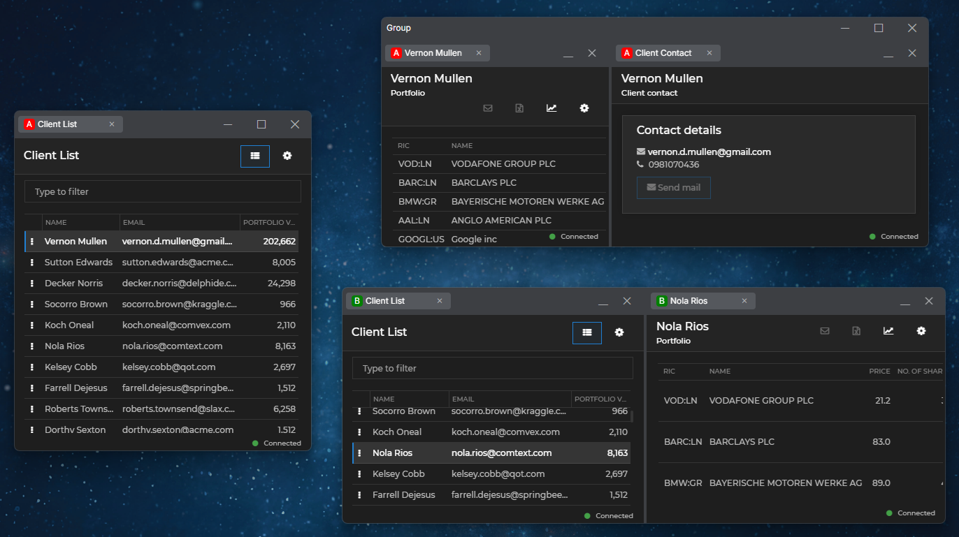
The system buttons in the window group header, on windows participating in a group, and on individual windows are available as follows:
- Window groups with a visible group header: the group header contains all system buttons ("Minimize", "Maximize", and "Close") while the windows participating in the window group contain only "Minimize" and "Close" buttons.
- The windows participating in a window group with a hidden group header contain only "Minimize" and "Close" buttons.
- Individual windows contain all system buttons ("Minimize", "Maximize", and "Close").
#### Apps in Groups
The titles of the app windows participating in the group are visible when right clicking on the Windows taskbar icon. When restoring a minimized group, the selected app is focused.

#### Navigating Window Tabs
You can jump to the next or the previous window in a tab group by using keyboard shortcuts:

| Shortcut | Description |
|----------|-------------|
| `CTRL + PgDn` | Jump to next tab. |
| `CTRL + PgUp` | Jump to previous tab. |
| `CTRL + SHIFT + TAB` | Jump to previous tab. |
| `CTRL + TAB` | Jump to next tab. |
#### Resizing Grouped Windows
Use the internal separators to resize windows in a group.
Grouped windows have common outer borders when aligned to each other. Use that border to resize the entire group, or hold `ALT` to resize a single window, disregarding the common outer border:

To align grouped windows manually in height or width, double click on the window border if you want to increase the window height or width, or hold `ALT` and double-click if you want to decrease it:

#### Preventing Snap & Drop
To prevent windows from snapping to other windows or dropping them in a window group while dragging them, hold `ALT`. The following demonstrates the user dragging a window over a window group. When the user holds `ALT`, the highlighted areas disappear and the window can be placed at any position on the screen without it snapping to other windows or being dropped in a window group:

> ℹ️ *For details on configuring the platform behavior when holding the `ALT` key, see the [Developers > Configuration > System > Window Management](https://docs.interop.io/desktop/developers/configuration/system/index.md#window_management-alternate_behavior) section.*
### Web Groups
The io.Connect web groups are based on web technologies and allow for complete customization of the containing group frame and all elements of the different io.Connect Window types that may participate in it. Web groups are the default window group implementation used by the platform for creating and manipulating window groups.
The io.Connect web groups can be customized visually by supplying custom CSS styles for the default Web Group App in **io.Connect Desktop**, or you can create your own custom Web Group App via the [`@interopio/groups-ui-react`](https://www.npmjs.com/package/@interopio/groups-ui-react) library.
> ℹ️ *For details on creating a custom Web Group App, see the [Extending Web Groups](#extending_web_groups) section.*
#### 9.0 Version Stream
If you are still using the **io.Connect Desktop** 9.0 version stream, you can use the `"groupType"` property in the `stickywindows.json` [window configuration](https://docs.interop.io/desktop/developers/configuration/io-connect-windows/index.md) file of **io.Connect Desktop** to switch to web groups:
```json
{
"groupType": "Web"
}
```
### Classic Groups
> ⚠️ *Note that if you are still using classic groups, it's highly recommended to migrate to web groups, as classic groups are deprecated and will be entirely removed in a future release.*
The io.Connect classic groups are based on WPF components and are available only in the [advanced platform mode](https://docs.interop.io/desktop/developers/configuration/system/index.md#platform_modes).
Available since io.Connect Desktop 10.0
To switch to classic groups, use the `"type"` property of the `"group"` object under the `"windowManagement"` top-level key in the `system.json` [system configuration](https://docs.interop.io/desktop/developers/configuration/system/index.md#window_management-window_groups-tab_overflow) file of **io.Connect Desktop**:
```json
{
"windowManagement": {
"group": {
"type": "Classic"
}
}
}
```
#### 9.0 Version Stream
The io.Connect classic groups are the default group implementation in the **io.Connect Desktop** 9.0 version stream. You can use the `"groupType"` property in the `stickywindows.json` [window configuration](https://docs.interop.io/desktop/developers/configuration/io-connect-windows/index.md) file of **io.Connect Desktop** to specify the desired window group implementation type:
```json
{
"groupType": "Classic"
}
```
The io.Connect classic groups allow limited visual customization via the `themes.json` configuration file of **io.Connect Desktop**.
> ℹ️ *For more details, see the [Developers > Configuration > Themes](https://docs.interop.io/desktop/developers/configuration/themes/index.md#theme_properties-window_groups) section.*
## Extending Web Groups
> ⚠️ *Note that the [`@interopio/groups-ui-react`](https://www.npmjs.com/package/@interopio/groups-ui-react) library doesn't support some of the features supported by the io.Connect [classic groups](#window_groups-classic_groups). For more details, see the [Limitations](#extending_web_groups-limitations) section.*
The [`@interopio/groups-ui-react`](https://www.npmjs.com/package/@interopio/groups-ui-react) library provides all functionalities necessary for building a Web Group App as a single React component - ``. The `` component provides extensibility points for passing custom components to it (see [Group Component](#extending_web_groups-group_component)).
*To open a console window for the Web Group App when testing or debugging, press `SHIFT + F12`.*
> ⚠️ *Note that the [`@interopio/groups-ui-react`](https://www.npmjs.com/package/@interopio/groups-ui-react) library doesn't include a built Web Group App. A Web Group App is provided in **io.Connect Desktop**. You can also use and customize the [Web Group App template](https://github.com/InteropIO/templates/tree/main/groups-react).*
> ℹ️ *See also the [Web Groups with Banners](https://github.com/InteropIO/web-groups-with-banners) example on GitHub.*
### Configuration
Your custom Web Group App, as every interop-enabled app, must have an [app definition](https://docs.interop.io/desktop/developers/configuration/application/index.md) file. It's `"type"` property must be set to `"webGroup"`.
> ⚠️ *Note that, by default, **io.Connect Desktop** will search for a registered app with the name `"web-group-application"` and if one is available, will use it. If no such app is found, the first available app definition of type `"webGroup"` will be used. **io.Connect Desktop** expects only one app definition for a Web Group App - i.e., one configuration file with `"type"` property set to `"webGroup"`. If multiple Web Group App definitions are present, the first one will be used.*
**io.Connect Desktop** comes with a Web Group App and a definition file for it named `webGroup.json` and located in `/interop.io/io.Connect Desktop/Desktop/config/apps`. Modify or replace this file with your own definition file, or delete it, if your app definitions are stored at another location.
The following is an example definition of a Web Group App:
```json
{
"name": "web-group-app",
"type": "webGroup",
"hidden": true,
"details": {
"url": "http://localhost:3000/",
"autoOpenDevTools": true,
"captureErrors": true,
"preloadScripts": ["https://example.com/my-script.js"],
"pool": {
"min": 5
}
}
}
```
The `"url"` property is required and must point to the location of your custom Web Group App.
Use the `"autoOpenDevTools"` property to automatically open the Chrome Dev Tools (disabled by default) when debugging your Web Group App.
Use the `"captureErrors"` property to instruct **io.Connect Desktop** to log errors from the Web Group App in the `application.log` file located in the `/interop.io/io.Connect Desktop/UserData/-/logs` folder where `-` represents the environment and region of **io.Connect Desktop** (e.g., `DEMO-INTEROP.IO`).
Use the `"preloadScripts"` property to specify a list of URLs pointing to scripts that will be loaded and executed before loading the Web Group App.
Use the `"pool"` property to specify the minimum number of cached Web Group App instances (3 is the default and also the minimum possible value) used for improving group performance and user experience. The higher the number, the more memory will be consumed; the lower the number, the higher the chance to experience delay during web group operations.
The top-level `"hidden"` property is set to `true` in order to hide the Web Group App from the [io.Connect launcher](https://docs.interop.io/desktop/capabilities/launcher/index.md), because this is a service app used directly by **io.Connect Desktop** to host io.Connect Windows.
> ℹ️ *For more details about global settings for web groups, see the [Developers > Configuration > System > Window Management](https://docs.interop.io/desktop/developers/configuration/system/index.md#window_management) section.*
### Using io.Connect APIs in the Web Group App
The Web Group App is a fully-featured io.Connect client, so you can use all io.Connect APIs in it.
The only thing to keep in mind when using the [Window Management API](https://docs.interop.io/desktop/capabilities/windows/window-management/javascript/index.md) in a Web Group App is that the [`io.windows.my()`](https://docs.interop.io/desktop/reference/javascript/windows/api/index.md#API-my) method by design won't work (will return `undefined`). The reason for this is that the Web Group App is a special app (and not a typical io.Connect Window) whose main purpose is to host regular io.Connect Windows allowing them to form window groups - either single windows (i.e., a group with a single window in it), windows in a tabbed group, or windows that stick to each other to form a window group.
### Group Elements
It's possible to add your custom components to the Web Group App or customize the default ones. This section demonstrates the available customizable zones and the default components of the Web Group App.
> ⚠️ *Note that when adding custom components to the Web Group App, you can use the `-webkit-app-region: drag` and `-webkit-app-region: no-drag` styles to define [custom draggable areas](https://www.electronjs.org/docs/latest/tutorial/window-customization#set-custom-draggable-region). This is especially useful if you are adding custom content inside components that already contain draggable areas (like the ``, `` or the tab header of a tabbed group) and want to include or exclude this content from the draggable area.*
#### Group Caption Bar
The Group Caption Bar element is located at the topmost part of the window group:
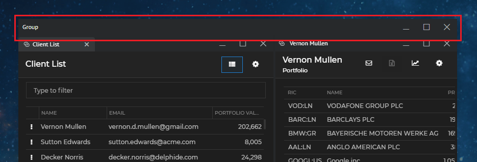
The Group Caption Bar element hosts the `` component which contains the ``, ``, `` and `` components. The following demonstrates the default structure (in render order) of the `` component. All buttons inside the component are rendered conditionally based on the value of their `visible` prop:
```javascript
```
For an example usage, see the [Group Caption Bar Components](#extending_web_groups-group_caption_bar_components) section.
#### Flat Windows
The io.Connect flat windows have a Flat Caption Bar element located at the topmost part of a flat window:
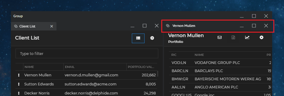
The Flat Caption Bar element hosts the `` component which contains the `` (or ``), ``, ``, `` and `` components. The following demonstrates the default structure (in render order) of the `` component. All buttons inside the component are rendered conditionally based on the value of their `visible` prop:
```javascript
(or when in multi Channel mode)
```
For an example usage, see the [Flat Window Components](#extending_web_groups-flat_window_components) section.
#### Tab Windows
The Tab Header element of a tab group isn't available as a single customizable component, but contains several customizable zones and components. One or more Tab elements hold the individual tabs and the Tab Header Buttons element holds the standard system buttons:
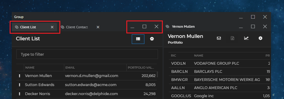
There are four additional customizable zones that are located before and after the tabs, above and below the tab header - the Before Tabs, After Tabs, Above Tabs and Below Tabs zones:
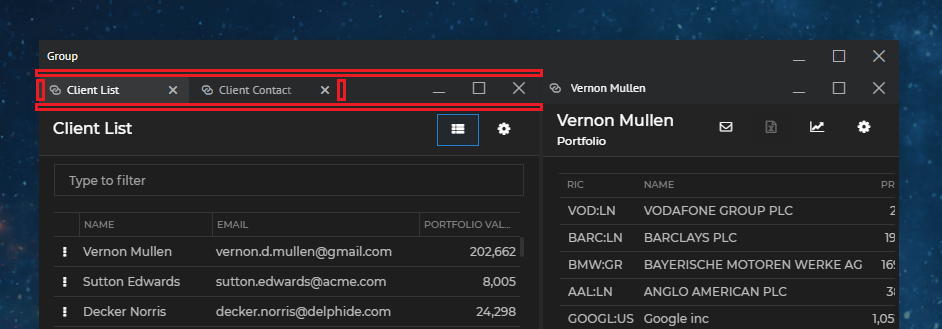
Each Tab element hosts an individual `` component. Each `` component contains the `` (or ``), ``, `` and `` components. The Tab Header Buttons element hosts the `` component. When [tab overflow](#tab_overflow) is enabled, the `` component is rendered for displaying the overflowed tabs. The following demonstrates the default structure (in render order) of the ``, `` and `` components. All buttons inside the components are rendered conditionally based on the value of their `visible` prop:
```javascript
(or when in multi Channel mode)
```
The move area for a tab group is automatically created between the After Tabs zone and the Tab Header Buttons element. There is no component for it and it isn't necessary to create it explicitly.
For an example usage, see the [Tab Window Components](#extending_web_groups-tab_window_components) section.
#### HTML Windows
The io.Connect HTML windows have only a single HTML Buttons element holding standard and custom buttons:
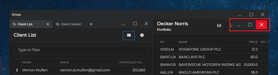
Available since io.Connect Desktop 9.2 & @interopio/groups-ui-react 2.1
The HTML Buttons element hosts the `` component. The following demonstrates the default structure (in render order) of the `` component. All buttons inside the component are rendered conditionally based on the value of their `visible` prop:
```javascript
```
For an example usage, see the [HTML Window Components](#extending_web_groups-html_window_components) section.
#### Other Zones
The [`@interopio/groups-ui-react`](https://www.npmjs.com/package/@interopio/groups-ui-react) library offers other customizable zones that don't contain default components and can be used for additional customizations:
- On a group level, you can use an Overlay zone to show a custom element anywhere within the group bounds. The bounds and lifetime of this element are determined by your custom styles and logic. For an example usage, see the [Overlays](#extending_web_groups-overlays) section.
- On a window level, you can use an Overlay zone to show a custom element anywhere within the bounds of all window types in the group. The bounds and lifetime of this element are determined by your custom styles and logic. The window-level overlay can be shown either in all windows simultaneously, or you can target a specific window. For an example usage, see the [Overlays](#extending_web_groups-overlays) section.
- On a window level, you can use an Above Window and a Below Window zone to show custom content that will be situated respectively at the top (below the caption bar) or at the bottom of all window types. For example usage, see [Common Window Components](#extending_web_groups-common_window_components).
### Using the Components
All default components can be reused and composed with custom code. If usage of such component has been detected, its default behavior will be applied. For instance, if you use the `` component, it will automatically close the window or group when the button is clicked, without the need of custom code to induce this behavior. If you pass the same component more than once, an error will be thrown.
To remove a component and make the respective zone or element empty, pass a `` component.
There are several prerequisites when creating a custom Web Group App:
- The size of the `` component must always be 100% of the window to avoid unexpected behavior and errors.
- The `` component must not be nested in other components, as its bounds are determined by the windows forming the window group and the group may also have an irregular shape. Wrapping the `` component will result in unexpected behavior.
- The CSS files must be added manually (see [Styles](#extending_web_groups-styles)).
### Group Component
The `` component has two props - `components` and `styles`.
Use the `components` prop to define the components for the various group and window elements and zones - [Group Caption Bar Components](#extending_web_groups-group_caption_bar_components), [Flat Window Components](#extending_web_groups-flat_window_components), [Tab Window Components](#extending_web_groups-tab_window_components), [Common Window Components](#extending_web_groups-common_window_components) and [Overlays](#extending_web_groups-overlays).
Use the `styles` prop to supply custom classes and CSS for some of the group elements (see [Styles](#extending_web_groups-styles)).
### Group Caption Bar Components
The `group` property of the `components` object in the `` component is used for defining the structure and content of the group caption bar and the group [overlay](#extending_web_groups-overlays).
The following example demonstrates how to create a custom group caption bar and add a custom button in it. The default functionality for editing the caption is preserved by using the default `` component:
```javascript
import {
GroupMoveArea,
GroupCaption,
GroupCaptionEditor,
GroupButtons
} from "@interopio/groups-ui-react";
import CustomButton from "./CustomButton";
const CustomGroupCaptionBar = ({
moveAreaId,
captionEditor,
targetId,
caption,
notifyCaptionBoundsChanged,
...rest
}) => {
return (
{captionEditor.show ?
:
}
);
};
export default CustomGroupCaptionBar;
```
Using the custom group caption bar in your Web Group App:
```javascript
import Group from "@interopio/groups-ui-react";
import CustomGroupCaptionBar from "./CustomGroupCaptionBar";
const App = () => {
return (
);
};
export default App;
```
> ℹ️ *See also the [Web Groups with Banners](https://github.com/InteropIO/web-groups-with-banners) example on GitHub.*
### Flat Window Components
The `flat` property of the `components` object in the `` component is used for defining the structure and content of the caption bar for flat windows.
The following example demonstrates how to create a custom caption for flat windows:
```javascript
import { useRef } from "react";
import { useEditableCaption } from "@interopio/groups-ui-react";
const CustomCaption = ({ caption, notifyBoundsChanged }) => {
const ref = useRef(null);
// Use this hook to notify the web groups framework that
// this component is the editable caption of the Flat Caption Bar element.
useEditableCaption(ref, { notifyBoundsChanged });
return
Custom Caption: {caption}
};
export default CustomCaption;
```
Creating a custom caption bar for flat windows containing a [Channel](https://docs.interop.io/desktop/capabilities/data-sharing/channels/overview/index.md) Selector and a custom caption. The default functionality for editing the caption is preserved by using the default `` component:
```javascript
import {
FlatChannelSelector,
FlatMoveArea,
FlatCaptionEditor,
FlatButtons
} from "@interopio/groups-ui-react";
import CustomCaption from "./CustomCaption";
const CustomFlatCaptionBar = ({
channels,
moveAreaId,
captionEditor,
caption,
notifyCaptionBoundsChanged,
...rest
}) => {
return (
{channels.visible && }
{captionEditor.show ?
:
}
);
};
export default CustomFlatCaptionBar;
```
Using the custom caption bar for flat windows in your Web Group App:
```javascript
import Group from "@interopio/groups-ui-react";
import CustomFlatCaptionBar from "./CustomFlatCaptionBar";
const App = () => {
return (
);
};
export default App;
```
> ℹ️ *See also the [Web Groups with Banners](https://github.com/InteropIO/web-groups-with-banners) example on GitHub.*
### Tab Window Components
The `tabs` property of the `components` object in the `` component is used for defining the structure and content of each tab element, tab header buttons and the additional zones around the tab elements.
The following example demonstrates how to create a custom "Close" button for tab windows:
```javascript
import { useEffect, useRef } from "react";
const CustomCloseButton = ({ close }) => {
const ref = useRef(null);
useEffect(() => {
if (!ref.current) { return };
// Stop the propagation of the `"mousedown"` event,
// in order to prevent the web groups framework from processing it.
ref.current.onmousedown = e => e.stopPropagation();
}, [ref]);
return
};
export default CustomCloseButton;
```
In this example, the propagation of the `"mousedown"` event is stopped, because otherwise the tab will enter draggable state. The `close()` handler is attached to the `"click"` event, because attaching it to the `"mousedown"` event won't work - the propagation of the `"mousedown"` event has been stopped using a direct DOM reference, which means that this event will never be fired as a React event.
> ⚠️ *Note that the final implementation of a Web Group App is a mixture of React and pure JavaScript. That's why when preventing the propagation of DOM events, it's strongly recommended to use direct references to the DOM elements. If you use React events, the event notifications may be received too late to stop the propagation.*
Creating a custom tab element for tab windows containing a [Channel](https://docs.interop.io/desktop/capabilities/data-sharing/channels/overview/index.md) Selector and a custom "Close" button. The default functionality for editing the caption is preserved by using the default `` component:
```javascript
import {
TabChannelSelector,
TabCaption,
TabCaptionEditor
} from "@interopio/groups-ui-react";
import CustomCloseButton from "./CustomCloseButton";
const CustomTab = ({
channels,
captionEditor,
selected,
windowId,
caption,
flashing,
pinned,
notifyCaptionBoundsChanged,
addContainerClass,
removeContainerClass,
close
}) => {
return (
{channels.visible && }
{captionEditor.show ?
:
}
);
};
export default CustomTab;
```
Using the custom tab element for tab windows in your Web Group App and defining a custom component for the Before Tabs zone:
```javascript
import Group from "@interopio/groups-ui-react";
import CustomTab from "./CustomTab";
const App = () => {
return (
{
return
🔍
}
}
}}
/>
);
};
export default App;
```
The `tabs` property of the `components` object also supports the following additional zones:
- `Above` - renders a custom component in the Above Tabs zone.
- `Below` - renders a custom component in the Below Tabs zone.
- `Buttons` - replaces or extends the default `` component.
- `OverflowPopup` - replaces the default `` component used when [tab overflow](#tab_overflow) is enabled.
> ℹ️ *See also the [Web Groups with Banners](https://github.com/InteropIO/web-groups-with-banners) example on GitHub.*
### HTML Window Components
Available since io.Connect Desktop 9.2 & @interopio/groups-ui-react 2.1
The `html` property of the `components` object in the `` component is used for defining the structure and content of the buttons for HTML windows.
The following example demonstrates adding a custom button before the standard buttons inside the `` component:
```javascript
import Group, { HtmlButtons } from "@interopio/groups-ui-react";
import CustomButton from "./CustomButton";
const App = () => {
return (
<>
}
}}
/>
);
};
export default App;
```
### Common Window Components
The `frame` property of the `components` object in the `` component is used for defining the structure and content of window and [overlay](#extending_web_groups-overlays) zones that are common for all window types. The available zones are `AboveWindow`, `BelowWindow`, `Overlay`, `WindowContentOverlay` and `LoadingAnimation`.
The following example demonstrates how to create a custom component for the Below Window zone that will be shown in all windows in the group, regardless of their type:
```javascript
import Group from "@interopio/groups-ui-react";
const App = () => {
return (
{
return
Custom Window Content
}
}
}}
/>
);
};
export default App;
```
> ⚠️ *Note that showing content in a Below Window zone effectively reduces the height of the window area.*
> ℹ️ *See also the [Web Groups with Banners](https://github.com/InteropIO/web-groups-with-banners) example on GitHub.*
### Loading Animation
To specify a custom loading animation for the windows in your Web Group App, use the `frame` property of the `components` object in the `` component:
```javascript
import Group from "@interopio/groups-ui-react";
import CustomLoadingAnimation from "./CustomLoadingAnimation";
const App = () => {
return (
);
};
export default App;
```
### Overlays
The [`@interopio/groups-ui-react`](https://www.npmjs.com/package/@interopio/groups-ui-react) library allows you to show custom overlays on a group or on a window level. The bounds and lifetime of overlay components is determined by your custom styles and logic. The window-level overlays can be shown either in all windows simultaneously, or you can target a specific window.
To define a window-level overlay, use the Overlay zone of the `frame` property of the `components` object in the `` component:
```javascript
import Group from "@interopio/groups-ui-react";
const App = () => {
return (
{
return
Custom Content
}
}
}}
/>
);
};
export default App;
```
If you use the `Overlay` property, your custom overlay will be shown over all window elements, including any Above Window or Below Window zones. If you want to display an overlay only over the actual window contents, use the `WindowContentOverlay` property of the `frame` object.
The following examples demonstrate how to create a group-level overlay that will show or hide when the user clicks a button in the group caption bar.
Create a custom group overlay:
```javascript
const CustomGroupOverlay = () => {
return (
);
};
export default CustomGroupOverlay;
```
Create a custom group caption bar and place a custom button in it that will show or hide the group overlay:
```javascript
import {
GroupMoveArea,
GroupCaption,
GroupButtons
} from "@interopio/groups-ui-react";
import CustomButton from "./CustomButton";
const CustomGroupCaptionBar = ({ moveAreaId, caption, showOverlay, setShowOverlay, ...props }) => {
return (
);
};
export default CustomGroupCaptionBar;
```
Pass the custom components to your custom Web Groups App and render the group overlay conditionally:
```javascript
import { useState } from "react";
import Group from "@interopio/groups-ui-react";
import CustomGroupCaptionBar from "./CustomGroupCaptionBar";
import CustomGroupOverlay from "./CustomGroupOverlay";
const App = () => {
const [showOverlay, setShowOverlay] = useState(false);
return (
{
return (
);
},
Overlay: () => showOverlay ? : <>
}
}}
/>
);
};
export default App;
```
> ℹ️ *See also the [Web Groups with Banners](https://github.com/InteropIO/web-groups-with-banners) example on GitHub.*
### Requesting Focus
Some components in your custom Web Group App may require keyboard focus when the user clicks on them (e.g., input fields) or when the component that contains them has been mounted. By default, the keyboard focus isn't on the Web Group App (the web page itself), but rather on the apps participating in it. To move the keyboard focus to a component in the Web Group App, use the `requestPageFocus()` method.
The following examples demonstrate how to move the keyboard focus to a custom input field located in a [custom window tab](#extending_web_groups-tab_window_components). The input field is used for changing the tab title - when the user double clicks on the tab, the input will be shown, and when they double click again, the new title will be set.
Create a custom input field and use the `requestPageFocus()` method to move the keyboard focus to it every time the component is mounted and when the user clicks on it. You must also use a direct reference to the element and stop the propagation of the `"mousedown"` and `"click"` events in order to prevent the web groups framework from processing them. Use the `requestPageFocus()` method in the `"click"` event in order to focus the element every time the user clicks on it, in case the element is already rendered, but loses focus, because the user has clicked somewhere else:
```javascript
import { useState, useEffect, useRef } from "react";
import { requestPageFocus } from "@interopio/groups-ui-react";
const CustomInput = ({ setTabTitle }) => {
const [newTitle, setNewTitle] = useState("");
const ref = useRef(null);
useEffect(() => {
if (!ref.current) { return };
// Stop the propagation of the `"mousedown"` and `"click"` events,
// in order to prevent the web groups framework from processing them.
ref.current.onmousedown = e => e.stopPropagation();
ref.current.onclick = (e) => {
e.stopPropagation();
// Request keyboard focus when the component is mounted and when the user clicks on it.
requestPageFocus();
};
}, [ref]);
return setTabTitle(newTitle)} onChange={e => {setNewTitle(e.target.value)}} value={newTitle} />
};
export default CustomInput;
```
> ⚠️ *Note that due to the nature of the Web Group App and the fact that React event handlers are always executed after the native DOM event handlers, you must use a direct reference to the DOM elements instead of React events when handling the `"mousedown"` and `"click"` events.*
> ⚠️ *Note that you shouldn't use `requestPageFocus()` in the window tab itself, but rather in an element it contains. If you use `requestPageFocus()` in the window tab, you will have to prevent the propagation of the `"click"` and `"mousedown"` events there, which will prevent the web groups framework from processing them, leading to undesirable side effects - the user won't be able to move the window tabs or even switch between them by clicking on them.*
Compose a custom window tab containing the custom input field that will render conditionally:
```javascript
import { useEffect, useState } from "react";
import { TabChannelSelector, TabCaption, TabCloseButton } from "@interopio/groups-ui-react";
import CustomInput from "./CustomInput";
const CustomTab = ({ channels, caption, selected, close }) => {
const [showInput, setShowInput] = useState(false);
const [tabTitle, setTabTitle] = useState(caption);
useEffect(() => setTabTitle(caption), [caption]);
return (
);
};
export default CustomTab;
```
Replace the default `` component with the custom one:
```javascript
import Group from "@interopio/groups-ui-react";
import CustomTab from "./CustomTab";
const App = () => {
return (
);
};
export default App;
```
### Transparent & Opaque Areas
Available since io.Connect Desktop 10.4 & @interopio/groups-ui-react 4.5.1
The Web Group App web page is rendered over the app windows participating in the web group. The areas of the web page that are marked as transparent are passed through, so that the app windows below are visible and receive mouse events directly. The areas that are marked as opaque remain rendered and clickable over the app windows.
To define which areas of the Web Group App are transparent and which are opaque, use the `-webkit-app-region` CSS property:
| Value | Description |
|-------|-------------|
| `drag` | Defines a [custom draggable area](https://www.electronjs.org/docs/latest/tutorial/window-customization#set-custom-draggable-region). Treated as an opaque area as well. |
| `no-drag` | Excludes an area from a custom draggable area. Treated as an opaque area as well. |
| `opaque` | The area will remain rendered and clickable over the app windows. Use this for all visible custom UI that may appear over an app window - popups, menus, dialogs, drawers, toolbars, sliding panels, overlays. |
| `transparent` | The area will be passed through to the app window below - the app window will be visible and will receive the mouse events for that area. Use this for the areas in which the app windows are displayed. |
The default styles distributed with the [`@interopio/groups-ui-react`](https://www.npmjs.com/package/@interopio/groups-ui-react) library already contain the necessary `-webkit-app-region` declarations. You have to define transparent and opaque areas only for your own custom elements, or if you override or replace the default styles.
The following example demonstrates how to define a transparent and an opaque area:
```css
/* This area will be passed through, so the app window below will be visible and will receive mouse events. */
.app-window-area {
background-color: transparent;
-webkit-app-region: transparent;
}
/* This area will be opaque, making the custom popup visible and clickable over the app windows. */
.my-custom-popup {
background-color: grey;
-webkit-app-region: opaque;
}
```
Take into account the following specifics when defining transparent and opaque areas:
- The `-webkit-app-region` property isn't inheritable, so you must declare it explicitly on each element that has to define an area. Declaring it on a parent element won't propagate it to its children.
- The `-webkit-app-region` property controls only how the platform treats the area, not how it looks. To make an element visually transparent or opaque, you still have to use standard CSS for background color and opacity. It's highly recommended to always keep the empty areas displayed over the app windows visually transparent - this will ensure consistent behavior in both [platform modes](https://docs.interop.io/desktop/developers/configuration/system/index.md#platform_modes), as well as when the platform falls back to software rendering (e.g., when hardware acceleration is unavailable on the user machine).
- An area is defined by the border box of the element, expanded by its `box-shadow`, if present. Decorations applied via `outline` or `filter: drop-shadow()` aren't included in the area, so don't use them for elements that must remain visible over an app window - use `box-shadow`, borders, or decorations inside the element box instead.
- An element that doesn't produce a layout box or has `visibility: hidden` doesn't define an area at all.
- When two areas overlap, the one that is visually on top prevails. The platform determines this by comparing the `z-index` of sibling elements, so the elements whose overlapping order matters must be siblings within a common container that establishes a stacking context. Use `isolation: isolate` for the container, as it has no visual side effects (`position: relative` with `z-index: 0` also works). Note that `z-index` is applied only to positioned, flex, or grid elements.
```css
.overlay-host {
/* Establishes a stacking context. */
isolation: isolate;
}
.app-window-area {
-webkit-app-region: transparent;
}
/* Remains opaque wherever it overlaps an app window area. */
.splitter {
position: relative;
z-index: 1;
-webkit-app-region: opaque;
}
```
- If a popup consists of a transparent positioning wrapper and a visible panel inside it, mark the visible panel as opaque, not the wrapper. Keep the popup shadows tight - the shadow is a part of the opaque area, so large shadows will create large areas around the popup that will block the mouse events for the app windows below.
### Hooks & Utilities
The [`@interopio/groups-ui-react`](https://www.npmjs.com/package/@interopio/groups-ui-react) library exposes hooks and utility functions that can be used in your custom components.
#### useIOConnectWindow()
Use the `useIOConnectWindow()` hook to obtain the [`IOConnectWindow`](https://docs.interop.io/desktop/reference/javascript/windows/ioconnectwindow/index.md) object of a window hosted in a web group by providing its window ID.
The window IDs are available via the props of the custom components - `windowId` in ``, or `selectedWindow` in ``, ``, ``, and all window-level zone components like `AboveWindow`, `BelowWindow`, `Overlay`, and more.
The following example demonstrates how to use the `useIOConnectWindow()` hook to rename a window in a tab group by changing its title when the user clicks a button:
```javascript
import { useIOConnectWindow } from "@interopio/groups-ui-react";
// Use inside a custom component where `windowId` is available directly in the props.
const CustomTabContent = ({ windowId }) => {
const ioConnectWindow = useIOConnectWindow(windowId);
const handleClick = () => {
if (ioConnectWindow) {
ioConnectWindow.setTitle("New Title");
}
};
return ;
};
```
#### useGroupComponentVisibility()
Use the `useGroupComponentVisibility()` hook to get the visibility state of group components, such as the group caption bar. This can be useful for adjusting the layout of your custom components based on the current state of the group.
```javascript
import { useGroupComponentVisibility } from "@interopio/groups-ui-react";
const CustomComponent = () => {
const { groupCaptionBarVisible } = useGroupComponentVisibility();
return groupCaptionBarVisible ?
Caption bar is visible
: null;
};
```
#### useExternalWindowPopup()
Available since io.Connect Desktop 10.0 & @interopio/groups-ui-react 3.0
> ⚠️ *Note that using the `useExternalWindowPopup()` hook for creating popup windows is necessary only if you are using a version of the [`@interopio/groups-ui-react`](https://www.npmjs.com/package/@interopio/groups-ui-react) library earlier than 4.5.1. As of **io.Connect Desktop** 10.4 and [`@interopio/groups-ui-react`](https://www.npmjs.com/package/@interopio/groups-ui-react) 4.5.1, custom popups in the Web Group App can be created from HTML elements in both [platform modes](https://docs.interop.io/desktop/developers/configuration/system/index.md#platform_modes) - see [Transparent & Opaque Areas](#extending_web_groups-transparent__opaque_areas). Existing implementations based on the `useExternalWindowPopup()` hook will continue to work.*
Use the `useExternalWindowPopup()` hook to display a custom popup in a dedicated window instead of rendering it as an HTML element in the Web Group App. The hook creates a dedicated Electron window to be used as a popup window that is positioned above the group windows. Because the popup is same-origin, you can use `ReactDOM.createPortal()` to render React components directly into it — state, effects, context, event handlers, and styling will work as expected.
The hook wraps the [`createPopup()`](https://docs.interop.io/desktop/reference/javascript/windows/api/index.md#API-createPopup) method of the Window Management API for creating the popup window.
The hook requires the io.Connect API to be available in the React context. This is automatically provided when your component is rendered inside the `` component or when using the [`@interopio/react-hooks`](https://www.npmjs.com/package/@interopio/react-hooks) library.
The typical usage pattern for creating a popup with the `useExternalWindowPopup()` hook is:
- Create a hidden popup window on mount via the `createPopup()` method.
- Render content into it via `ReactDOM.createPortal()` by using the `getContainer()` method to retrieve the popup container.
- Display the popup via the `showPopup()` method with positioning options.
- Resize the popup via the `resizePopup()` method when content is updated.
- Hide the popup via the `hidePopup()` method or close it via the `closePopup()` method to destroy it entirely.
If you want to reuse the popup, use the `hidePopup()` method — hiding is faster because it avoids recreating the underlying Electron window.
Take into account the following behaviors when using the `useExternalWindowPopup()` hook:
- The popup automatically inherits the current io.Connect theme. When the theme changes, the popup will be updated too.
- Pressing the `ESC` key in either the parent window or the popup will automatically hide the popup.
- If the dedicated Electron popup window is unexpectedly destroyed (e.g., closed by the system), the hook will recreate it automatically when `showPopup()` is called.
- The popup creation operation will time out in 60 seconds. If the popup isn't created within this time, the operation will fail and return `null`.
- Copying the styles from the parent window to the popup window happens once on popup creation and the styles to copy must be global and already be loaded in the parent window document before the `createPopup()` method is invoked. If you are importing styles dynamically, you must transfer them to the popup window manually.
The `useExternalWindowPopup()` hook returns an object with the following properties:
| Property | Type | Description |
|----------|------| ------------|
| `closePopup()` | `function` | Function with the following signature: `() => Promise`. Closes and destroys the popup window. A new popup must be created with `createPopup()` to show a popup again. |
| `createPopup()` | `function` | Function with the following signature: `(options?: CreatePopupOptions) => Promise`. Creates a dedicated Electron window to use as a popup window. Must be called before `showPopup()`. Accepts a [`CreatePopupOptions`](https://docs.interop.io/desktop/reference/javascript/windows/createpopupoptions/index.md) object as an argument. Returns the created `PopupWindow` object, or `null` if creation fails. |
| `getContainer()` | `function` | Function with the following signature: `() => HTMLElement \| null`. Returns the DOM container element inside the popup window. Use this to load your own content via `ReactDOM.createPortal()`. Returns `null` if the popup hasn't been created yet. |
| `hidePopup()` | `function` | Function with the following signature: `() => Promise`. Hides the popup without destroying it. The popup can be displayed again with `showPopup()`. |
| `isOpen` | `boolean` | Flag indicating whether a popup window has been created (exists). |
| `isVisible` | `boolean` | Flag indicating whether the popup window is currently visible. |
| `popup` | `object \| null` | The current `PopupWindow` object or `null` if a popup hasn't been created yet. |
| `resizePopup()` | `function` | Function with the following signature: `(size: Size) => Promise`. Resizes the popup window to the specified dimensions. |
| `showPopup()` | `function` | Function with the following signature: `(options?: ShowPopupOptions) => Promise`. Displays the popup at a position relative to the specified target bounds. Accepts a `ShowPopupOptions` object as an argument. |
The `ShowPopupOptions` object has the following properties:
| Property | Type | Description |
|----------|------|-------------|
| `focus` | `boolean` | If `true`, the popup window will gain focus when shown and will hide automatically when it loses focus. If `false`, the popup window won't be on focus when shown and won't hide automatically if it gains and loses focus afterwards. If you set this to `false`, you will be responsible for implementing the conditions and the mechanism for hiding or closing the popup window. |
| `horizontalOffset` | `number` | Horizontal offset from the area around which the popup will appear (the area defined in the `targetBounds` property). Valid only if the target location of the popup window is set to `"left"` or `"right"`. |
| `size` | `object` | A `Size` object specifying the dimensions of the popup window. |
| `targetBounds` | `object` | A `Bounds` object specifying the bounds of the area around which the popup window will appear. |
| `targetLocation` | `"top"` \| `"bottom"` \| `"left"` \| `"right"` \| `"none"` | Location where the popup will appear relative to the area around which the popup window will appear (the area defined in the `targetBounds` property). If `"none"` is passed, the popup will appear at the top left corner of the area defined in the `targetBounds` property. |
| `verticalOffset` | `number` | Vertical offset from the area around which the popup will appear (the area defined in the `targetBounds` property). Valid only if the target location of the popup window is set to `"top"` or `"bottom"`. |
The following example demonstrates how to create and display a simple popup that will appear below a button:
```javascript
import React, { useCallback, useEffect, useRef, useState } from "react";
import { createPortal } from "react-dom";
import { useExternalWindowPopup } from "@interopio/groups-ui-react";
const MyPopupButton = () => {
const buttonRef = useRef(null);
const {
popup,
getContainer,
createPopup,
showPopup,
hidePopup
} = useExternalWindowPopup();
// Create the popup window on mount.
useEffect(() => {
const createPopupOptions = {
transparent: true,
copyStyles: true
};
createPopup(createPopupOptions);
return () => { hidePopup(); };
}, []);
// Display the popup when the button is clicked.
const handleClick = useCallback(() => {
if (!popup || !buttonRef.current) return;
const bounds = buttonRef.current.getBoundingClientRect();
const showPopupOptions = {
targetBounds: {
top: bounds.top,
left: bounds.left,
width: bounds.width,
height: bounds.height
},
size: { width: 200, height: 150 },
targetLocation: "bottom",
focus: true
};
showPopup(showPopupOptions);
}, [popup, showPopup]);
const container = getContainer();
return (
<>
{container && createPortal(
Popup Content
,
container
)}
);
};
export default MyPopupButton;
```
The following example demonstrates how to resize the popup dynamically when its content changes:
```javascript
import React, { useEffect, useState } from "react";
import { createPortal } from "react-dom";
import { useExternalWindowPopup } from "@interopio/groups-ui-react";
const DynamicPopup = ({ buttonBounds }) => {
const [items, setItems] = useState(["Item 1", "Item 2"]);
const {
popup,
getContainer,
createPopup,
showPopup,
hidePopup,
resizePopup
} = useExternalWindowPopup();
useEffect(() => {
const createPopupOptions = {
transparent: true,
copyStyles: true
};
createPopup(createPopupOptions);
return () => { hidePopup(); };
}, []);
// Show the popup once created.
useEffect(() => {
if (!popup) return;
const showPopupOptions = {
targetBounds: buttonBounds,
size: { width: 250, height: items.length * 40 + 60 },
targetLocation: "bottom",
focus: true
};
showPopup(showPopupOptions);
}, [popup]);
// Resize when the number of items changes.
useEffect(() => {
const size = { width: 250, height: items.length * 40 + 60 };
resizePopup(size);
}, [items, resizePopup]);
const container = getContainer();
if (!container) return null;
return createPortal(
{items.map((item, i) => (
{item}
))}
,
container
);
};
export default DynamicPopup;
```
To hide the popup when a window in the group is clicked, use the `isVisible` state tracked by the hook to detect when the popup transitions from visible to hidden:
```javascript
import React, { useEffect, useRef } from "react";
import { useExternalWindowPopup } from "@interopio/groups-ui-react";
const PopupWithAutoHide = ({ onHide }) => {
const { isVisible } = useExternalWindowPopup();
const wasVisibleRef = useRef(false);
useEffect(() => {
// Detect when the popup transitions from visible to hidden.
if (!isVisible && wasVisibleRef.current) {
onHide();
}
wasVisibleRef.current = isVisible;
}, [isVisible, onHide]);
// Rest of the component.
};
export default PopupWithAutoHide;
```
#### Utility Functions
The library exports the following utility functions:
| Function | Description |
|----------|-------------|
| `getGroupId()` | Returns the ID of the current web group. |
| `requestFrameFocus()` | Moves the keyboard focus to a specific window in the web group. Accepts the window ID string as an argument. |
| `requestGroupFocus()` | Focuses the last focused window in the web group. Use this to instruct the framework to focus the appropriate window when bringing the web group to the foreground (e.g., when the user switches from one web group instance to another and vice versa) instead of keeping track of the focus manually. |
| `requestPageFocus()` | Moves the [keyboard focus to the Web Group App page](#extending_web_groups-requesting_focus) (the HTML document). Use this when you want keyboard input to be directed to the DOM elements in the web page. |
### Styles
To use the default styles for your custom Web Group App, import the following CSS file:
```javascript
import "@interopio/groups-ui-react/dist/styles/groups.css";
```
The default styles distributed with the Web Group App package must not be removed, because they contain both visual and behavioral styling. To use custom styles, simply import your CSS file after the default CSS import to override it. You can also customize the default CSS variables located in the `vars.css` file in the package.
Two default themes are available - dark and light. The trigger for switching between them is the class property of the `` element - `"dark"` for the dark theme and `"light"` for the light theme:
```html
```
> ⚠️ *Note that when adding custom components to the Web Group App, you can use the `-webkit-app-region: drag` and `-webkit-app-region: no-drag` styles to define [custom draggable areas](https://www.electronjs.org/docs/latest/tutorial/window-customization#set-custom-draggable-region). This is especially useful if you are adding custom content inside components that already contain draggable areas (like the ``, `` or the tab header of a tabbed group) and want to include or exclude this content from the draggable area.*
> ⚠️ *Note that the `-webkit-app-region` property is also used for defining which areas of the Web Group App are transparent and which are opaque. Elements marked with `drag` or `no-drag` are treated as opaque areas as well. For more details, see the [Transparent & Opaque Areas](#extending_web_groups-transparent__opaque_areas) section.*
Available since io.Connect Desktop 9.1 & @interopio/groups-ui-react 2.0
The `` component allows you to supply custom classes and CSS settings for some of the group elements by using its `styles` prop. Currently, styles can be supplied for the group frame, the tab header of a tab group, and the move area of a tab group:
```javascript
import Group from "@interopio/groups-ui-react";
const App = () => {
return (
);
};
export default App;
```
Available since io.Connect Desktop 9.4 & @interopio/groups-ui-react 2.3
The `` component receives `addContainerClass()` and `removeContainerClass()` functions as props, which allow you to dynamically add or remove CSS classes from the tab container element. This is useful for applying custom styles to the tab container based on the state of the window or other conditions:
```javascript
import { useEffect } from "react";
import { TabChannelSelector, TabCaption, TabCloseButton } from "@interopio/groups-ui-react";
const CustomTab = ({
channels,
caption,
selected,
close,
flashing,
addContainerClass,
removeContainerClass
}) => {
useEffect(() => {
if (flashing) {
addContainerClass("attention");
} else {
removeContainerClass("attention");
}
}, [flashing]);
return (
{channels.visible && }
);
};
export default CustomTab;
```
Available since io.Connect Desktop 9.7 & @interopio/groups-ui-react 2.6
To set the minimum tab width after which the tabs will be grouped in an [overflow](#tab_overflow) menu, modify the following CSS variable in the `vars.css` file of the [`@interopio/groups-ui-react`](https://www.npmjs.com/package/@interopio/groups-ui-react) library:
```css
/* Set the minimum tab width for tab overflow. */
--t42-tab-bar-tab-overflowable-min-width: 96px
```
### Limitations
You should consider the following technical limitations when using the [`@interopio/groups-ui-react`](https://www.npmjs.com/package/@interopio/groups-ui-react) library:
- In the [advanced platform mode](https://docs.interop.io/desktop/developers/configuration/system/index.md#platform_modes), unless you set the [transparency mode](https://docs.interop.io/desktop/developers/configuration/system/index.md#window_management-transparency_control) to `"Transparent"` (usable on Windows 8+) in the `system.json` [system configuration](https://docs.interop.io/desktop/developers/configuration/system/index.md) file of **io.Connect Desktop**, any popups you may use must not have shadows or transparency. If the transparency mode is set to any other value, the shadow or the transparency will blend with the specified key color which will result in an undesirable visual effect. Also, the specified key color shouldn't be used individually or in a gradient, because it will always be rendered as transparent.
> ℹ️ *For more details on the transparency mode, see the [Developers > Configuration > System > Window Management](https://docs.interop.io/desktop/developers/configuration/system/index.md#window_management-transparency_control) section. For details on how to define the transparent and opaque areas of the Web Group App, see the [Transparent & Opaque Areas](#extending_web_groups-transparent__opaque_areas) section.*
- Hot module reloading may not work well because of the pool with instances of the Web Group App. This pool is [configurable](https://docs.interop.io/desktop/developers/configuration/application/index.md#app_definition-web_group_app) and is necessary for ensuring smooth operation and better user experience when performing group operations.
- It's strongly discouraged to render custom components around the `` component, because most likely they will be visually cut off by the internal logic for handling the cases of irregular (non-rectangular) window groups.
- The Web Group App instance doesn't have an io.Connect Window object ([`io.windows.my()`](https://docs.interop.io/desktop/reference/javascript/windows/api/index.md#API-my) returns `undefined`). See also [Using io.Connect APIs in the Web Group App](#extending_web_groups-using_ioconnect_apis_in_the_web_group_app).
- Refs to the custom components passed to the `` component shouldn't be used in any parent component of `` because the children of `` aren't immediately rendered and therefore these refs won't work as expected.
The [`@interopio/groups-ui-react`](https://www.npmjs.com/package/@interopio/groups-ui-react) library currently doesn't support the following:
- maximizing a window participating in a group and returning it to the group on restore;
- expand and collapse programmatic commands and buttons;
- the `"sizingMode": "Single"` option for [resizing windows in a group](https://docs.interop.io/desktop/developers/configuration/io-connect-windows/index.md#ioconnect_window_properties-resizing_grouped_windows);
- the `"allowTabClose"` option for [hiding the "Close" button](https://docs.interop.io/desktop/developers/configuration/application/index.md#tab_close) of tab windows;
- the download bar displayed in io.Connect Windows when downloading files;
- hibernate and resume operations;