Changelog
io.Connect Browser 4.6
Release date: 07.10.2026
Versions of all main and additional libraries of io.Connect Browser for the current release:
| Library | Version |
|---|---|
@interopio/browser |
4.6 |
@interopio/browser-platform |
4.6 |
@interopio/browser-worker |
4.6 |
@interopio/cli |
4.5 |
@interopio/fdc3 |
2.12 |
@interopio/home-ui-react |
5.0 |
@interopio/iframes-api |
1.1 |
@interopio/intent-resolver-ui |
5.0 |
@interopio/modals-api |
5.0 |
@interopio/modals-ui |
5.0 |
@interopio/ng |
6.3 |
@interopio/react-hooks |
5.0 |
@interopio/search-api |
3.6 |
@interopio/theme |
5.0 |
@interopio/widget |
3.6 |
@interopio/workspaces-api |
4.6 |
@interopio/workspaces-ui-react |
5.0 |
@interopio/workspaces-ui-web-components |
5.0 |
⚠️ Note that in this release the major version of some of the libraries has been incremented only for release purposes and procedural consistency, not due to breaking changes in the respective libraries.
Breaking Changes
⚠️ Note that each breaking change is listed under all libraries it affects.
@interopio/home-ui-react
- The
getIcon()function in theconfigobject of the<Section />component, used for creating custom sections, must now return{ variant: IconVariant }for predefined icons or{ src: string }for custom icons instead of a string.
@interopio/theme
Due to redesign of the Layouts panel in the Launchpad and overall improvement of the platform styles, the following CSS variables have been removed or replaced:
- Removed the CSS variables for the Layouts panel of the Launchpad:
--launchpad-layouts-check-icon-size,--launchpad-layouts-create-button-margin,--launchpad-layouts-header-height,--launchpad-layouts-header-padding,--launchpad-layouts-no-active-padding,--launchpad-layouts-separator-color,--launchpad-layouts-separator-margin,--launchpad-layouts-separator-size, and--launchpad-layouts-wrapper-margin. Use the new CSS variables for the Layouts footer instead.- Removed the
--launchpad-section-item-actions-desktop-gap,--launchpad-section-item-actions-margin, and--launchpad-section-item-actions-mobile-gapCSS variables.- Removed the
--workspace-popup-wsp-separatorCSS variable.- Replaced the
--workspace-popup-app-padding,--workspace-popup-wsp-title-lh, and--workspace-popup-wsp-title-paddingCSS variables with new CSS variables for the Workspace dialogs and popups.- Replaced the
--workspace-settings-h-paddingand--workspace-settings-v-paddingCSS variables with new CSS variables for the Workspace Settings panel.
New Features
⚠️ Note that each new feature is listed under all libraries it affects.
@interopio/browser-platform
Tab Overflow for Workspaces
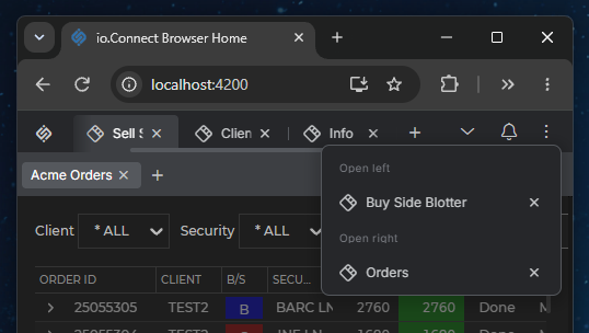
It's now possible to enable tab overflow for Workspaces. When there isn't enough space to display all Workspace tabs in the Workspaces App header, the Workspace tabs shrink to a minimum width and then become scrollable. A "More Workspaces" button appears in the header, allowing users to select or close any of the Workspaces whose tabs are out of view to the left and to the right of the visible Workspace tabs.
By default, tab overflow for Workspaces is disabled. To enable it, set the
workspaceTabsOverflowproperty of theworkspacesobject totruein the configuration object for initializing the@interopio/browser-platformlibrary:import IOBrowserPlatform from "@interopio/browser-platform"; const config = { licenseKey: "my-license-key", workspaces: { src: "https://my-workspaces-app.com", // Enabling tab overflow for Workspaces. workspaceTabsOverflow: true } }; const { io } = await IOBrowserPlatform(config);ℹ️ For details on customizing the tab overflow for Workspaces, see the Developers > Platform Styles > Workspaces > Tab Overflow section.
@interopio/home-ui-react
Launchpad Redesign
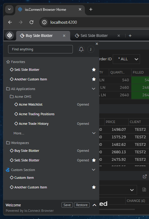
The Launchpad has been redesigned - the Global Layouts are now listed in a Layouts section similarly to apps and Workspaces instead of in a separate panel in the Launchpad. The Layouts section is always rendered after all default and custom sections and can't be hidden or repositioned. The currently active Global Layout is displayed in a footer at the bottom of the Launchpad:
Favorites are now added and removed via the context menu for each section item instead of via a dedicated button in the item list. Global Layouts can now also be added to the favorite items.
The buttons for creating a new Workspace and a new Global Layout are now located in the headers of the Workspaces and Layouts sections respectively.
ℹ️ For details on customizing the Launchpad sections and the Layouts footer, see the Developers > Platform Styles > Launchpad > Sections and Developers > Platform Styles > Launchpad > Layouts Footer sections respectively.
Library Features
- Added
sectionIconSrcto the default section components:<ApplicationsSection />,<FavoritesSection />, and<WorkspacesSection />.- Extended the
configobject of the<Section />component with an optionalHeaderButtonproperty that accepts a custom section header action component.- Added item-level
isSelectedandstatusPillsupport for items rendered in the<Section />component.
@interopio/theme
Added CSS variables for customizing the styles of the following io.Connect Browser apps and UI components:
Launchpad Sections
Use the following CSS variables for customizing the styles of the Launchpad sections:
Variable Description --launchpad-section-header-min-heightMinimum height for the headers of the Launchpad sections. --launchpad-section-header-paddingPadding for the headers of the Launchpad sections. --launchpad-section-item-border-radiusBorder radius for the items in the Launchpad sections. --launchpad-section-item-marginMargin for the items in the Launchpad sections. --launchpad-section-item-paddingPadding for the items in the Launchpad sections. ⚠️ Note that some CSS variables for the Launchpad sections have been deprecated.
Launchpad Layouts Footer
Use the following CSS variables for customizing the styles of the Layouts footer of the Launchpad:
Variable Description --launchpad-layouts-footer-active-layout-buttons-gapGap between the action buttons for the active Layout in the Layouts footer. --launchpad-layouts-footer-active-layout-details-gapGap between the details of the active Layout in the Layouts footer. --launchpad-layouts-footer-background-colorBackground color for the Layouts footer. --launchpad-layouts-footer-border-topTop border for the Layouts footer. --launchpad-layouts-footer-dot-separator-colorColor for the dot separator in the Layouts footer. --launchpad-layouts-footer-heading-colorColor for the heading of the Layouts footer. --launchpad-layouts-footer-heading-line-heightLine height for the heading of the Layouts footer. --launchpad-layouts-footer-heading-sizeFont size for the heading of the Layouts footer. --launchpad-layouts-footer-heading-weightFont weight for the heading of the Layouts footer. --launchpad-layouts-footer-info-colorColor for the info text in the Layouts footer. --launchpad-layouts-footer-info-font-sizeFont size for the info text in the Layouts footer. --launchpad-layouts-footer-info-line-heightLine height for the info text in the Layouts footer. --launchpad-layouts-footer-paddingPadding for the Layouts footer. --launchpad-layouts-footer-save-button-widthWidth for the "Save" button in the Layouts footer. ⚠️ Note that some CSS variables for the Launchpad Layouts have been deprecated.
Workspace Tab
Use the following CSS variables for customizing the styles of the Workspace tabs:
Variable Description --workspace-tab-overflow-min-widthMinimum width to which the Workspace tabs shrink before they become scrollable. Applies only when tab overflow for Workspaces is enabled. --workspace-tab-title-mask-imageMask image applied to the title of a Workspace tab, used for the text fade-out effect on text overflow. Set to noneto disable the text mask.--workspace-tab-title-overflowControls how the title of a Workspace tab is rendered when it overflows the available space. The existing
--workspace-tab-text-maskvariable is no longer applied to the Workspace tab titles directly - it now only defines the fade-out gradient and is used as the default value of--workspace-tab-title-mask-image. Any custom gradient specified for--workspace-tab-text-maskwill continue to be applied as before.#root { /* The title will be truncated with an ellipsis instead of fading out. */ --workspace-tab-title-mask-image: none; --workspace-tab-title-overflow: ellipsis; }Tab Overflow for Workspaces
Use the following CSS variables for customizing the styles of the tab overflow for Workspaces elements:
Variable Description --workspace-tabs-overflow-button-marginMargin for the "More Workspaces" button. --workspace-tabs-overflow-panel-h-paddingHorizontal padding for the "More Workspaces" panel. --workspace-tabs-overflow-panel-max-heightMaximum height for the "More Workspaces" panel. --workspace-tabs-overflow-panel-v-paddingVertical padding for the "More Workspaces" panel. --workspace-tabs-overflow-scroll-axisPadding along the scrollbar for the Workspace tabs. --workspace-tabs-overflow-scroll-colorColor for the scroll handle for the Workspace tabs. --workspace-tabs-overflow-scroll-color-activeColor for the scroll handle for the Workspace tabs when active. --workspace-tabs-overflow-scroll-color-hoverColor for the scroll handle for the Workspace tabs when hovered. --workspace-tabs-overflow-scroll-fade-sizeWidth of the fade-out effect at the edges of the Workspace tabs area when there are Workspace tabs out of view. --workspace-tabs-overflow-scroll-perpendicularPadding across the scrollbar for the Workspace tabs. --workspace-tabs-overflow-scroll-sizeSize of the scroll handle for the Workspace tabs. Workspace Dialogs & Popups
Use the following CSS variables for customizing the styles of the Workspace dialogs and popups:
Variable Description --workspace-dialog-heading-colorColor for the heading in the Workspace dialogs. --workspace-dialog-heading-font-sizeFont size for the heading in the Workspace dialogs. --workspace-dialog-heading-font-weightFont weight for the heading in the Workspace dialogs. --workspace-dialog-heading-lhLine height for the heading in the Workspace dialogs. --workspace-popup-add-workspace-button-paddingPadding for the "Create New Workspace" button in the "Add Workspace" popup. --workspace-popup-add-workspace-title-lhLine height for the title of the "Add Workspace" popup. --workspace-popup-add-workspace-title-paddingPadding for the title of the "Add Workspace" popup. --workspace-popup-app-button-widthWidth for the buttons in the "Add Apps" popup. --workspace-popup-app-padding-horizontalHorizontal padding for the "Add Apps" popup. --workspace-popup-app-padding-verticalVertical padding for the "Add Apps" popup. --workspace-popup-border-radiusBorder radius for the Workspace popups. --workspace-popup-panel-horizontal-paddingHorizontal padding for the Workspace popups. --workspace-popup-panel-vertical-paddingVertical padding for the Workspace popups. --workspace-popup-scroll-perpendicularPadding across the scrollbar in the Workspace popups. --workspace-popup-scroll-sizeSize of the scroll handle in the Workspace popups. --workspace-popup-title-colorColor for the title in the Workspace tab menu. --workspace-popup-title-paddingPadding for the title in the Workspace tab menu. ⚠️ Note that some CSS variables for the Workspace dialogs and popups have been deprecated.
Workspace Settings Panel
Use the following CSS variables for customizing the styles of the Workspace Settings panel:
Variable Description --workspace-settings-paddingPadding for the Workspace Settings panel. --workspace-settings-title-paddingPadding for the title of the Workspace Settings panel. ⚠️ Note that some CSS variables for the Workspace Settings panel have been deprecated.
@interopio/workspaces-ui-react
Tab Overflow for Workspaces
Added support for tab overflow for Workspaces.
The library provides a default Workspace Tabs Overflow component and a default "More Workspaces" button, which are available as the
<WorkspaceTabsOverflowPopup />and<WorkspaceTabsOverflowButton />components. You can reuse them in your custom Workspaces App, or replace the default Workspace Tabs Overflow component entirely.The "More Workspaces" button is part of the System Buttons component. If you replace the System Buttons component, use the
<WorkspaceTabsOverflowButton />component and pass it theworkspaceTabsOverflowprop of the System Buttons component in order to preserve the "More Workspaces" button:import Workspaces, { WorkspaceTabsOverflowButton } from "@interopio/workspaces-ui-react"; import CustomButton from "./CustomButton"; const CustomSystemButtons = ({ workspaceTabsOverflow }) => { return ( <> {/* Preserves the default "More Workspaces" button for tab overflow. */} <WorkspaceTabsOverflowButton {...workspaceTabsOverflow} /> <CustomButton /> </> ); }; const App = () => { return ( <Workspaces components={{ header: { SystemButtonsComponent: CustomSystemButtons } }} /> ); }; export default App;To replace the default Workspace Tabs Overflow component, use the
WorkspaceTabsOverflowComponentproperty of thepopupsobject within thecomponentsprop of the<Workspaces />component. The custom component receives the lists of Workspaces whose tabs are out of view to the left and to the right of the visible tabs, as well as functions for selecting and closing a Workspace.The following example demonstrates a reference implementation of the Workspace Tabs Overflow component that lists all Workspaces whose tabs are out of view:
const MyTabsOverflowPopup = ({ hiddenTabsToTheLeft, hiddenTabsToTheRight, onSelectWorkspace, onCloseWorkspace }) => {
    const hiddenTabs = [...hiddenTabsToTheLeft, ...hiddenTabsToTheRight];

    return (
        <ul>
            {hiddenTabs.map(({ id, title }) => (
                <li key={id}>
                    <span onClick={() => onSelectWorkspace(id)}>{title}</span>
                    <button onClick={() => onCloseWorkspace(id)}>Close</button>
                </li>
            ))}
        </ul>
    );
};

export default MyTabsOverflowPopup;
The following example demonstrates how to replace the default Workspace Tabs Overflow component with your custom component:
import Workspaces from "@interopio/workspaces-ui-react";
import MyTabsOverflowPopup from "./MyTabsOverflowPopup";

const App = () => {
    return (
        <Workspaces
            components={{
                popups: {
                    WorkspaceTabsOverflowComponent: MyTabsOverflowPopup
                }
            }}
        />
    );
};

export default App;
Workspace Tab Menu
The Workspace tab menu has been redesigned and now displays the name of the Workspace Layout. The "Save" option now saves the Workspace in its current Layout, while the new "Save As" option saves it under a new name. The new "Rename" and "Delete" options allow users to rename and delete the Workspace Layout. The "Settings" option has been renamed to "Lock Settings".
ℹ️ For details on customizing the Workspace tab menu, see the Developers > Platform Styles > Workspaces > Dialogs & Popups > General section.
@interopio/workspaces-ui-web-components
Added support for tab overflow for Workspaces.
Added support for the redesigned Workspace tab menu.
Improvements & Bug Fixes
⚠️ Note that each improvement or bug fix is listed under all libraries it affects.
@interopio/browser-platform
- Fixed an issue related to properly initializing apps using the
@interopio/browser-platformlibrary as Browser Clients when opened via the IFrames API.
@interopio/home-ui-react
- Improved the Launchpad UI for handling secondary actions for search results when a main action hasn't been defined. Now, if a main action isn't available, the secondary actions will be accessible by clicking directly on the result row - a context menu with the available secondary actions will appear on click and the row won't contain a three-dot menu.
- Fixed an issue related to switching between views in the Launchpad.
@interopio/workspaces-ui-react
- Added support for the
iframeSandboxproperty of thedetailsobject in the app definition for configuring thesandboxattribute of the<iframe>element. TheiframeSandboxproperty takes precedence over theworkspacesSandboxproperty.- Improved handling the closing of Workspace tabs on mobile devices.
- Fixed an issue related to properly applying custom width for the Workspace tabs and the Workspace window tabs via CSS variables.
- Fixed an issue related to closing the windows in a Workspace row, column, and group when the respective element is closed.
@interopio/workspaces-ui-web-components
- Added support for the
iframeSandboxproperty of thedetailsobject in the app definition for configuring thesandboxattribute of the<iframe>element. TheiframeSandboxproperty takes precedence over theworkspacesSandboxproperty.- Improved handling the closing of Workspace tabs on mobile devices.
- Fixed an issue related to properly applying custom width for the Workspace tabs and the Workspace window tabs via CSS variables.
- Fixed an issue related to closing the windows in a Workspace row, column, and group when the respective element is closed.
- Fixed an issue related to passing props to custom elements for the areas before and after the window tabs in window groups.
- Fixed an issue related to the "Restore" button icon in window groups.