
Home App
Overview
The @interopio/home-ui-react library offers React components that enable you to create and customize a Home App for your io.Connect Browser projects. The Home App is designed to act as a Main app of an io.Connect Browser project.
Currently, the only supported option is to build a Home App that's also a Workspaces App.
ℹ️ You can use the io.Connect CLI to create and customize your own Home App.
Installation
To install the @interopio/home-ui-react library, execute the following command:
npm install @interopio/home-ui-reactFor the library to operate properly in the Home app, you must also install the following optional peer dependencies:
- The
@interopio/browser-platformlibrary. - The React and ReactDOM libraries.
Using the Components
All default components can be reused and composed with custom code. If usage of such component has been detected, its default behavior will be applied. For instance, if you use the <PanelWithToggleButton /> component, it will automatically open the panel it contains when the user clicks on its button, without the need of custom code to induce this behavior.
Home Component
Available since io.Connect Browser 3.2
The <IOConnectHome /> component is the root component for building a Home App. Its config prop is the main customization point for the Home App.
The config object of the <IOConnectHome /> component has the following properties:
| Property | Type | Description |
|---|---|---|
components |
object |
Components for customizing the Home App. Available since io.Connect Browser 3.4. |
getIOConnectConfig |
function |
Required. Function with the following signature: (userData: UserData) => IOConnectInitSettings. The function will be called when initializing the Main app. It must return valid configuration settings for initializing the @interopio/react-hooks library. When called, the function will receive as an argument an object with type and user properties describing the type of the authentication and the logged in user respectively. Depending on the configured authentication mechanism, the user details may include ID, password, authentication token, and more. You can use this object to extract the necessary authentication details for initializing the Main app (e.g., if your Main app is connected to io.Manager) and also to provide user details to be displayed in the Profile panel of the Home App. |
launchpad |
object |
Settings for the Launchpad used in the Home App. |
login |
object |
Settings for the user authentication process. |
settings |
object |
General platform settings for the Home App. Available since io.Connect Browser 4.0. |
setupFlow |
object |
Settings for the first-time user setup flow for requesting the necessary browser permissions. |
workspaces |
object |
Settings for the Workspaces App. |
The components object has the following properties:
| Property | Type | Description |
|---|---|---|
IOInitErrorScreen |
React.ComponentType |
Component for displaying an error screen in case of failure to initialize the Home App. Available since io.Connect Browser 4.0. |
SystemLoader |
React.ComponentType |
Component for displaying the Home App loader. |
⚠️ Note that, currently, the only supported option is to build a Home App that's also a Workspaces App, so you must configure your Main app as a Workspaces App.
The following example demonstrates a basic configuration for the <IOConnectHome /> component. The configuration contains:
- the required license key for initializing an io.Connect Browser project;
- settings for using the Main app as a Workspaces App;
- settings for using modal windows which are required for the Launchpad;
- authentication settings for connecting to io.Manager when using Basic authentication;
- the authentication mechanism for the Home App and optional user validation;
- user details to be displayed in the Profile panel;
import { IOConnectHome } from "@interopio/home-ui-react";
import IOBrowserPlatform from "@interopio/browser-platform";
import IOWorkspaces from "@interopio/workspaces-api";
import IOModals from "@interopio/modals-api";
import "@interopio/workspaces-ui-react/dist/styles/workspaces.css";
import "@interopio/home-ui-react/src/index.css";

const getConfig = ({ type, user }) => {
    // Extracting the user details.
    const { id, username, password, firstName, lastName, email } = user;

    // Platform configuration.
    const platformConfig = {
        browserPlatform: {
            factory: IOBrowserPlatform,
            config: {
                // Required license key.
                licenseKey: "my-license-key",
                // Workspaces App configuration.
                workspaces: {
                    src: "/",
                    isFrame: true
                },
                // Modal windows are required for the Launchpad.
                modals: {
                    sources: {
                        bundle: "https://my-modals/modals-bundle.js",
                        styles: ["https://my-modals/styles.css", "https://example.com/custom-styles.css"],
                        fonts: ["https://my-modals/fonts.css"]
                    }
                },
                browser: {
                    // Enabling the Workspaces and Modals APIs.
                    libraries: [IOWorkspaces, IOModals],
                    // Enabling the Main app to use modal windows.
                    modals: {
                        alerts: {
                            enabled: true
                        },
                        dialogs: {
                            enabled: true
                        }
                    }
                },
                // Connection to io.Manager using Basic authentication.
                manager: {
                    url: "https://my-io-manager.com:4242/api",
                    auth: {
                        basic: {
                            // Extracted user details from the `user` object.
                            username,
                            password
                        }
                    },
                    critical: true
                },
                // User details that will be displayed in the Profile panel.
                user: {
                    id,
                    username,
                    firstName,
                    lastName,
                    email
                }
            }
        }
    };

    return platformConfig;
};

// Configuration for the `<IOConnectHome />` component.
const config = {
    // Retrieve the platform configuration.
    getIOConnectConfig: getConfig,
    // Login settings.
    login: {
        type: "simple",
        onLogin: async (username, password) => {
            // Custom validation logic.
            const { firstName, lastName, email } = await validateUser(username, password);
            const user = {
                id: username,
                username,
                password,
                firstName,
                lastName,
                email
            };

            return user;
        }
    }
};

const App = () => <IOConnectHome config={config} />;

export default App;
Authentication
The Home App provides mechanisms for simple and Auth0 authentication. It's also possible to integrate custom authentication with the Home App.
The simple authentication consists of a form for the user credentials (username and password). You must provide a callback with your custom logic for validating the user credentials.
The Auth0 authentication uses @auth0/auth0-react internally. It's required to provide the domain and the client ID for Auth0 authentication. You can also perform additional user validation after successful Auth0 authentication, and based on the returned result, the user will be either authenticated, or automatically logged out of Auth0 and returned to the login screen. It's possible to customize the login pages for both types of authentication.
For the built-in simple and Auth0 authentication mechanisms, you can customize the login page.
When using custom authentication, you have to display your own login page to the user and authenticate them. After successful authentication, you have to display the <IOConnectHome /> component and pass the user credentials to it.
The following sections demonstrate how to provide configuration settings for the supported authentication mechanisms by using the config prop of the <IOConnectHome /> component.
Simple
The following example demonstrates basic configuration for simple authentication:
import { IOConnectHome } from "@interopio/home-ui-react";
import "@interopio/workspaces-ui-react/dist/styles/workspaces.css";
import "@interopio/home-ui-react/src/index.css";

const getConfig = (userData) => {
    // Define and return the required platform configuration.
};

const config = {
    getIOConnectConfig: getConfig,
    // Settings for simple authentication.
    login: {
        // Type must be set to `"simple"`.
        type: "simple",
        // Asynchronous callback for user validation.
        onLogin: async (username, password) => {
            // Custom validation logic.
            await validateUser(username, password);

            // Must return a `User` object. The only required property is `id`.
            const user = { id: username, username, password };

            return user;
        }
    }
};

const App = () => <IOConnectHome config={config} />;

export default App;
The login object for simple authentication accepts the following properties:
| Property | Type | Description |
|---|---|---|
components |
object |
Components for customizing the login page. |
onLogin |
function |
Required. Function with the following signature: (user: string, password: string) => Promise<User>. Asynchronous callback for user validation. Must return a User object. |
onLogout |
function |
Function with the following signature: () => void. Callback for handling the user logout. |
type |
"simple" |
Required. Type of the authentication. Must be set to "simple". |
userInputName |
string |
This will modify the placeholder for the input field of the login form. |
The callback supplied in the onLogin property must resolve with a User object with the following properties:
| Property | Type | Description |
|---|---|---|
email |
string |
User email. |
firstName |
string |
First name of the user. |
id |
string |
Required. User ID. |
lastName |
string |
Last name of the user. |
password |
string |
Password for authentication. |
token |
string |
Authentication token. |
username |
string |
Username for authentication. |
Auth0
The following example demonstrates basic configuration for Auth0 authentication:
import { IOConnectHome } from "@interopio/home-ui-react";
import "@interopio/workspaces-ui-react/dist/styles/workspaces.css";
import "@interopio/home-ui-react/src/index.css";

const getConfig = (userData) => {
    // Define and return the required platform configuration.
};

const config = {
    getIOConnectConfig: getConfig,
    // Settings for Auth0 authentication.
    login: {
        // Type must be set to `"auth0"`.
        type: "auth0",
        // Required settings for connecting to the Auth0 authentication provider.
        providerOptions: {
            domain: "my-domain.auth0.com",
            clientId: "my-client-id"
        }
    }
};

const App = () => <IOConnectHome config={config} />;

export default App;
The login object for Auth0 authentication accepts the following properties:
| Property | Type | Description |
|---|---|---|
components |
object |
Components for customizing the login page. |
loginType |
"popup" | "redirect" |
Type of the Auth0 authentication. |
providerOptions |
object |
Required. Auth0ProviderOptions for connecting to the Auth0 authentication provider. The domain and clientId properties are required. |
type |
"auth0" |
Required. Type of the authentication. Must be set to "auth0". |
validateUser |
function |
Function with the following signature: (auth0User: Auth0BaseUser) => ValidationResult. Callback for additional user validation after successful Auth0 authentication. If the validation fails, the user will be automatically logged out of Auth0 and returned to the login screen. |
The callback supplied in the validateUser property must return a result in one of the following shapes:
type ValidationResult = { ok: true } | { ok: false; message: string };The specified error message will be shown to the user in case of an unsuccessful validation.
Custom
Available since io.Connect Browser 3.4
The following example demonstrates basic configuration and flow when using custom authentication:
import { useState } from "react";
import { IOConnectHome } from "@interopio/home-ui-react";
import { authenticateUser, logOutUser } from "./helpers";
import MyLoginPage from "./MyLoginPage";
import "@interopio/workspaces-ui-react/dist/styles/workspaces.css";
import "@interopio/home-ui-react/src/index.css";

const getConfig = (userData) => {
    // Define and return the required platform configuration.
};

const App = () => {
    const [user, setUser] = useState(null);

    const config = {
        getIOConnectConfig: getConfig,
        // Settings for custom authentication.
        login: {
            // Type must be set to `"custom"`.
            type: "custom",
            // Provide details about the authenticated user.
            user: {
                id: user?.id,
                username: user?.username
            },
            // Callback that will be invoked on logout of the platform.
            onLogout: () => {
                // Use your custom logic to log out the user.
                logOutUser();

                setUser(null);
            }
        }
    };

    const logInUser = async () => {
        // Use your custom logic to authenticate the user.
        const user = await authenticateUser();

        if (user) {
            // Set the user object to provide an ID and a username for the Home App.
            setUser(user);
        };
    };

    // Display the Home App only if the user is logged in.
    return user ? <IOConnectHome config={config} /> : <MyLoginPage logInUser={logInUser} />
};

export default App;
The login object for custom authentication accepts the following properties:
| Property | Type | Description |
|---|---|---|
onLogout |
function |
Required. Function with the following signature: () => void. Callback for handling the user logout. |
type |
"custom" |
Required. Type of the authentication. Must be set to "custom". |
user |
object |
Required. Object with required id and username properties. Set the properties of this object after your custom authentication procedure has completed successfully in order to provide details about the authenticated user to the <IOConnectHome /> component. |
Customizing the Login Page
For simple and Auth0 authentication, you can use the components property in the configuration object to provide custom components for the login page.
The components object has the following properties:
| Property | Type | Description |
|---|---|---|
Heading |
React.ComponentType |
Component for the heading displayed in the login page. |
Logo |
React.ComponentType |
Component for the logo displayed in the login page. |
The following example demonstrates providing custom logo and heading for the login page when using simple authentication:
import { IOConnectHome } from "@interopio/home-ui-react";
import "@interopio/workspaces-ui-react/dist/styles/workspaces.css";
import "@interopio/home-ui-react/src/index.css";
import logo from "./logo.png";

const getConfig = (userData) => {
    // Define and return the required platform configuration.
};

const config = {
    getIOConnectConfig: getConfig,
    login: {
        type: "simple",
        onLogin: async (username, password) => {
            // Custom validation logic.
        },
        // Custom components for the login page.
        components: {
            Logo: () => <img src={logo} />,
            Heading: () => <div>My Custom Heading</div>
        }
    }
};

const App = () => <IOConnectHome config={config} />;

export default App;
Setup Flow
To customize the first-time user setup flow of the Home App, use the setupFlow property of the config object for the <IOConnectHome /> component.
⚠️ Note that for security reasons browsers prevent granting user permissions programmatically. This means that the first-time user setup flow shouldn't be skipped if you want the Home App to function properly.
The setupFlow object has the following properties:
| Property | Type | Description |
|---|---|---|
components |
object |
Components for customizing the setup page. Currently, only a logo for the setup flow page can be specified. |
enabled |
boolean |
If true (default), will enable the first-time user setup flow for requesting the necessary browser permissions. |
settings |
object |
Settings for the setup process. Currently, only the edgeNotificationsPermissionTimeout property is available that specifies an interval in milliseconds to wait for the notifications permission prompt when using Microsoft Edge as a browser. |
The following example demonstrates how to provide a custom logo for the setup flow page:
import { IOConnectHome } from "@interopio/home-ui-react";
import "@interopio/workspaces-ui-react/dist/styles/workspaces.css";
import "@interopio/home-ui-react/src/index.css";
import logo from "./logo.png";

const getConfig = (userData) => {
    // Define and return the required platform configuration.
};

const config = {
    getIOConnectConfig: getConfig,
    // Setup flow settings.
    setupFlow: {
        // Custom logo for the setup flow page.
        components: {
            Logo: () => <img src={logo} />
        }
    }
};

const App = () => <IOConnectHome config={config} />;

export default App;
Workspaces
To customize the Workspaces App of the Home App, use the workspaces property of the config object for the <IOConnectHome /> component.
The workspaces object has the following properties:
| Property | Type | Description |
|---|---|---|
components |
object |
Components for the <Workspaces /> component of the Workspaces App. |
ℹ️ For more details on customizing the
<Workspaces />component, see the Windows > Workspaces > Workspaces App section.
The Home App header area (which is in fact the Workspaces App header area) can be customized by using the header property of the components object. The following sections describe how to customize the Logo and System Buttons element of the Workspaces App by using the LogoComponent and SystemButtonsComponent properties of the header object.
It's also possible to customize these areas with your own custom panels with toggle buttons by using the <PanelWithToggleButton /> component. This component enables you to easily add a button in the Home App header area and open a panel when the user clicks on that button.
Logo Element
To customize the Logo element of the Workspaces App, use the LogoComponent property of the header object under the components key.
The following example demonstrates creating a custom button for the Launchpad by reusing the <LaunchpadAccess /> component and passing the custom button as its prop:
import { IOConnectHome, LaunchpadAccess } from "@interopio/home-ui-react";
import "@interopio/workspaces-ui-react/dist/styles/workspaces.css";
import "@interopio/home-ui-react/src/index.css";

// Creating a custom Launchpad button.
// It's required to pass the `onClick` prop to your custom component. It's used for opening and closing the Launchpad panel.
// It's not required to pass the `active` prop. It can be used to style your button dynamically based on its current state.
const CustomLaunchpadButton = ({ active, onClick }) => {
    return (
        <div className={active ? "active" : undefined} onClick={onClick}>
            Custom logo
        </div>
    );
};

const getConfig = (userData) => {
    // Define and return the required platform configuration.
};

const config = {
    getIOConnectConfig: getConfig,
    workspaces: {
        components: {
            header: {
                LogoComponent: () => {
                    // Perform a check whether the Home App is running in io.Connect Browser.
                    const isPlatform = window.iobrowser?.platformStarted;

                    // Display the Launchpad button only in the Main app, otherwise - hide it.
                    // This check is necessary in order to avoid having more than one Launchpad instances within your project.
                    return isPlatform ? <LaunchpadAccess Button={CustomLaunchpadButton} /> : null;
                }
            }
        }
    }
};

const App = () => <IOConnectHome config={config} />;

export default App;
⚠️ Note that the Home App is designed to operate with a single instance of the Launchpad. By default, the Home App will show the Launchpad button only in the browser window hosting the Main app instance and will hide it in all other non-platform browser windows (e.g., if the user opens an additional Workspaces App instance in a separate browser window by using the "Create Workspace" button in the Launchpad). Having more than one active Launchpad instances may cause unpredictable behavior, especially in regard to managing Layouts. That's why it's highly recommended to hide the Launchpad button in non-platform browser windows when you are using a custom component for the Launchpad. To check whether the current browser window is hosting the Main app instance, use the
platformStartedBoolean property of theiobrowserobject injected in the globalwindowobject of the Main app and in all Browser Clients.
System Buttons Element
To customize the System Buttons element of the Workspaces App, use the SystemButtonsComponent property of the header object under the components key.
The following example demonstrates reusing the default Notification Panel and system menu entries while adding a custom section in the system dropdown menu in the Home App header area:
import {
    IOConnectHome,
    PreferencesPanel,
    NotificationsPanelWithToggleButton,
    SystemMenu,
    NotificationSettingsPanel,
    ProfilePanel
} from "@interopio/home-ui-react";
import "@interopio/workspaces-ui-react/dist/styles/workspaces.css";
import "@interopio/home-ui-react/index.css";

// It's required to pass the `onClose` prop to your custom component. It's used for opening and closing the panel.
const MyCustomPanel = ({ onClose }) => {
    return (
        <div>
            <div>My Custom Panel</div>
            <button onClick={onClose}>Close</button>
        </div>
    );
};

// Reusing the default system menu sections and adding a custom menu item that will open the custom panel.
const customMenuEntries = [
    {
        name: "platformPreferences",
        displayName: "Platform Preferences",
        icon: "cog",
        onClick: (openPanel) => openPanel(PreferencesPanel)

    },
    {
        name: "notificationSettingsPanel",
        displayName: "Notification Settings",
        icon: "bell",
        onClick: (openPanel) => openPanel(NotificationSettingsPanel),
        separatorAfter: true
    },
    {
        name: "profile",
        displayName: "Profile",
        icon: "user",
        onClick: (openPanel) => openPanel(ProfilePanel)
    },
    // Custom menu item that will open the custom panel when clicked.
    {
        name: "customPanel",
        displayName: "My Custom Panel",
        iconSrc: "https://example.com/my-custom-icon.png",
        // Pass your custom panel as an argument to the function for opening and closing the panel.
        onClick: (openPanel) => openPanel(MyCustomPanel)
    }
];

const getConfig = (userData) => {
    // Define and return the required platform configuration.
};

const config = {
    getIOConnectConfig: getConfig,
    workspaces: {
        components: {
            header: {
                SystemButtonsComponent: () => (
                    <>
                        <NotificationsPanelWithToggleButton />
                        <SystemMenu actions={customMenuEntries} />
                    </>
                )
            }
        }
    }
};

const App = () => <IOConnectHome config={config} />;

export default App;
The <SystemMenu /> component accepts an actions prop with an array of SystemMenuAction objects.
The <SystemMenu /> component has the following properties:
| Property | Type | Description |
|---|---|---|
actions |
object[] |
Required. Array of SystemMenuAction objects describing the items in the system dropdown menu. |
panelWrapperClassName |
string |
Class name for the wrapper element of the panel opened by a system menu action. |
Each SystemMenuAction object has the following properties:
| Property | Type | Description |
|---|---|---|
disabled |
boolean |
If true, the system menu item will be disabled. |
displayName |
string |
Display name for the system menu item. |
icon |
string |
Name of a default icon used in the io.Connect themes. (IconVariant value as defined in the index.d.ts file of the @interopio/components-react library that's used internally by the @interopio/home-ui-react library.) |
iconSrc |
string |
Icon to display for the item. This can be any value accepted by the src attribute of the <img> HTML element. |
name |
string |
Required. Name for the system menu item. Must be unique for each item. |
onClick |
function |
Function with the following signature: (openPanel: (Panel: SystemMenuPanel) => void) => void. Callback that receives as an argument a function for opening the respective panel when the user clicks on the system menu item. You must pass the panel component as an argument to the function (e.g., onClick: (openPanel) => openPanel(MyCustomPanel)). |
separatorAfter |
boolean |
If true, there will be a separator after the system menu item. |
Custom Panels with Toggle Buttons
To create a custom panel with a toggle button in the Home App header area, use the <PanelWithToggleButton /> component. Pass your custom button and panel as required props to the component. You can also specify the position of the panel within the browser window, whether it should be pinned, and more.
The following example demonstrates creating a custom panel with toggle button and composing it within the System Buttons element of the Workspaces App:
import {
    IOConnectHome,
    PanelWithToggleButton,
    NotificationsPanelWithToggleButton,
    SystemMenu
} from "@interopio/home-ui-react";
import MyCustomButton from "./MyCustomButton";
import MyCustomPanel from "./MyCustomPanel";
import "@interopio/workspaces-ui-react/dist/styles/workspaces.css";
import "@interopio/home-ui-react/index.css";

const MyCustomPanelWithToggleButton = () => {
    // Pass your custom button and panel as props.
    // Optionally, define other settings for displaying your panel.
    return <PanelWithToggleButton Button={MyCustomButton} Panel={MyCustomPanel} position={"right"} />;
};

const getConfig = (userData) => {
    // Define and return the required platform configuration.
};

const config = {
    getIOConnectConfig: getConfig,
    workspaces: {
        components: {
            header: {
                SystemButtonsComponent: () => (
                    <>
                        <MyCustomPanelWithToggleButton />
                        <NotificationsPanelWithToggleButton />
                        <SystemMenu />
                    </>
                )
            }
        }
    }
};

const App = () => <IOConnectHome config={config} />;

export default App;
The <PanelWithToggleButton /> component has the following properties:
| Property | Type | Description |
|---|---|---|
Button |
React.ComponentType |
Required. Component that will be used as a button in the Home App header area. When the user clicks this button, the panel specified in the Panel property will be opened. |
onClose |
function |
Function with the following signature: () => void | Promise<void>. Callback that will be invoked when the panel is about to be closed. Can be synchronous or asynchronous. |
Panel |
React.ComponentType |
Required. Component that will be used as a panel to be displayed when the user clicks on the button specified in the Button property. |
panelWrapperClassName |
string |
Class name for the element that wraps the panel specified in the Panel property. |
pinned |
boolean |
If true, the panel will be pinned and won't close when it's clicked or when it loses focus. The panel will remain visible within the browser window until the user clicks on its button in the Home App header area again. Defaults to false. |
position |
"left" | "right" |
Position for the panel. Defaults to "left". |
tag |
React.ElementType |
Tag for the root element of the <PanelWithToggleButton /> component. Defaults to "div". |
Launchpad
⚠️ Note that the Launchpad requires using modal windows in your Home App.
To customize the Launchpad of the Home App, use the launchpad property of the config object for the <IOConnectHome /> component.
The launchpad object has the following properties:
| Property | Type | Description |
|---|---|---|
components |
object |
Components for the Launchpad. |
settings |
object |
Settings for the Launchpad. Available since io.Connect Browser 4.0. |
Components
The components object has the following properties:
| Property | Type | Description |
|---|---|---|
header |
object |
Components to be displayed in the Launchpad header area. Available since io.Connect Browser 4.0. |
sections |
object[] |
Array of objects describing the default and any custom sections to be displayed in the Launchpad. Available since io.Connect Browser 4.0. |
The header object has the following properties:
| Property | Type | Description |
|---|---|---|
AfterSearch |
React.ComponentType | null |
Component to be displayed after the search bar in the Launchpad header area. Set to null to remove all items after the search bar (e.g., if you want to remove the "Pin" button). |
BeforeSearch |
React.ComponentType | null |
Component to be displayed before the search bar in the Launchpad header area. Set to null to remove all items before the search bar. |
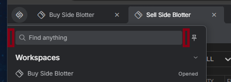
The customizable zones before and after the search bar in the Launchpad header (adding components to these zones will resize the search bar to accommodate the new items):
Each object in the sections array has the following properties:
| Property | Type | Description |
|---|---|---|
Component |
React.ComponentType |
Required. Component of a default or a custom section to be displayed in the Launchpad. |
placementId |
string |
Required. Unique identifier of the section. Used internally by the @interopio/home-ui-react library. |
Settings
The settings object has the following properties:
| Property | Type | Description |
|---|---|---|
header |
object |
Settings for the Launchpad header area. |
mode |
"pinned" | "default" |
Mode for displaying the Launchpad in the browser window. By default, the Launchpad will be closed automatically when the user clicks in it to open a section item or when it loses focus. Pinning the Launchpad will cause it to remain visible in the browser window until the user clicks on the Launchpad button again to close it. When the Launchpad is pinned, the size of the Workspaces App is decreased within the browser window in order to accommodate the pinned Launchpad. Use "pinned" to make the Launchpad pinned by default. Defaults to "default". |
The header object has the following properties:
| Property | Type | Description |
|---|---|---|
showHeader |
boolean |
If true (default), will display the Launchpad header area (the area containing the search bar and the "Pin" button). |
showSearch |
boolean |
If true (default), will display the search bar in the Launchpad header area. |
Default Sections
The <FavoritesSection />, <WorkspacesSection />, and <ApplicationsSection /> components are the default sections of the Launchpad. You can reuse them, rearrange them and modify their behavior by passing them as an array to the sections property of the components object in the Launchpad configuration. Each of these components has the following properties:
| Property | Type | Description |
|---|---|---|
isSectionCollapsible |
boolean |
If true, the section will be collapsible. |
sectionIconSrc |
string |
Custom icon source for the section header icon. This can be any value accepted by the src attribute of the <img> HTML element. Available since io.Connect Browser 4.5. |
sortOrder |
"ascending" | "descending" | "disabled" |
Specifies the order in which items in the section will be sorted (alphabetically for the "Applications" and "Workspaces" section, and by most recently added for the "Favorites" section). If set to "disabled", the items will be displayed in the order they are passed to the section. |
The <ApplicationsSection /> component also has the following additional properties:
| Property | Type | Description |
|---|---|---|
folderIconGetters |
object |
Object with key/value pairs where each key is the name of a folder to customize and the value is a function that receives a Boolean indicating whether the folder is open and returns icon source data for the folder header icon. This allows you to provide different icons for the open and closed states of the folders. It's also possible to customize the icons of nested folders. If you specify a nested folder, the folder names must be separated with a forward slash ("/"). Available since io.Connect Browser 4.3. |
isFolderCollapsible |
boolean |
If true, the folders in the section will be collapsible. Available since io.Connect Browser 4.0. |
The following example demonstrates rearranging the default sections and customizing the icons for app folders in the "Applications" section:
import {
    IOConnectHome,
    FavoritesSection,
    ApplicationsSection,
    WorkspacesSection
} from "@interopio/home-ui-react";
import "@interopio/workspaces-ui-react/dist/styles/workspaces.css";
import "@interopio/home-ui-react/src/index.css";

const getConfig = (userData) => {
    // Define and return the required platform configuration.
};

// Custom icons for app folders.
const folderIconGetters = {
    // Customizing the app folder icons also works for nested folders.
    // Nested folders must be separated with a forward slash ("/").
    "Trading/Sales": (isOpen) => isOpen ? "custom-trading-sales-open-icon" : "custom-trading-sales-closed-icon",
    "Analytics": (isOpen) => isOpen ? "custom-analytics-open-icon" : "custom-analytics-closed-icon"
};

const config = {
    getIOConnectConfig: getConfig,
    launchpad: {
        components: {
            // Customizing the default sections.
            sections: [
                { placementId: "favorites-section", Component: FavoritesSection },
                { placementId: "applications-section", Component: () => <ApplicationsSection folderIconGetters={folderIconGetters} /> },
                { placementId: "workspaces-section", Component: WorkspacesSection }
            ]
        }
    }
};

const App = () => <IOConnectHome config={config} />;

export default App;
Custom Sections
The sections property of the components object in the Launchpad configuration allows you to add your own custom sections to the Launchpad. You can reuse the default <Section /> component or provide an entirely customized one.
The <Section /> component has the following properties:
| Property | Type | Description |
|---|---|---|
config |
object |
Required. Configuration for the section. |
onItemClick |
function |
Function with the following signature: (params: { item: SectionItemType; modifier: string | null; selectedContextMenuActionName?: string }) => void. Callback for handling clicks on items in the section. |
The config object has the following properties:
| Property | Type | Description |
|---|---|---|
id |
string |
Required. ID for the section. |
getIcon |
function |
Function with the following signature: (isOpen: boolean) => { variant: IconVariant } | { src: string }. Function that receives a Boolean argument indicating whether the section is open and returns icon data for the section header icon. |
HeaderButton |
React.ComponentType |
Optional component rendered as an action button in the section header area. Available since io.Connect Browser 4.5. |
isCollapsible |
boolean |
If true (default), the section will be collapsible. |
items |
object[] |
Required. Array of items or sections to be displayed within the current section. |
title |
string |
Required. Title for the section. |
The items array accept a list of objects each describing a section (as described in the config object), or an item with the following properties:
| Property | Type | Description |
|---|---|---|
className |
string |
Class name for the item. Available since io.Connect Browser 4.0. |
contextMenuActions |
object[] |
List of objects describing context menu actions that will be shown in the context menu for the item. You can handle these actions in the callback provided to the onItemClick property of the <Section /> component. |
description |
string |
Description for the item. |
icon |
string |
Name of a default icon used in the io.Connect themes. (IconVariant value as defined in the index.d.ts file of the @interopio/components-react library that's used internally by the @interopio/home-ui-react library.) |
iconSrc |
string |
Icon to display for the item. This can be any value accepted by the src attribute of the <img> HTML element. |
id |
string |
Required. ID for the item. |
isSelected |
boolean |
If true, the item is marked as selected. Available since io.Connect Browser 4.5. |
openInstances |
number |
The number of currently opened item instances (e.g., number started app instances or restored Workspace Layouts). Available since io.Connect Browser 4.0. |
statusPill |
object |
Optional status pill displayed after the item title. The object accepts required variant and text properties. Available since io.Connect Browser 4.5. |
title |
string |
Required. Title for the item. |
tooltip |
string |
Tooltip for the item. Available since io.Connect Browser 4.0. |
type |
string |
Required. Type that can be used in search operations by the Search Bar. |
Each object in the contextMenuActions array has the following properties:
| Property | Type | Description |
|---|---|---|
disabled |
boolean |
If true, the context menu item will be disabled. Defaults to false. |
displayName |
string |
Display name for the context menu item. |
icon |
string |
Name of a default icon used in the io.Connect themes. (IconVariant value as defined in the index.d.ts file of the @interopio/components-react library that's used internally by the @interopio/home-ui-react library.) Available since io.Connect Browser 4.0. |
iconSrc |
string |
Icon to display for the context menu item. This can be any value accepted by the src attribute of the <img> HTML element. Available since io.Connect Browser 4.0. |
name |
string |
Required. Name for the context menu item. |
separatorAfter |
boolean |
If true, there will be a separator after the context menu item. Available since io.Connect Browser 4.0. |
The callback provided to the onItemClick property of the <Section /> component will receive as an argument an object with the following properties:
| Property | Type | Description |
|---|---|---|
item |
object |
Required. Object describing the clicked section item. This is the same object that was passed in the items array of the section configuration. |
modifier |
string | null |
Required. Keyboard key used as a modifier when the action was clicked. |
selectedContextMenuActionName |
string |
Name of the clicked context menu action. |
The following example demonstrates rearranging the default sections and adding a custom section with several items in it. Clicking on an item in the custom section will perform a predefined action:
import {
    IOConnectHome,
    FavoritesSection,
    WorkspacesSection,
    ApplicationsSection,
    Section
} from "@interopio/home-ui-react";
import icon from "./icon.png";
import "@interopio/workspaces-ui-react/dist/styles/workspaces.css";
import "@interopio/home-ui-react/index.css";

const items = [
    {
        id: "custom-item",
        title: "Custom Item",
        type: "custom-type"
    },
    {
        id: "another-custom-item",
        title: "Another Custom Item",
        type: "custom-type"
    }
];

const CustomSection = () => {
    return (
        <Section
            config={{
                id: "my-section-id",
                title: "Custom Section",
                items,
                getIcon: () => ({ src: icon })
            }}
            onItemClick={({ item }) => alert(`Clicked "${item.title}".`)}
        />
    );
};

const sections = [
    { placementId: "favorites-section", Component: FavoritesSection },
    { placementId: "applications-section", Component: ApplicationsSection },
    { placementId: "workspaces-section", Component: WorkspacesSection },
    { placementId: "custom-section", Component: CustomSection }
];

const getConfig = (userData) => {
    // Define and return the required platform configuration.
};

const config = {
    getIOConnectConfig: getConfig,
    launchpad: {
        components: {
            sections
        }
    }
};

export const App = () => <IOConnectHome config={config} />;

export default App;
Loader
Available since io.Connect Browser 3.4
The default loader of the Home App can be customized by using the <SystemLoader /> component exported by the library. You can also replace it with your custom component. The default loader is used for different loading events in the Home App. The logo displayed for all loading events is the same, but the text is specific to each event.
To customize or replace the loader, use the SystemLoader property of the components object inside the config object for the <IOConnectHome /> component.
To replace the loader logo, use the Logo prop of the <SystemLoader /> component. All default texts will still be shown for the different loading events:
import { IOConnectHome, SystemLoader } from "@interopio/home-ui-react";
import "@interopio/workspaces-ui-react/dist/styles/workspaces.css";
import "@interopio/home-ui-react/src/index.css";

const getConfig = (userData) => {
    // Define and return the required platform configuration.
};

const config = {
    getIOConnectConfig: getConfig,
    components: {
        // Provide a custom icon for the default loader of the Home App.
        SystemLoader: () => <SystemLoader Logo={() => <span>My Logo</span>} />
    }
};

const App = () => <IOConnectHome config={config} />;

export default App;
When replacing the default loader component with your custom one, you can reuse the default text, remove it, or provide your own text to be displayed for all loading events:
import { IOConnectHome } from "@interopio/home-ui-react";
import MyLogo from "./MyLogo";
import "@interopio/workspaces-ui-react/dist/styles/workspaces.css";
import "@interopio/home-ui-react/src/index.css";

// Custom loader that will be used by the Home App for all loading events.
// Your custom component loader will receive two props - `Logo` and `text`.
// The `text` prop enables you to reuse the default texts for the different loading events.
const MyCustomLoader = ({ Logo, text }) => {
    return (
        <div>
            <MyLogo />
            <h2>{text}</h2>
        </div>
    );
};

const getConfig = (userData) => {
    // Define and return the required platform configuration.
};

const config = {
    getIOConnectConfig: getConfig,
    components: {
        // Replacing the default loader of the Home App.
        SystemLoader: MyCustomLoader
    }
};

const App = () => <IOConnectHome config={config} />;

export default App;
Error Screen
Available since io.Connect Browser 4.0
The default error screen displayed in case of failure to initialize the Home App can be customized by using the IOInitErrorScreen property of the components object inside the config object for the <IOConnectHome /> component.
To customize the default component, provide your own custom implementation of the error screen. Your custom component will receive as prop the error message that prevents the initialization of the Home App:
import { IOConnectHome } from "@interopio/home-ui-react";
import "@interopio/workspaces-ui-react/dist/styles/workspaces.css";
import "@interopio/home-ui-react/src/index.css";

// Creating a custom component for the error screen.
const MyCustomErrorScreen = ({ errorMessage }) => {
    return (
        <div>
            <h1>My Custom Error Screen</h1>
            <h2>{errorMessage}</h2>
        </div>
    );
};

const getConfig = (userData) => {
    // Define and return the required platform configuration.
};

const config = {
    getIOConnectConfig: getConfig,
    components: {
        IOInitErrorScreen: MyCustomErrorScreen
    }
};

const App = () => <IOConnectHome config={config} />;

export default App;
Platform Settings
Available since io.Connect Browser 4.0
The settings object inside the config object for the <IOConnectHome /> component enables you to provide general platform settings for the Home App.
The settings object has the following properties:
| Property | Type | Description |
|---|---|---|
isBeforeunloadDialogEnabled |
boolean |
If true (default), will display a confirmation dialog to the user when they try to close or refresh the window containing the Main app instance of the Home App. |
The following example demonstrates how to disable the confirmation dialog for closing or refreshing the browser window containing the Main app instance of the Home App:
import { IOConnectHome } from "@interopio/home-ui-react";
import "@interopio/workspaces-ui-react/dist/styles/workspaces.css";
import "@interopio/home-ui-react/src/index.css";

const getConfig = (userData) => {
    // Define and return the required platform configuration.
};

const config = {
    getIOConnectConfig: getConfig,
    settings: {
        isBeforeunloadDialogEnabled: false
    }
};

const App = () => <IOConnectHome config={config} />;

export default App;
Styles
To use the default styles for your custom Home App, import the following CSS files:
import "@interopio/workspaces-ui-react/dist/styles/workspaces.css";
import "@interopio/home-ui-react/index.css";
To use custom styles for the Home App, simply import your CSS file after the default CSS imports to override them.
Two default themes are available - dark and light. The trigger for switching between them is the class property of the <html> element - "dark" for the dark theme and "light" for the light theme:
<!-- Dark theme -->
<html class="dark">

<!-- Light theme -->
<html class="light">
Available since io.Connect Browser 4.0
To customize the Home App styles (including the styles for the Launchpad, the Workspaces App, and more), use the CSS variables provided by the io.Connect themes.
Components
The following table lists the exported components for building a Home App:
| Component | Description |
|---|---|
<IOConnectHome /> |
The main component for building a Home App. |
<PlatformPrefsProvider /> |
Context provider for reading and updating platform preferences shared across Home App components. |
<SystemLoader /> |
Component for the default loader of the Home App. Available since io.Connect Browser 3.4. |
The following table lists the exported components comprising the Launchpad:
| Component | Description |
|---|---|
<ApplicationsSection /> |
Component containing a section in the Launchpad with the available io.Connect apps. |
<FavoritesSection /> |
Component containing a section in the Launchpad with favorite items. |
<Launchpad /> |
The main component containing the Launchpad. |
<LaunchpadAccess /> |
Component containing an icon for the Launchpad in the header area of the Home App when the Home App is also a Workspaces App. |
<LaunchpadBody /> |
Component containing the body of the Launchpad (the list of Launchpad sections and the search results section). Available since io.Connect Browser 4.1. |
<LaunchpadContentsContainer /> |
Component containing the <LaunchpadHeader /> and <LaunchpadBody /> components. Accepts the same properties as the <Launchpad /> component and can be used instead of it. Available since io.Connect Browser 4.1. |
<LaunchpadHeader /> |
Component containing the header area of the Launchpad (search bar and pin icon). Available since io.Connect Browser 4.1. |
<LaunchpadPinButton /> |
Component containing a pin button for the Launchpad. |
<Section /> |
Component that can be used for creating custom sections in the Launchpad. |
<WorkspacesSection /> |
Component containing a section in the Launchpad with Workspace Layouts. |
⚠️ Note that if you want to use the
<LaunchpadHeader />and<LaunchpadBody />components, they must be wrapped in the<LaunchpadContentsContainer />component in order to function properly. This is due to the fact that the<LaunchpadContentsContainer />component contains all required providers for passing information down to the<LaunchpadHeader />and<LaunchpadBody />components.
The following table lists the exported components comprising the Notification Panel:
| Component | Description |
|---|---|
<NotificationsPanel /> |
Component containing the Notification Panel displayed when the user clicks on the notifications icon in the Home App header area. |
<NotificationsPanelButton /> |
Component containing the notification icon displayed in the Home App header area. |
<NotificationsPanelWithToggleButton /> |
Component that wraps the <NotificationsPanelButton /> and <NotificationsPanel /> components in the Home App header area. |
<PanelWithToggleButton /> |
Component that can be used for creating custom panels opened by custom buttons in the Home App header area. |
The following table lists the exported components comprising the system dropdown menu in the Home App header area:
| Component | Description |
|---|---|
<NotificationSettingsPanel /> |
Component containing the Notification Settings panel inside the system dropdown menu in the Home App header area. |
<PreferencesPanel /> |
Component containing the Platform Preferences panel inside the system dropdown menu in the Home App header area. |
<ProfilePanel /> |
Component containing the Profile panel inside the system dropdown menu in the Home App header area. |
<SystemMenu /> |
Component containing the system dropdown menu in the Home App header area. |
Hooks
The following table lists the exported hooks:
| Hook | Description |
|---|---|
useFavorites() |
Use this hook to retrieve, remove, and toggle favorite items. |
useIsLaunchpadCollapsed() |
Use this hook to retrieve and update the collapsed/expanded state of the Launchpad. |
usePlatformPref() |
Use this hook to retrieve and update a specific platform preference by key. |
usePlatformPrefs() |
Use this hook to retrieve and update platform preferences in bulk. |
Running in io.Connect Desktop
Available since io.Connect Browser 4.0
The Home App can run in io.Connect Desktop provided that auto injection of the @interopio/desktop library is disabled.
If the Home App is configured to run in io.Connect Desktop, the setup flow for requesting browser permissions will be skipped.
To run the Home App in io.Connect Desktop, you must create an app definition for it. The following example demonstrates how to create a basic app definition for the Home App and disable auto injection of the @interopio/desktop library:
{
    "name":"my-home-app",
    "title":"My Home App",
    "icon": "https://my-home-app.com/home-icon.png",
    "type": "window",
    "details":{
        "url":"https://my-home-app.com",
        "autoInjectAPI":{
            "enabled": false
        }
    }
}
The Home App will automatically detect that it's running in io.Connect Desktop and won't initialize any of its Main app logic - it will default to being a normal io.Connect Desktop client app.
When the Home App instance detects that it's not a Main app, it will hide its Launchpad button by default. If you are using a custom component for the Launchpad, it's highly recommended to hide it when your Home App is running in io.Connect Desktop as both the Home App and io.Connect Desktop are designed to use a single instance of the Launchpad. Having more than one active Launchpad instances may cause unpredictable behavior, especially in regard to managing Layouts.
To check whether the Home App instance is a Main app, use the platformStarted Boolean property of the iobrowser object injected in the global window object of the Main app and in all Browser Clients. If the platformStarted property is set to false, the Home App instance is running as a regular Browser Client. If the iobrowser object is missing, the Home App instance isn't running in io.Connect Browser at all:
const isPlatform = window.iobrowser?.platformStarted;