
Changelog
io.Connect Browser 4.1
Release date: 16.09.2025
Versions of all main and additional libraries of io.Connect Browser for the current release:
| Library | Version |
|---|---|
@interopio/browser |
4.1 |
@interopio/browser-platform |
4.1 |
@interopio/browser-worker |
4.1 |
@interopio/cli |
4.1 |
@interopio/fdc3 |
2.7 |
@interopio/home-ui-react |
2.1 |
@interopio/intent-resolver-ui |
1.1 |
@interopio/modals-api |
1.1 |
@interopio/modals-ui |
1.1 |
@interopio/ng |
6.0 |
@interopio/react-hooks |
4.1 |
@interopio/search-api |
3.1 |
@interopio/theme |
3.1 |
@interopio/widget |
3.1 |
@interopio/workspaces-api |
4.1 |
@interopio/workspaces-ui-react |
4.1 |
@interopio/workspaces-ui-web-components |
2.1 |
Breaking Changes
⚠️ Note that each breaking change is listed under all libraries it affects.
@interopio/widget
- The compact mode for the io.Connect widget has been deprecated.
- The
modeproperty of theWidgetConfigobject has been deprecated and theWidgetModeinterface has been removed from the library types.- The
"top","bottom","left", and"right"members of theWidgetPositionenumeration have been deprecated and replaced with"top-left","top-center","top-right","center-left","center-right","bottom-left","bottom-center", and"bottom-right".- The default value for the
positionproperty of theWidgetConfigobject has been changed to"bottom-center"instead of"bottom".
New Features
⚠️ Note that each new feature is listed under all libraries it affects.
@interopio/browser
The following features are now available in the
@interopio/browserlibrary:Refreshing Windows
To refresh a window, use the
refresh()method of aWebWindowinstance:await myWindow.refresh();Zooming
You can now use the
zoomIn(),zoomOut(),setZoomFactor(), andonZoomFactorChanged()methods of aWebWindowinstance to control window zooming programmatically:// Retrieves the current zoom factor. const zoomFactor = myWindow.zoomFactor; // Increase the zoom factor by one step. await myWindow.zoomIn(); // Decrease the zoom factor by one step. await myWindow.zoomOut(); // Set a specific zoom factor. await myWindow.setZoomFactor(150); // Get notified when the zoom factor changes. myWindow.onZoomFactorChanged(console.log);
@interopio/browser-platform
The following features are now available in the
@interopio/browser-platformlibrary:Request Headers for Publishing OpenTelemetry Signals
To specify headers to be added to all HTTP requests sent by io.Connect Browser when publishing OpenTelemetry signals, use the
headersproperty of theotelobject in the configuration object for initializing the@interopio/browser-platformlibrary. To specify headers to be added to the HTTP requests sent by io.Connect Browser when publishing metrics, use theheadersproperty of themetricsobject under theoteltop-level key:import IOBrowserPlatform from "@interopio/browser-platform"; const config = { licenseKey: "my-license-key", otel: { // Headers that will be sent with every request for publishing OpenTelemetry signals. headers: { "Custom-Header": "custom-header-value" }, metrics: { url: "https://my-metrics-collector.com/metrics", // Headers that will be sent with every request for publishing metrics. headers: { "Custom-Metrics-Header": "custom-header-value" } } } }; const { io } = await IOBrowserPlatform(config);Additional OpenTelemetry Attributes
To specify additional resource attributes to be added to all published OpenTelemetry signals, use the
additionalResourceAttributesproperty of theotelobject in the configuration object for initializing the@interopio/browser-platformlibrary. To specify additional entity-level attributes to be added to all published OpenTelemetry signals, use thegetAdditionalAttributesproperty of theotelobject and provide a function that returns an object with key/value pairs describing the attribute names and values. TheadditionalResourceAttributesandgetAdditionalAttributesproperties are also available under themetricsproperty of theotelobject:import IOBrowserPlatform from "@interopio/browser-platform"; const config = { licenseKey: "my-license-key", otel: { // Resource attributes to be added to all published OpenTelemetry signals. additionalResourceAttributes: { "resourceAttribute": "custom-value" }, // Entity-level attributes to be added to all published OpenTelemetry signals. getAdditionalAttributes: () => { return { "attribute": "custom-value" } }, metrics: { url: "https://my-metrics-collector.com/metrics", // Resource attributes to be added to all published metrics. additionalResourceAttributes: { "resourceAttribute": "custom-value" }, // Entity-level attributes to be added to all published metrics. getAdditionalAttributes: () => { return { "attribute": "custom-value" } } } } }; const { io } = await IOBrowserPlatform(config);Caching of App Definitions, Layouts & App Preferences
It's now possible to instruct io.Connect Browser to cache app definitions, Layouts, and app preferences fetched from remote stores. The data will be cached by using the
IndexedDBAPI of the browser and will be cached per user if you provide any user details. You can also specify whether the platform should wait for an initial response from the remote store before continuing its initialization.The following example demonstrates how to enable caching of Layouts:
import IOBrowserPlatform from "@interopio/browser-platform";

const config = {
    licenseKey: "my-license-key",
    layouts: {
        mode: "rest",
        rest: {
            url: "https://my-remote-store/layouts",
            cache: {
                // Enabling caching of Layouts. Caching data from remote stores is disabled by default.
                enabled: true
            },
            // It's required to set this when caching is enabled in order to instruct the platform
            // at what interval to poll the remote store for updates.
            // If not set, the platform will fetch the Layout definitions only once on startup.
            pollingInterval: 30000,
            // If `true` (default) the platform will wait for an initial response
            // from the remote store before continuing with its initialization.
            waitInitialResponse: true
        }
    },
    // Providing user details so that the platform can cache the data per user.
    user: {
        id: "user-id"
    }
};

const { io } = await IOBrowserPlatform(config);
Refreshing Windows
Zooming
- You can now use the
zoomIn(),zoomOut(),setZoomFactor(), andonZoomFactorChanged()methods of aWebWindowinstance to control window zooming programmatically.
@interopio/home-ui-react
The
<Launchpad />component now contains the<LaunchpadContentsContainer />,<LaunchpadHeader />, and<LaunchpadBody />child components and has the following structure:<Launchpad> <LaunchpadContentsContainer> <LaunchpadHeader /> <LaunchpadBody /> </LaunchpadContentsContainer> </Launchpad>The
<LaunchpadContentsContainer />component accepts the same properties as the<Launchpad />component and can be used independently of the<Launchpad />component. Using the<LaunchpadContentsContainer />component instead of the<Launchpad />component may be useful if your custom Launchpad implementation requires you to have separate components for the Launchpad header and body.⚠️ Note that if you want to use the
<LaunchpadHeader />and<LaunchpadBody />components, they must be wrapped in the<LaunchpadContentsContainer />component in order to function properly. This is due to the fact that the<LaunchpadContentsContainer />component contains all required providers for passing information down to the<LaunchpadHeader />and<LaunchpadBody />components.
Component Description <LaunchpadContentsContainer />Component containing the <LaunchpadHeader />and<LaunchpadBody />components. Accepts the same properties as the<Launchpad />component and can be used instead of it.<LaunchpadHeader />Component containing the header area of the Launchpad (search bar and pin icon). <LaunchpadBody />Component containing the body of the Launchpad (the list of Launchpad sections and the search results section).
@interopio/ng
- Version 5.0 and later of the
@interopio/nglibrary has been verified to offer full support for all Angular versions up to 20, both with standalone components and modules.- Version 6.0 and later of the
@interopio/nglibrary has been verified to offer full support for Angular versions 19 and 20, both with standalone components and modules. Angular versions up to 18 haven't been verified to work with@interopio/ngversion 6.0 and won't be supported as Angular support for these versions has either ended or will end soon.Version 6.0 and later of the
@interopio/nglibrary is specifically designed to support both standalone components and modules. It also provides theprovideIoConnect()function for configuring and initializing the@interopio/nglibrary in Angular apps that use standalone components. TheprovideIoConnect()function accepts anIOConnectNgSettingsobject as an optional argument.⚠️ Note that the
provideIoConnect()function is available only in version 6.0 and later of the@interopio/nglibrary.The following examples demonstrate using the
provideIoConnect()function for configuring and initializing the@interopio/nglibrary in an Angular Main app that uses standalone components.In
app.config.tsof the Main app:import { ApplicationConfig } from "@angular/core"; import { provideIoConnect } from "@interopio/ng"; import IOBrowserPlatform, { IOConnectBrowserPlatform } from "@interopio/browser-platform"; // Browser platform configuration. const config: IOConnectBrowserPlatform.Config = { licenseKey: "my-license-key" }; export const appConfig: ApplicationConfig = { providers: [ // Configuring and initializing the Main app. provideIoConnect({ browserPlatform: { factory: IOBrowserPlatform, config } }) ] };In
main.tsof the Main app:import { bootstrapApplication } from "@angular/platform-browser"; import { appConfig } from "./app/app.config"; import { App } from "./app/app"; bootstrapApplication(App, appConfig);The following examples demonstrate using the
provideIoConnect()function for configuring and initializing the@interopio/nglibrary in an Angular Browser Client app that uses standalone components.In
app.config.tsof the Browser Client app:import { ApplicationConfig } from "@angular/core"; import { provideIoConnect } from "@interopio/ng"; import IOBrowser, { IOConnectBrowser } from "@interopio/browser"; const config: IOConnectBrowser.Config = { // Optional Browser Client configuration. }; export const appConfig: ApplicationConfig = { providers: [ // Configuring and initializing the Browser Client. provideIoConnect({ browser: { factory: IOBrowser, config } }) ] };In
main.tsof the Browser Client app:import { bootstrapApplication } from "@angular/platform-browser"; import { appConfig } from "./app/app.config"; import { App } from "./app/app"; bootstrapApplication(App, appConfig);
@interopio/theme
Added CSS variables for customizing the styles of the following io.Connect Browser apps and UI components:
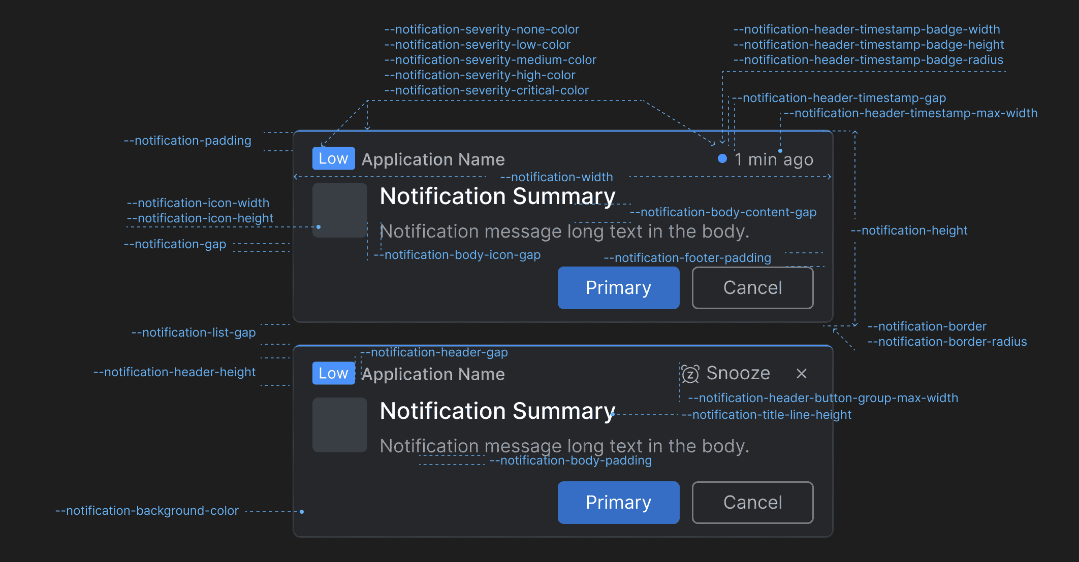
Notifications
Use the following CSS variables for customizing the styles of the io.Connect Browser notifications:
Variable Description --notification-background-colorBackground color for the notifications. --notification-body-content-gapGap between the title and the text in the notification body content. --notification-body-icon-gapGap between the notification icon and the notification body content. --notification-body-paddingPadding for the notification body. --notification-borderBorder for the notifications. --notification-border-radiusBorder radius for the notifications. --notification-footer-paddingPadding for the notification footer. --notification-gapGap between the header, the body, and the footer of the notifications. --notification-header-button-group-max-widthMaximum width for the action buttons ("Snooze", "Close") in the notification header. --notification-header-gapGap between elements in the notification header. --notification-header-heightHeight for the notification header. --notification-header-timestamp-badge-heightHeight for the timestamp badge in the notification header. --notification-header-timestamp-badge-radiusBorder radius for the timestamp badge in the notification header. --notification-header-timestamp-badge-widthWidth for the timestamp badge in the notification header. --notification-header-timestamp-gapGap between the timestamp badge and the timestamp in the notification header. --notification-header-timestamp-max-widthMaximum width for the timestamp in the notification header. --notification-heightHeight for the notifications. --notification-icon-heightHeight for the icon displayed in the notification. --notification-icon-widthWidth for the icon displayed in the notification. --notification-paddingPadding for the notifications. --notification-severity-critical-colorColor for notifications with severity "Critical". --notification-severity-high-colorColor for notifications with severity "High". --notification-severity-low-colorColor for notifications with severity "Low". --notification-severity-medium-colorColor for notifications with severity "Medium". --notification-severity-none-colorColor for notifications with severity "None". --notification-title-line-heightLine height for the title in the notification. --notification-widthWidth for the notifications. Notification Panel
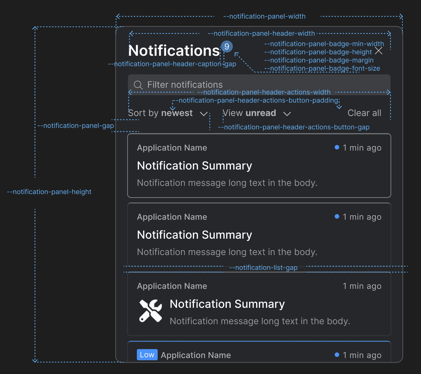
Use the following CSS variables for customizing the styles of the Notification Panel:
Variable Description --notification-list-gapGap between notifications in the notification list of the Notification Panel and the toasts wrapper. --notification-panel-badge-font-sizeFont size for the Notification Panel badge. --notification-panel-badge-heightHeight for the Notification Panel badge. --notification-panel-badge-marginMargin for the Notification Panel badge. --notification-panel-badge-min-widthMinimum width for the Notification Panel badge. --notification-panel-gapGap between the header and the body of the Notification Panel. --notification-panel-header-actions-button-gapGap between the "Sort by" and "View" dropdowns in the Notification Panel header. --notification-panel-header-actions-button-paddingPadding for the action buttons in the Notification Panel header. --notification-panel-header-actions-widthWidth for the element that contains action buttons in the Notification Panel header. --notification-panel-header-caption-gapGap between the caption, the badge, and the system buttons in the Notification Panel header. --notification-panel-header-search-gapGap between the search bar and the search results. --notification-panel-header-search-widthWidth for the search bar in the Notification Panel header. --notification-panel-header-widthWidth for the Notification Panel header. --notification-panel-heightHeight for the Notification Panel. --notification-panel-widthWidth for the Notification Panel. Notification Settings
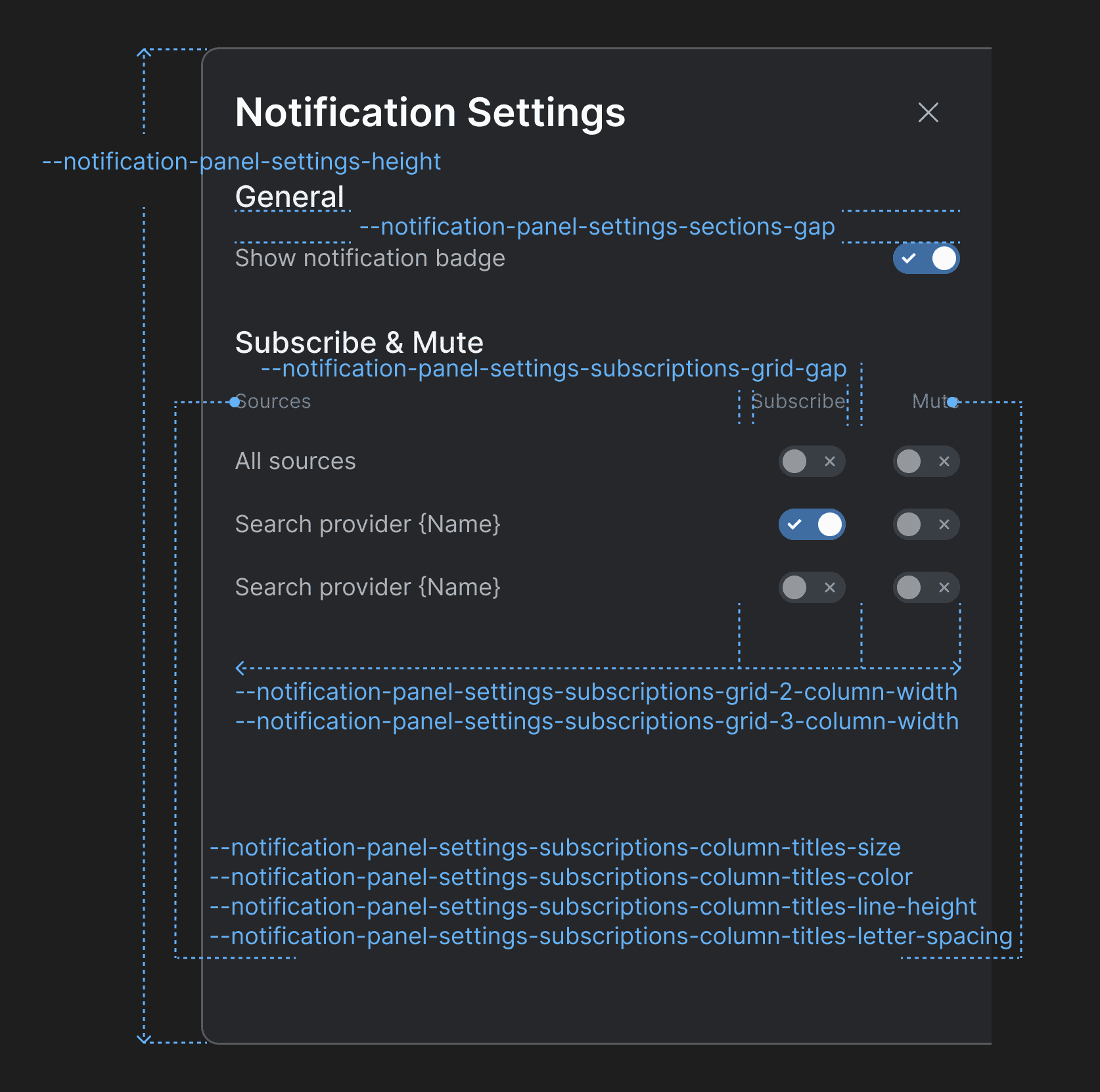
Use the following CSS variables for customizing the styles of the Notification Settings panel:
Variable Description --notification-panel-settings-heightHeight for the Notification Settings panel. --notification-panel-settings-sections-gapGap between the sections in the Notification Settings panel. --notification-panel-settings-subscriptions-column-titles-colorColor for the column titles of the "Subscribe & Mute" section. --notification-panel-settings-subscriptions-column-titles-letter-spacingLetter spacing for the column titles of the "Subscribe & Mute" section. --notification-panel-settings-subscriptions-column-titles-line-heightLine height for the column titles of the "Subscribe & Mute" section. --notification-panel-settings-subscriptions-column-titles-sizeFont size for the column titles of the "Subscribe & Mute" section. --notification-panel-settings-subscriptions-grid-2-column-widthColumn width for a grid layout with two columns in the "Subscribe & Mute" section. --notification-panel-settings-subscriptions-grid-3-column-widthColumn width for a grid layout with three columns in the "Subscribe & Mute" section. --notification-panel-settings-subscriptions-grid-gapGap between the columns of the grid layout in the "Subscribe & Mute" section. Channel Selector
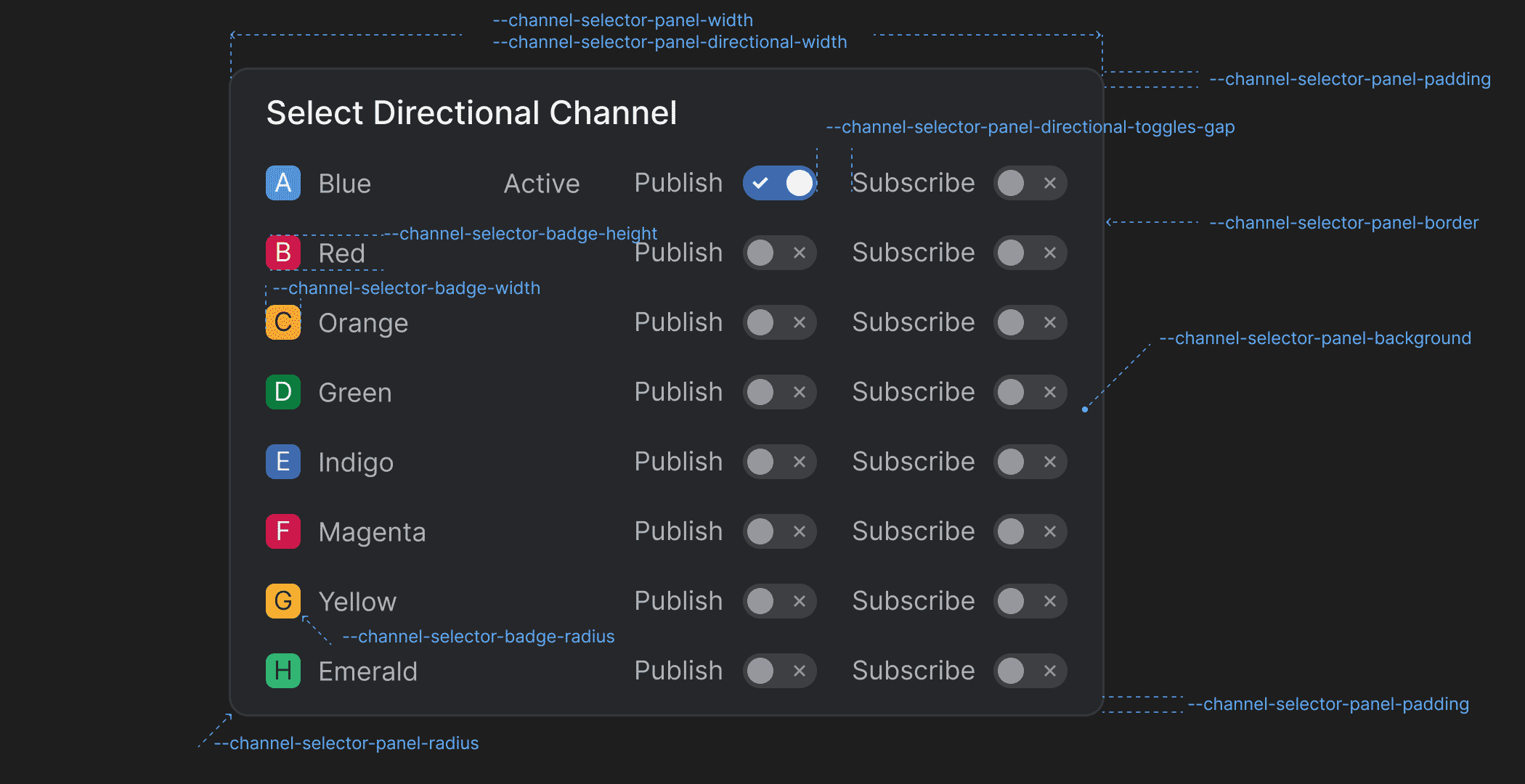
Use the following CSS variables for customizing the styles of the Channel Selector:
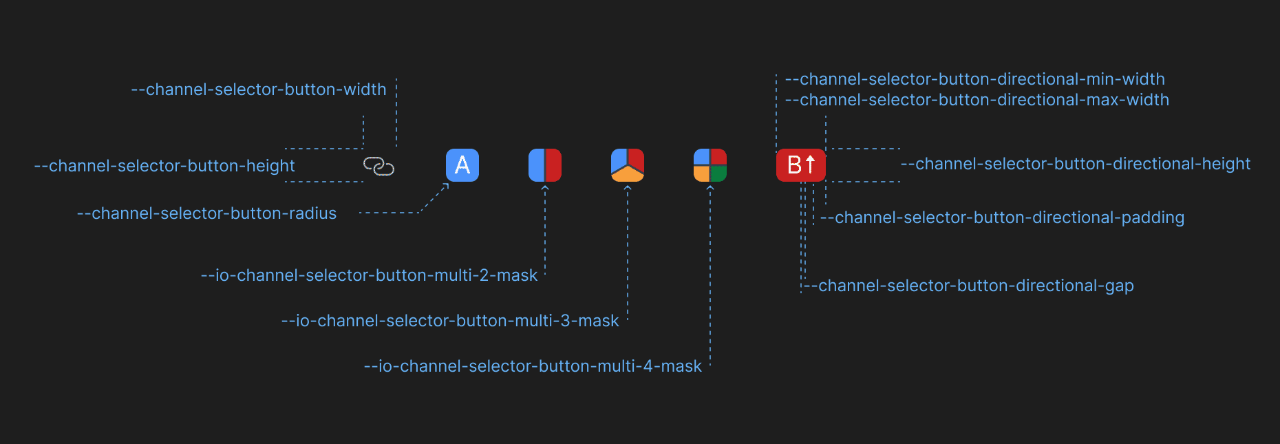
Variable Description --channel-selector-badge-heightHeight for the Channel Selector badge displayed in the Channel Selector panel. --channel-selector-badge-radiusBorder radius for the Channel Selector badge displayed in the Channel Selector panel. --channel-selector-badge-widthWidth for the Channel Selector badge displayed in the Channel Selector panel. --channel-selector-button-directional-gapGap between Channel letter and the Channel direction icon in the Channel Selector button when using directional Channels. --channel-selector-button-directional-heightHeight for the Channel Selector button when using directional Channels. --channel-selector-button-directional-max-widthMaximum width for the Channel Selector button when using directional Channels. --channel-selector-button-directional-min-widthMinimum width for the Channel Selector button when using directional Channels. --channel-selector-button-directional-paddingPadding for the Channel Selector button when using directional Channels. --channel-selector-button-heightHeight for the Channel Selector button. --channel-selector-button-radiusBorder radius for the Channel Selector button. --channel-selector-button-widthWidth for the Channel Selector button. --channel-selector-panel-backgroundBackground color for the Channel Selector panel. --channel-selector-panel-borderBorder for the Channel Selector panel. --channel-selector-panel-directional-toggles-gapGap between the direction labels and the respective toggles in the Channel Selector panel when using directional Channels. --channel-selector-panel-directional-widthWidth for the Channel Selector panel when using directional Channels. --channel-selector-panel-paddingPadding for the Channel Selector panel. --channel-selector-panel-radiusBorder radius for the Channel Selector panel. --channel-selector-panel-title-background-hoverBackground color for the title of the Channel Selector panel when hovered. --channel-selector-panel-widthWidth for the Channel Selector panel. --io-channel-selector-button-multi-2-maskMask for the Channel Selector button if two Channels are selected when using multiple Channels. --io-channel-selector-button-multi-3-maskMask for the Channel Selector button if three Channels are selected when using multiple Channels. --io-channel-selector-button-multi-4-maskMask for the Channel Selector button if four Channels are selected when using multiple Channels. Intent Resolver
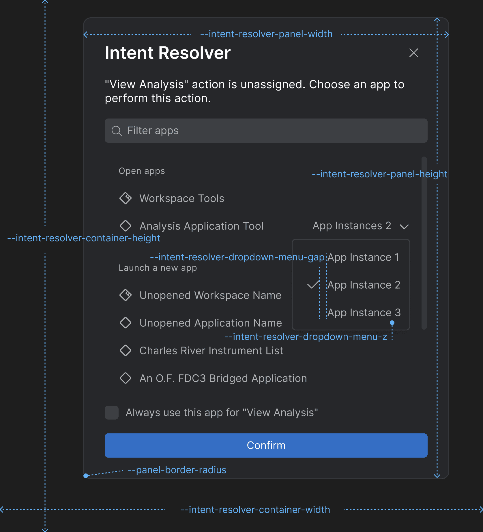
Use the following CSS variables for customizing the styles of the Intent Resolver:
Variable Description --intent-resolver-dropdown-menu-gapGap between the items in the dropdown menu of the Intent Resolver panel for selecting an app instance. --intent-resolver-dropdown-menu-zZ-order for the dropdown menu of the Intent Resolver for selecting an app instance. --intent-resolver-panel-border-radiusBorder radius for the Intent Resolver panel. --intent-resolver-panel-heightHeight for the Intent Resolver panel. --intent-resolver-panel-paddingPadding for the Intent Resolver panel. --intent-resolver-panel-widthWidth for the Intent Resolver panel. Platform Preferences Panel
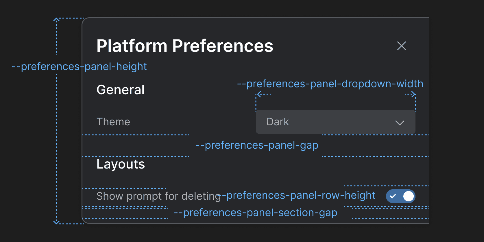
Use the following CSS variables for customizing the styles of the Platform Preferences panel:
Variable Description --preferences-panel-dropdown-widthWidth for the dropdowns menus in the Platform Preferences panel. --preferences-panel-gapGap between the header and the body of the Platform Preferences panel. --preferences-panel-heightHeight for the Platform Preferences panel. --preferences-panel-row-heightHeight for each row in the sections of the Platform Preferences panel. --preferences-panel-section-gapGap between the items in each section of the Platform Preferences panel. Profile Panel
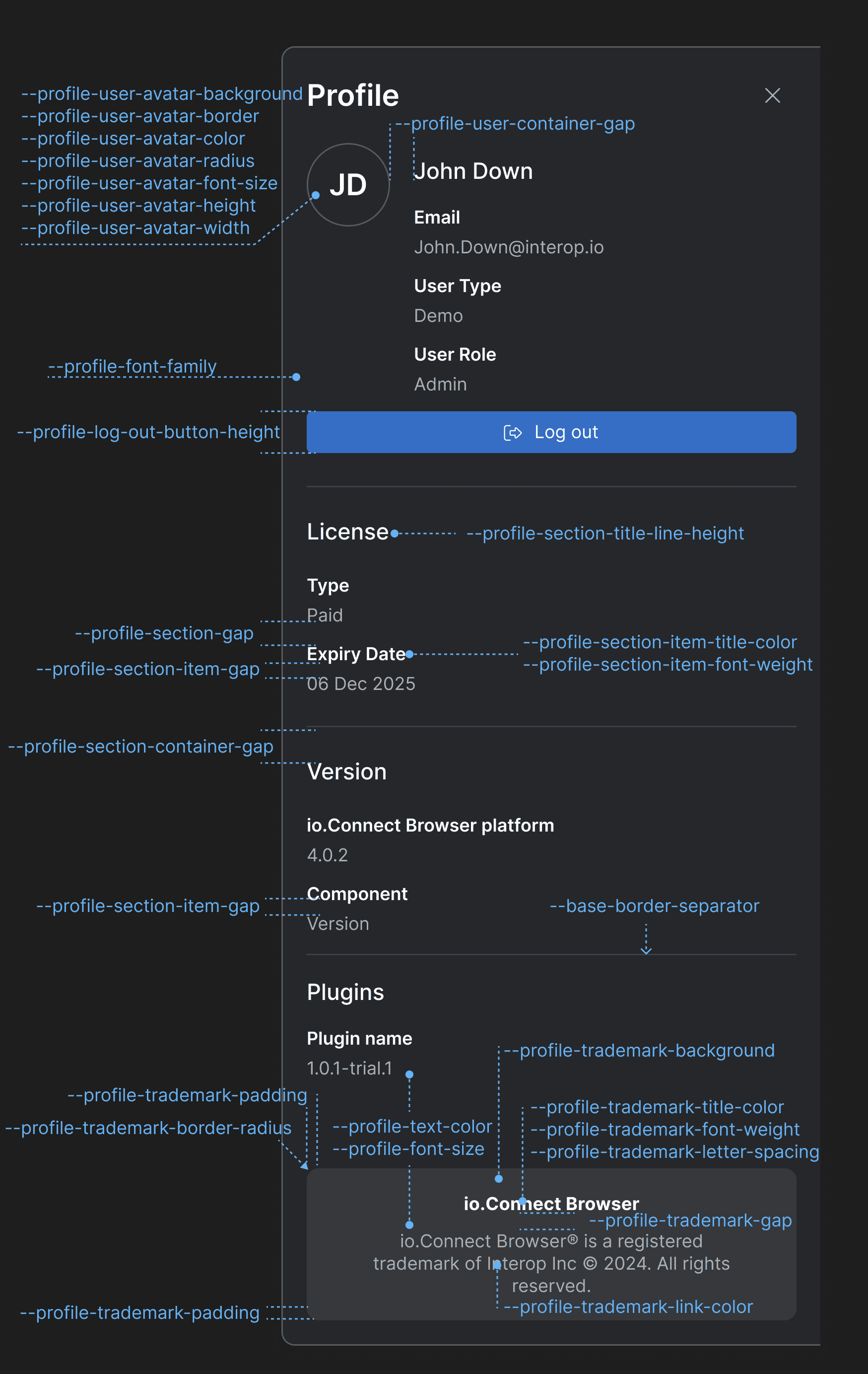
Use the following CSS variables for customizing the styles of the Profile panel:
Variable Description --profile-font-familyFont family for the Profile panel. --profile-font-sizeFont size for the Profile panel. --profile-log-out-button-heightHeight of the "Log out" button. --profile-section-container-gapGap between sections in the Profile panel. --profile-section-gapGap between the items in each section of the Profile panel. --profile-section-item-gapGap between the title and the value of a section item. --profile-section-item-title-colorColor for the title of a section item. --profile-section-item-title-font-weightFont weight for the title of a section item. --profile-section-title-line-heightLine height for the titles of the Profile panel sections. --profile-text-colorText color for the Profile panel. --profile-trademark-backgroundBackground color for the trademark section. --profile-trademark-border-radiusBorder radius for the trademark section. --profile-trademark-gapGap between the title and the text of the trademark section. --profile-trademark-letter-spacingLetter spacing for title and the text of the trademark section. --profile-trademark-link-colorColor for the link in the trademark section. --profile-trademark-paddingPadding for the trademark section. --profile-trademark-title-colorColor for the title of the trademark section. --profile-trademark-title-font-weightFont weight for the title of the trademark section. --profile-user-avatar-backgroundBackground color for the user avatar. --profile-user-avatar-borderBorder for the user avatar. --profile-user-avatar-colorColor for the user avatar initials. --profile-user-avatar-font-sizeFont size for the user avatar initials. --profile-user-avatar-heightHeight for the user avatar. --profile-user-avatar-radiusBorder radius for the user avatar. --profile-user-avatar-widthWidth for the user avatar. --profile-user-container-gapGap between the user avatar and the user info section.
@interopio/widget
- Placeholders indicating the available docking positions for the io.Connect widget will now appear within the window when the user moves the widget manually.
- Additional docking positions are now available for the widget -
"top-left","top-center","top-right","center-left","center-right","bottom-left","bottom-center", and"bottom-right".- io.Connect Browser will now remember the last docked position for the widget (per app) and will load the widget in the same position during the next user session. This setting is configurable and can be changed by using the newly added
restoreLastKnownPositionproperty of theWidgetConfigobject passed in the configuration object for initializing the@interopio/browserlibrary in Browser Client apps:import IOBrowser from "@interopio/browser"; const options = { widget: { enable: true, restoreLastKnownPosition: false } }; const io = await IOBrowser(options);
- You can now use
TABandSHIFT + TABto move through the buttons of the widget. UseENTERorSPACEto open or close the widget context menu. Click outside the widget context menu or useESCto close it.- The widget now supports directional multiple Channels:
Improvements & Bug Fixes
⚠️ Note that each improvement or bug fix is listed under all libraries it affects.
@interopio/browser
- Improved lifecycle management of Browser Client apps.
- Improved preserving Channels on Layout save and restore.
- Fixed an issue related to the platform closing when a Global Layout is restored.
@interopio/browser-platform
- Improved lifecycle management of Browser Client apps.
- Improved preserving Channels on Layout save and restore.
- Fixed an issue related to the platform closing when a Global Layout is restored.
@interopio/home-ui-react
- Improved handling of hidden apps in Launchpad.
@interopio/intent-resolver-ui-react
- Fixed an issue related to disappearing texts in the Intent Resolver.
@interopio/ng
- Migrated to TypeScript 5.8.2 as required by Angular 20.
- Updated Node.js to 20.19 as required by Angular 20.
@interopio/widget
- Browser Clients with selected Channels will join the respective Channels and set correctly any Channel restrictions when they are brought back into a Workspace after having been ejected from it.
@interopio/workspaces-ui-react
- Removed
react/jsx-runtimefrom the package.- Optimized the operation for closing Workspaces by avoiding unnecessary snapshots of Workspaces.