
Platform Styles
Overview
Available since io.Connect Desktop 9.9
io.Connect Desktop and all its default system web apps (Workspaces App, web groups, Launchpad, and more) use the io.Connect styles provided by the @interopio/theme package.
The following sections describe the CSS variables which you can use to override the default io.Connect theme styles.
Workspaces
CSS variables for overriding the Workspaces App styles.
General
| Variable | Description |
|---|---|
--workspace-general-background |
Background for the Workspaces App. |
--workspace-general-border |
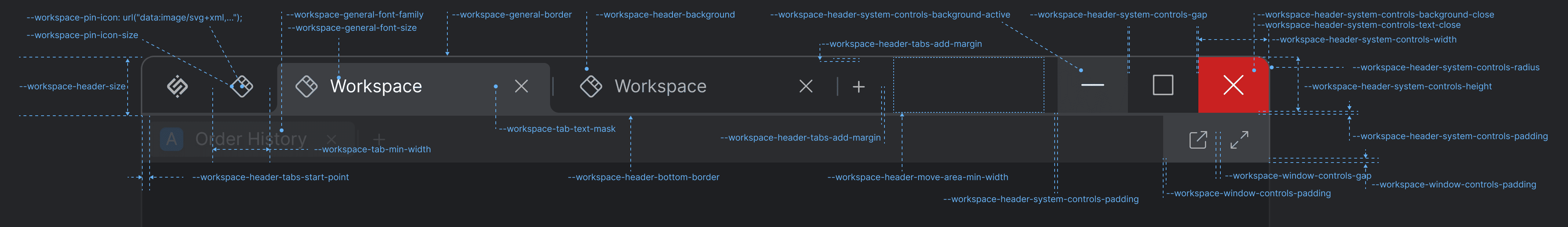
Border for the Workspaces App. |
--workspace-general-font-family |
Font family for the Workspaces App. |
--workspace-general-font-size |
Font size for the Workspaces App. |
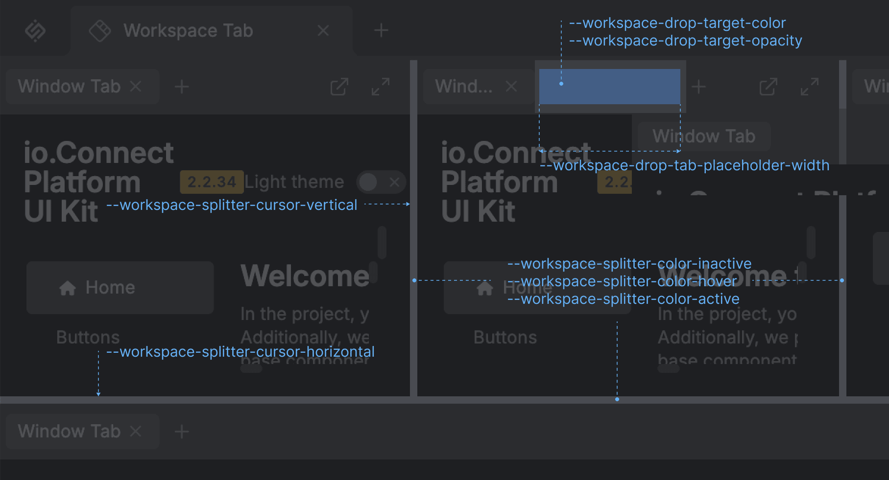
Splitters & Drop Target
| Variable | Description |
|---|---|
--workspace-drop-tab-placeholder |
Width of the tab placeholder for the Workspace drop target. |
--workspace-drop-target-color |
Color for the Workspace drop target. |
--workspace-drop-target-opacity |
Opacity for the Workspace drop target. |
--workspace-splitter-color-active |
Color for the Workspace splitters when active. |
--workspace-splitter-color-hover |
Color for the Workspace splitters when hovered. |
--workspace-splitter-color-inactive |
Color for the Workspace splitters when inactive. |
--workspace-splitter-cursor-horizontal |
Cursor style for horizontal Workspace splitters. |
--workspace-splitter-cursor-vertical |
Cursor style for vertical Workspace splitters. |
Header & System Buttons
| Variable | Description |
|---|---|
--workspace-header-background-color |
Background color for the Workspace header. |
--workspace-header-bottom-border |
Bottom border for the Workspace header. |
--workspace-header-gap |
Gap between the Workspace header elements (logo, tabs, controls). |
--workspace-header-height |
Height for the Workspace header. |
--workspace-header-move-area-min-width |
Minimum width for the Workspace move area. |
--workspace-header-system-controls-background-active |
Background for the Workspace header system buttons when active. |
--workspace-header-system-controls-background-close |
Background for the "Close" system button. |
--workspace-header-system-controls-gap |
Gap between the Workspace header system buttons. |
--workspace-header-system-controls-height |
Height for the Workspace header system buttons. |
--workspace-header-system-controls-padding |
Padding for the Workspace header system buttons. |
--workspace-header-system-controls-text-close |
Text color for the "Close" system button. |
--workspace-header-system-controls-radius |
Border radius for the Workspace header system buttons. |
--workspace-header-system-controls-width |
Width for the Workspace header system buttons. |
--workspace-header-tabs-add-margin |
Margin for the "Add Workspace" button. |
--workspace-header-tabs-padding |
Padding for the Workspace tabs in the Workspace header. |
--workspace-header-tabs-start-point |
Offset before the first Workspace tab. |
--workspace-pin-icon |
Default SVG icon for pinned Workspaces. |
--workspace-pin-icon-size |
Size (width and height) for the icons of pinned Workspaces. |
Workspace Tab
| Variable | Description |
|---|---|
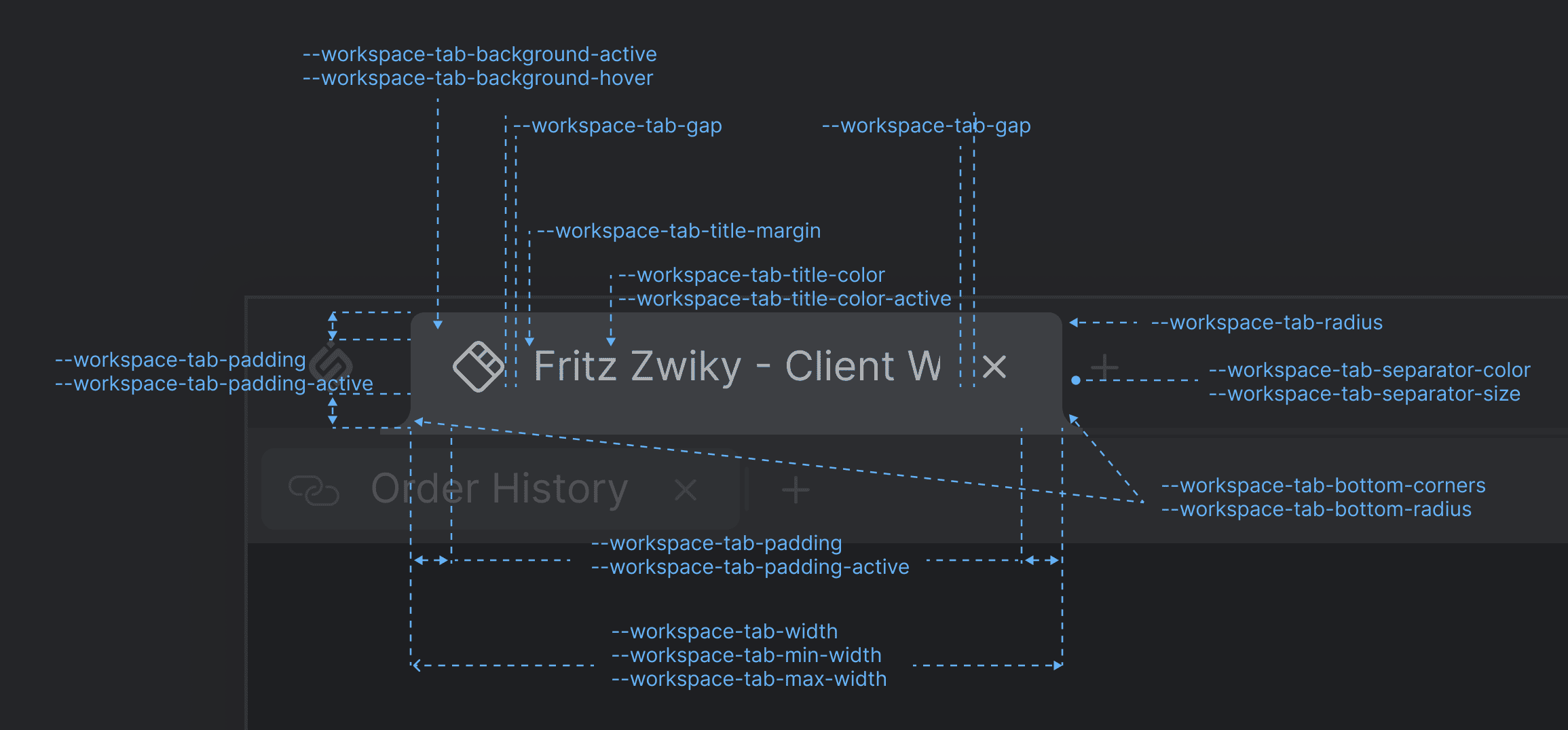
--workspace-tab-background-active |
Background color for the Workspace tabs when active. |
--workspace-tab-background-hover |
Background color for the Workspace tabs when hovered. |
--workspace-tab-bottom-radius |
Border radius for the bottom corners of the Workspace tabs. |
--workspace-tab-bottom-corners |
Set to block to display the additional rounded corners at the bottom of the active Workspace tab. Set to none to remove the additional rounded corners. |
--workspace-tab-gap |
Gap between Workspace tabs. |
--workspace-tab-margin |
Margin for the Workspace tabs. |
--workspace-tab-max-width |
Maximum width for the Workspace tabs. |
--workspace-tab-min-width |
Minimum width for the Workspace tabs. |
--workspace-tab-padding |
Padding for the Workspace tabs. |
--workspace-tab-padding-active |
Padding for the Workspace tabs when active. |
--workspace-tab-radius |
Border radius for the Workspace tabs. |
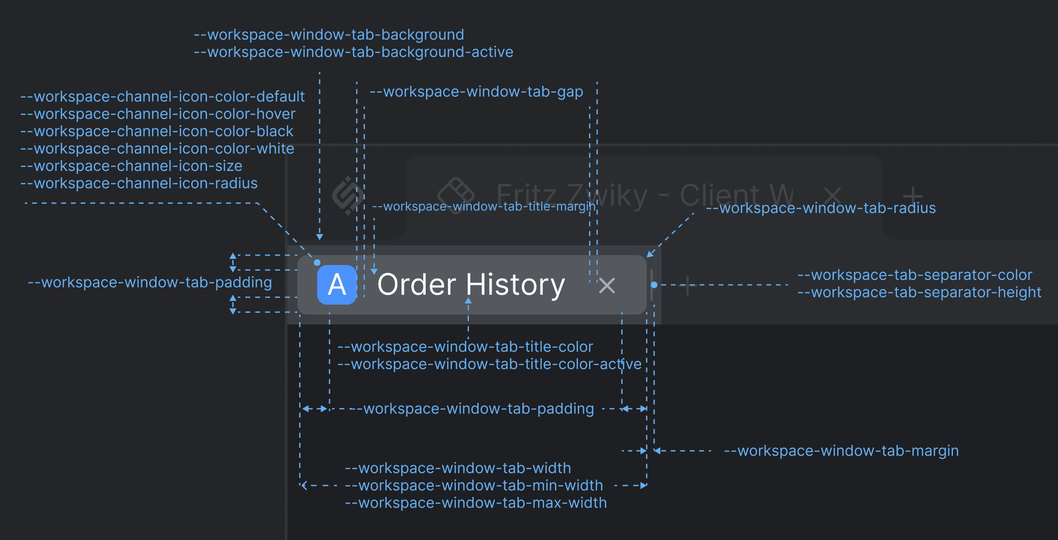
--workspace-tab-separator-color |
Color for the separator between the Workspace tabs and the "Add Workspace" button. |
--workspace-tab-separator-height |
Height for the separator between the Workspace tabs and the "Add Workspace" button. |
--workspace-tab-text-mask |
Used for text fade-out effect on text overflow in the Workspace tabs. |
--workspace-tab-title-color |
Color for the Workspace tab title. |
--workspace-tab-title-color-active |
Color for the Workspace tab title when active. |
--workspace-tab-title-margin |
Margin for the Workspace tab title. |
--workspace-tab-width |
Width for the Workspace tabs. |
--workspace-tab-width-hide-button-close |
The "Close" button of the Workspace tab will be hidden when the Workspace tab shrinks to the specified width. |
--workspace-tab-width-hide-button-lock |
The "Lock" button of the Workspace tab will be hidden when the Workspace tab shrinks to the specified width. |
--workspace-tab-width-hide-title |
The title of the Workspace tab will be hidden when the Workspace tab shrinks to the specified width. |
Workspace Windows
| Variable | Description |
|---|---|
--workspace-channel-icon-color-black |
Text color for the Channel Selector icon to be used with light icon backgrounds to achieve higher contrast ration. |
--workspace-channel-icon-color-default |
Default color for the Channel Selector icon in the Workspace window tabs. |
--workspace-channel-icon-color-hover |
Color for the Channel Selector icon in the Workspace window tabs when hovered. |
--workspace-channel-icon-color-white |
Text color for the Channel Selector icon to be used with dark icon backgrounds to achieve higher contrast ration. |
--workspace-channel-icon-radius |
Border radius for the corners of the Channel Selector icon in the Workspace window tabs. |
--workspace-channel-icon-size |
Size (width and height) for the Channel Selector icon in the Workspace window tabs. |
--workspace-window-controls-gap |
Gap between the buttons in the Workspace window group ("Extract", "Maximize"/"Restore"). |
--workspace-window-controls-padding |
Padding for the container of the "Extract" and "Maximize"/"Restore" buttons in the Workspace window group. |
--workspace-window-header-gap |
Gap between the elements in the headers of Workspace window groups (tabs, "Add App" button, move area, system buttons). |
--workspace-window-header-height |
Height for the headers of Workspace window groups. |
--workspace-window-header-tabs-start-point |
Offset for the first tab in the headers of Workspace window groups. |
--workspace-window-tab-background |
Background for the tabs of Workspace windows. |
--workspace-window-tab-background-active |
Background for the tabs of Workspace windows when active. |
--workspace-window-tab-gap |
Gap between the items in the Workspace window tabs. |
--workspace-window-tab-margin |
Margin for the Workspace window tabs. |
--workspace-window-tab-max-width |
Maximum width for the Workspace window tabs. |
--workspace-window-tab-min-width |
Minimum width for the Workspace window tabs. |
--workspace-window-tab-padding |
Padding for the Workspace window tabs. |
--workspace-window-tab-radius |
Border radius for the tab corners of Workspace windows. |
--workspace-window-tab-title-color |
Color for the titles of Workspace window tabs. |
--workspace-window-tab-title-color-active |
Color for the titles of Workspace window tabs when active. |
--workspace-window-tab-title-margin |
Margin for the titles of Workspace window tabs. |
--workspace-window-tab-width |
Width for the Workspace window tabs. |
Logo
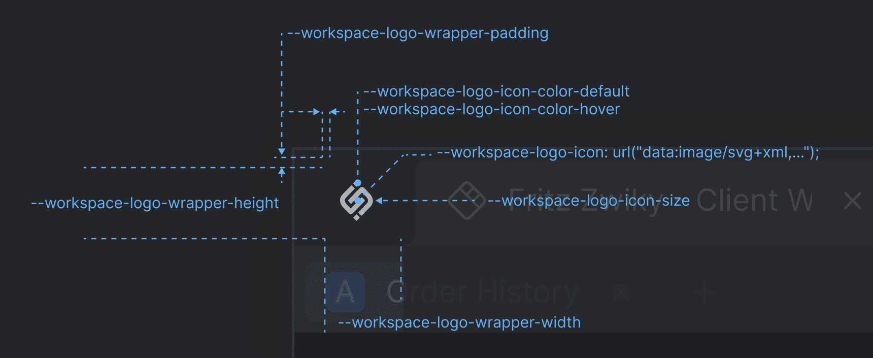
| Variable | Description |
|---|---|
--workspace-logo-icon |
Default icon for the logo of the Workspaces App. |
--workspace-logo-icon-color-default |
Default color for the Workspaces App logo icon. |
--workspace-logo-icon-color-hover |
Color for the Workspaces App logo icon when hovered. |
--workspace-logo-icon-size |
Size (width and height) for the Workspaces App logo icon. |
--workspace-logo-wrapper-height |
Height for the Workspaces App logo container. |
--workspace-logo-wrapper-padding |
Padding for the Workspaces App logo container. |
--workspace-logo-wrapper-width |
Width for the Workspaces App logo container. |
Dialogs & Popups
General
| Variable | Description |
|---|---|
--workspace-dialog-backdrop-background |
Background color for the blurred background of Workspace dialogs. Available since io.Connect Desktop 10.0.3. |
--workspace-dialog-max-width |
Maximum width for Workspace dialogs. |
--workspace-dialog-min-width |
Minimum width for Workspace dialogs. |
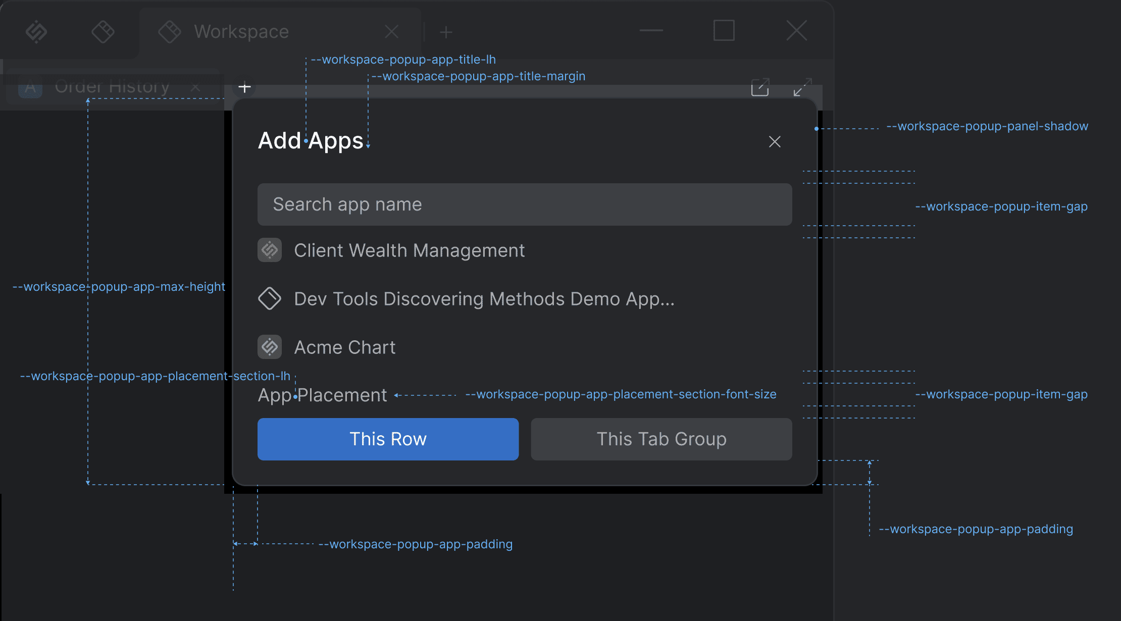
--workspace-popup-item-gap |
Gap between the items in Workspace popups. |
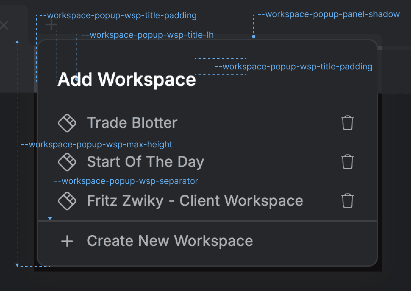
--workspace-popup-panel-shadow |
Drop shadow for the Workspace popups. |
--workspace-popup-top-position |
Top position for the Workspace popup relative to the top border of the respective button that triggers the popup. |
"Add Apps" Popup
| Variable | Description |
|---|---|
--workspace-popup-app-max-height |
Maximum height for the "Add App" Workspace popup. |
--workspace-popup-app-padding |
Padding for the "Add App" Workspace popup. |
--workspace-popup-app-placement-section-font-size |
Font size for the "App Placement" section in the "Add App" Workspace popup. |
--workspace-popup-app-placement-section-lh |
Line height for the "App Placement" section in the "Add App" Workspace popup. |
--workspace-popup-app-title-lh |
Line height for the title of the "Add App" Workspace popup. |
--workspace-popup-app-title-margin |
Margin for the title of the "Add App" Workspace popup. |
"Add Workspace" Popup
| Variable | Description |
|---|---|
--workspace-popup-wsp-max-height |
Maximum height for the "Add Workspace" Workspace popup. |
--workspace-popup-wsp-separator |
Thickness, color, and type for the section separator used in the "Add Workspace" Workspace popup. |
--workspace-popup-wsp-title-lh |
Line height for the title of the "Add Workspace" Workspace popup. |
--workspace-popup-wsp-title-padding |
Padding for the title of the "Add Workspace" Workspace popup. |
Settings Panel
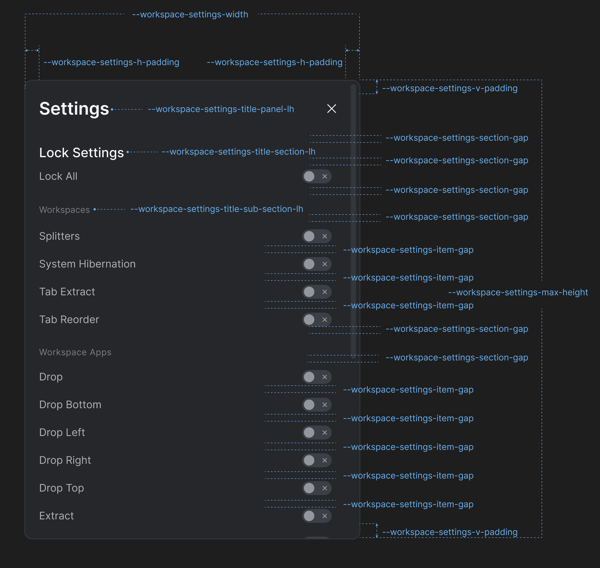
| Variable | Description |
|---|---|
--workspace-settings-h-padding |
Horizontal padding for the Workspace Settings panel. |
--workspace-settings-item-gap |
Gap between the section items in the Workspace Settings panel. |
--workspace-settings-max-height |
Maximum height for the Workspace Settings panel. |
--workspace-settings-section-gap |
Gap between the sections in the Workspace Settings panel. |
--workspace-settings-title-panel-lh |
Line height for the title of the Workspace Settings panel. |
--workspace-settings-title-section-lh |
Line height for the section titles of the Workspace Settings panel. |
--workspace-settings-title-sub-section-lh |
Line height for the sub-section titles of the Workspace Settings panel. |
--workspace-settings-v-padding |
Vertical padding for the Workspace Settings panel. |
--workspace-settings-width |
Width for the Workspace Settings panel. |
Loader
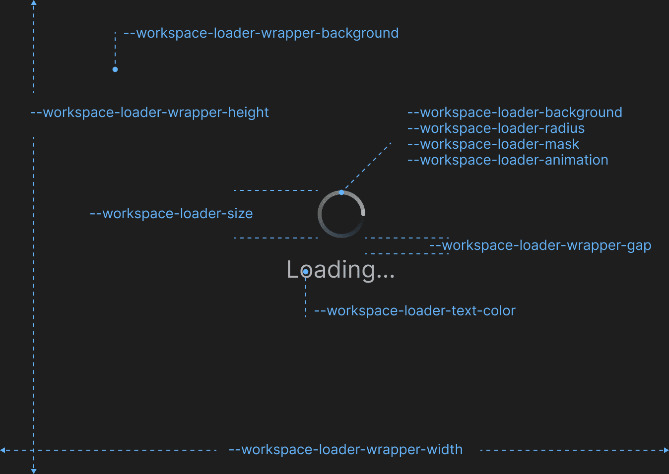
| Variable | Description |
|---|---|
--workspace-loader-animation |
Animation style for the Workspace loading animation. |
--workspace-loader-background |
Background color for the Workspace loading animation. |
--workspace-loader-mask |
Overlay mask for the Workspace loading animation. |
--workspace-loader-radius |
Border radius for the Workspace loading animation. |
--workspace-loader-size |
Size (width & height) the Workspace loading animation. |
--workspace-loader-text-color |
Text color for the Workspace loading animation. |
--workspace-loader-wrapper-background |
Background color of the loading wrapper |
--workspace-loader-wrapper-gap |
Gap between the items within the Workspace loader wrapper. |
--workspace-loader-wrapper-height |
Height for the Workspace loader wrapper. |
--workspace-loader-wrapper-width |
Width for the Workspace loader wrapper. |
Launchpad
CSS variables for overriding the styles of the io.Connect Launchpad and its sections and panels.
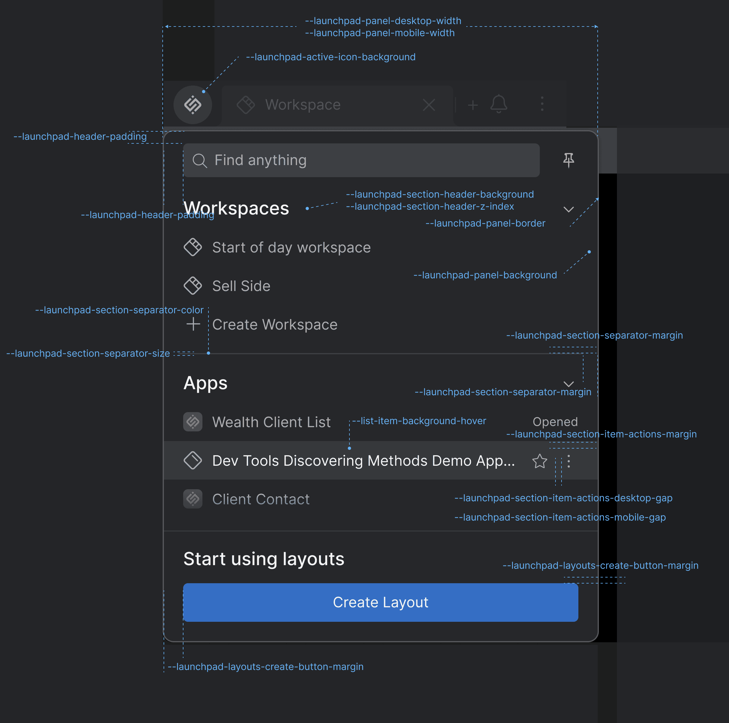
General
| Variable | Description |
|---|---|
--launchpad-active-icon-background |
Background color for when the Launchpad icon is active (i.e., when the Launchpad is open). |
Panel
| Variable | Description |
|---|---|
--launchpad-panel-background |
Background color for the main Launchpad panel. |
--launchpad-panel-border |
Border for the Launchpad panel. |
--launchpad-panel-desktop-width |
Width of the Launchpad panel on desktop devices. |
--launchpad-panel-mobile-width |
Width of the Launchpad panel on mobile devices. |
Header
| Variable | Description |
|---|---|
--launchpad-header-padding |
Padding for the Launchpad header. |
Search
| Variable | Description |
|---|---|
--launchpad-search-bar-margin |
Margin around the Launchpad search bar. |
--launchpad-search-no-result-padding |
Padding for the "No results" and "Loading..." messages in the Launchpad search results section. |
Section Separator
| Variable | Description |
|---|---|
--launchpad-section-header-background |
Background for the header of the main sections to make them appear above other items when sticky. |
--launchpad-section-header-z-index |
Z-index for the header of the main sections to make them appear above other items when sticky. |
--launchpad-section-item-actions-desktop-gap |
Gap between the actions of a section item on desktop devices. |
--launchpad-section-item-actions-margin |
Margin around the actions of a section item. |
--launchpad-section-item-actions-mobile-gap |
Gap between the actions of a section item on mobile devices. |
--launchpad-section-separator-color |
Color for the Launchpad section separators. |
--launchpad-section-separator-margin |
Margin for the Launchpad section separators. |
--launchpad-section-separator-size |
Thickness (height) of the section separators. |
Layouts Section
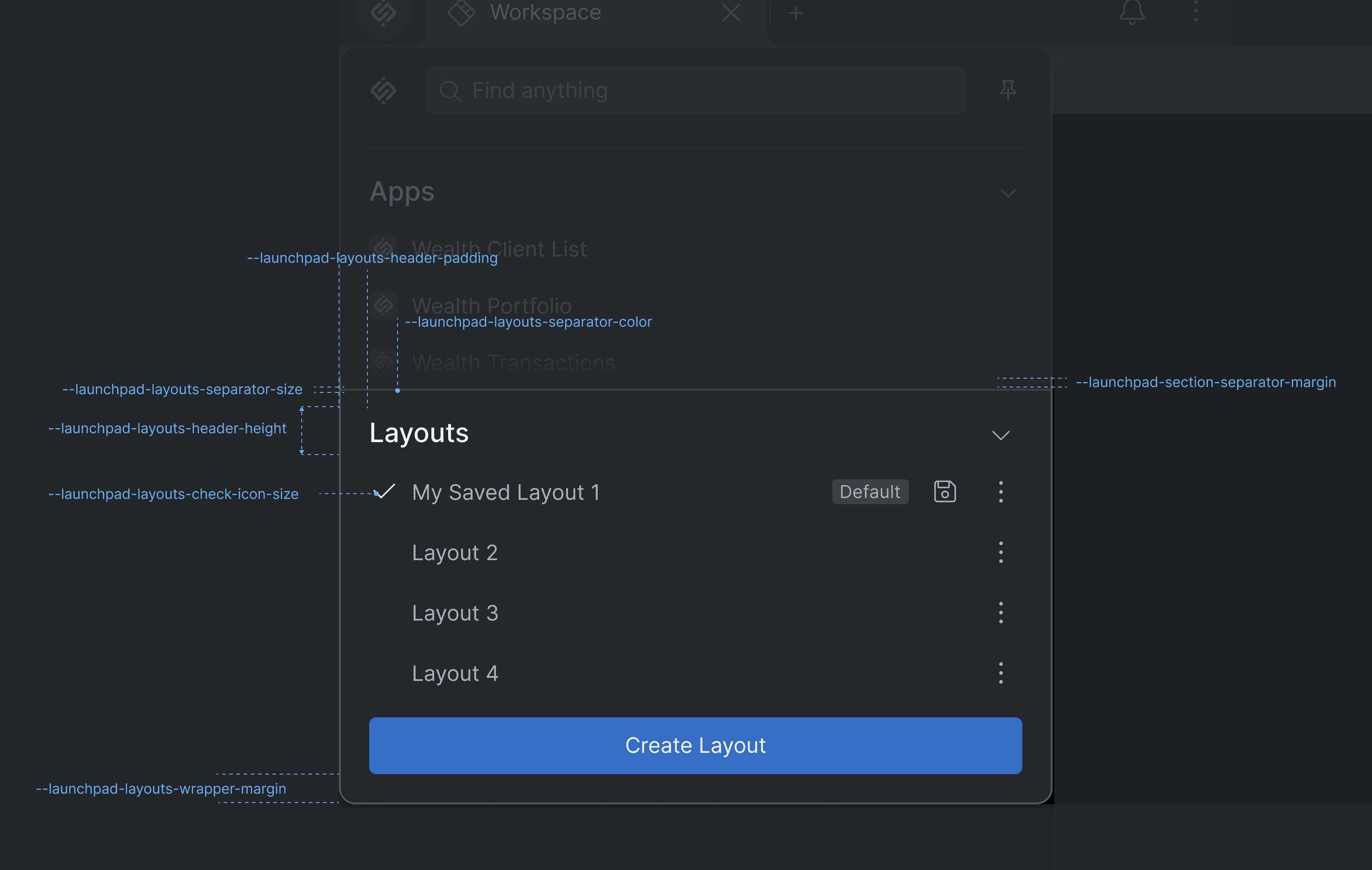
| Variable | Description |
|---|---|
--launchpad-layouts-check-icon-size |
Size of the check icon of the active Layout in the Layouts section. |
--launchpad-layouts-create-button-margin |
Margin for the "Create Layout" button. |
--launchpad-layouts-header-height |
Height for the Layouts section header. |
--launchpad-layouts-header-padding |
Padding for the Layouts section header. |
--launchpad-layouts-no-active-padding |
Padding for the "Choose which Layout to load" text. |
--launchpad-layouts-separator-color |
Color for the Layouts section separator. |
--launchpad-layouts-separator-margin |
Margin for the Layouts section separator. |
--launchpad-layouts-separator-size |
Size (height) of the Layouts section separator. |
--launchpad-layouts-wrapper-margin |
Margin for the Layouts section. |
Platform Preferences Panel
Available since io.Connect Desktop 9.10
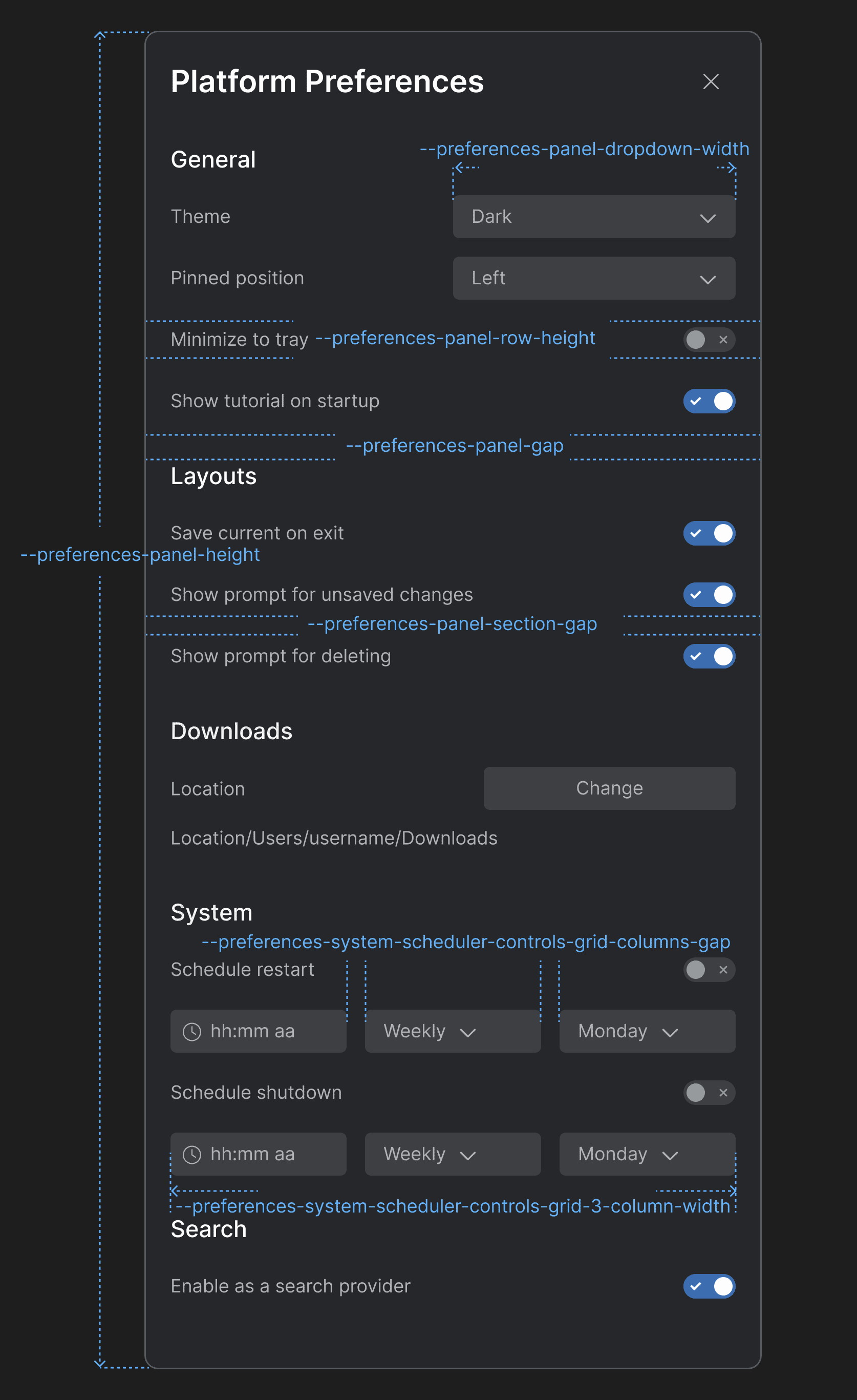
| Variable | Description |
|---|---|
--preferences-panel-dropdown-width |
Width for the dropdowns menus in the Platform Preferences panel. |
--preferences-panel-gap |
Gap between the header and the body of the Platform Preferences panel. |
--preferences-panel-height |
Height for the Platform Preferences panel. |
--preferences-panel-row-height |
Height for each row in the sections of the Platform Preferences panel. |
--preferences-panel-section-gap |
Gap between the items in each section of the Platform Preferences panel. |
--preferences-system-scheduler-controls-grid-3-column-width |
Column width for a grid layout with three columns in the "System" section. |
--preferences-system-scheduler-controls-grid-columns-gap |
Gap between the columns of the grid layout containing the scheduler controls in the "System" section. |
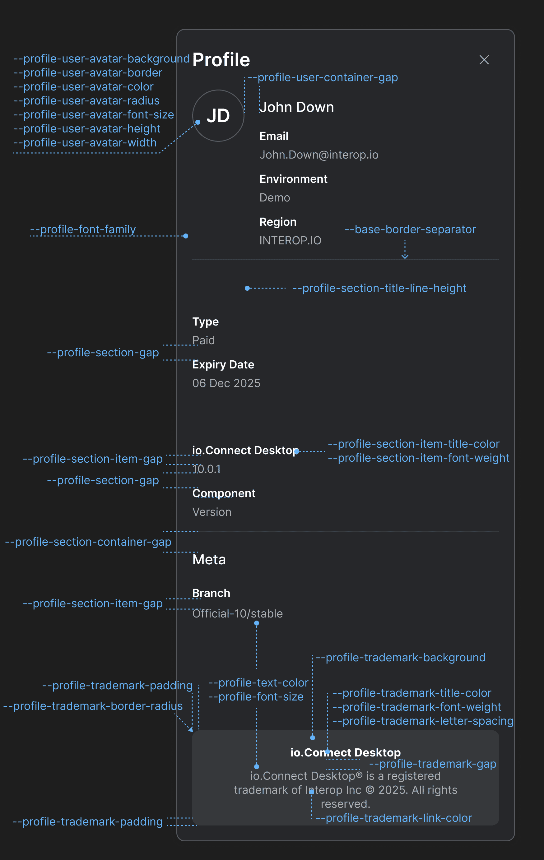
Profile Panel
Available since io.Connect Desktop 9.10
| Variable | Description |
|---|---|
--profile-font-family |
Font family for the Profile panel. |
--profile-font-size |
Font size for the Profile panel. |
--profile-section-container-gap |
Gap between sections in the Profile panel. |
--profile-section-gap |
Gap between the items in each section of the Profile panel. |
--profile-section-item-gap |
Gap between the title and the value of a section item. |
--profile-section-item-title-color |
Color for the title of a section item. |
--profile-section-item-title-font-weight |
Font weight for the title of a section item. |
--profile-section-title-line-height |
Line height for the titles of the Profile panel sections. |
--profile-text-color |
Text color for the Profile panel. |
--profile-trademark-background |
Background color for the trademark section. |
--profile-trademark-border-radius |
Border radius for the trademark section. |
--profile-trademark-gap |
Gap between the title and the text of the trademark section. |
--profile-trademark-letter-spacing |
Letter spacing for title and the text of the trademark section. |
--profile-trademark-link-color |
Color for the link in the trademark section. |
--profile-trademark-padding |
Padding for the trademark section. |
--profile-trademark-title-color |
Color for the title of the trademark section. |
--profile-trademark-title-font-weight |
Font weight for the title of the trademark section. |
--profile-user-avatar-background |
Background color for the user avatar. |
--profile-user-avatar-border |
Border for the user avatar. |
--profile-user-avatar-color |
Color for the user avatar initials. |
--profile-user-avatar-font-size |
Font size for the user avatar initials. |
--profile-user-avatar-height |
Height for the user avatar. |
--profile-user-avatar-radius |
Border radius for the user avatar. |
--profile-user-avatar-width |
Width for the user avatar. |
--profile-user-container-gap |
Gap between the user avatar and the user info section. |
Notifications
Available since io.Connect Desktop 9.10
CSS variables for overriding the styles of the io.Connect notifications and notification apps.
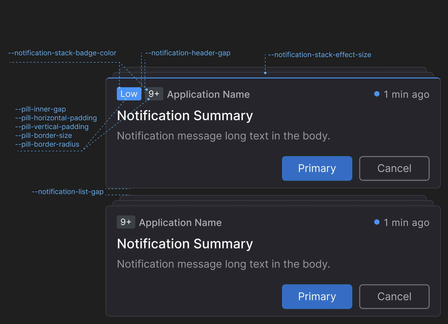
Notification
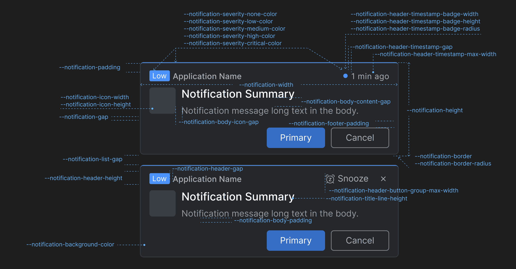
| Variable | Description |
|---|---|
--notification-background-color |
Background color for the notifications. |
--notification-body-content-gap |
Gap between the title and the text in the notification body content. |
--notification-body-icon-gap |
Gap between the notification icon and the notification body content. |
--notification-body-padding |
Padding for the notification body. |
--notification-border |
Border for the notifications. |
--notification-border-radius |
Border radius for the notifications. |
--notification-footer-padding |
Padding for the notification footer. |
--notification-gap |
Gap between the header, the body, and the footer of the notifications. |
--notification-header-button-group-max-width |
Maximum width for the action buttons ("Snooze", "Close") in the notification header. |
--notification-header-gap |
Gap between elements in the notification header. |
--notification-header-height |
Height for the notification header. |
--notification-header-timestamp-badge-height |
Height for the timestamp badge in the notification header. |
--notification-header-timestamp-badge-radius |
Border radius for the timestamp badge in the notification header. |
--notification-header-timestamp-badge-width |
Width for the timestamp badge in the notification header. |
--notification-header-timestamp-gap |
Gap between the timestamp badge and the timestamp in the notification header. |
--notification-header-timestamp-max-width |
Maximum width for the timestamp in the notification header. |
--notification-height |
Height for the notifications. |
--notification-icon-height |
Height for the icon displayed in the notification. |
--notification-icon-width |
Width for the icon displayed in the notification. |
--notification-padding |
Padding for the notifications. |
--notification-severity-critical-color |
Color for notifications with severity "Critical". |
--notification-severity-high-color |
Color for notifications with severity "High". |
--notification-severity-low-color |
Color for notifications with severity "Low". |
--notification-severity-medium-color |
Color for notifications with severity "Medium". |
--notification-severity-none-color |
Color for notifications with severity "None". |
--notification-title-line-height |
Line height for the title in the notification. |
--notification-width |
Width for the notifications. |
Notification Panel
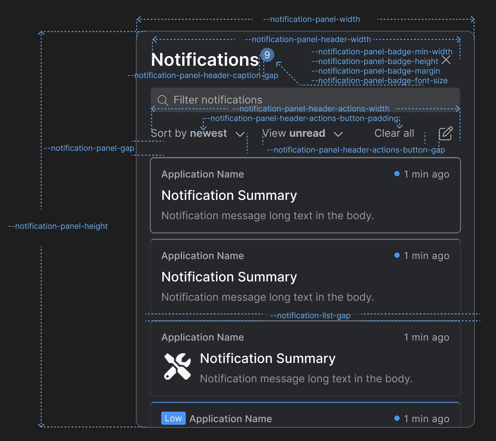
| Variable | Description |
|---|---|
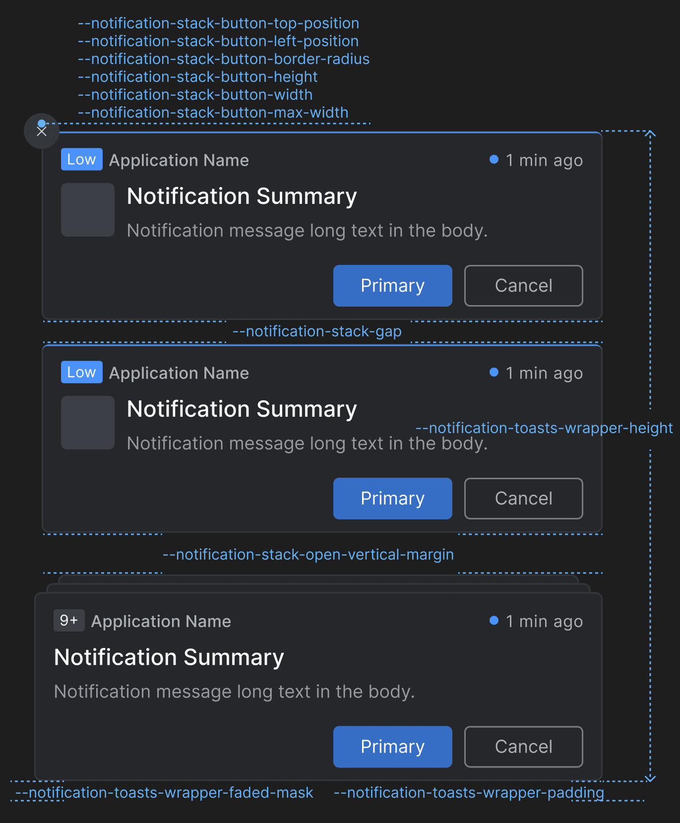
--notification-list-gap |
Gap between notifications in the notification list of the Notification Panel and the toasts wrapper. |
--notification-panel-badge-font-size |
Font size for the Notification Panel badge. |
--notification-panel-badge-height |
Height for the Notification Panel badge. |
--notification-panel-badge-margin |
Margin for the Notification Panel badge. |
--notification-panel-badge-min-width |
Minimum width for the Notification Panel badge. |
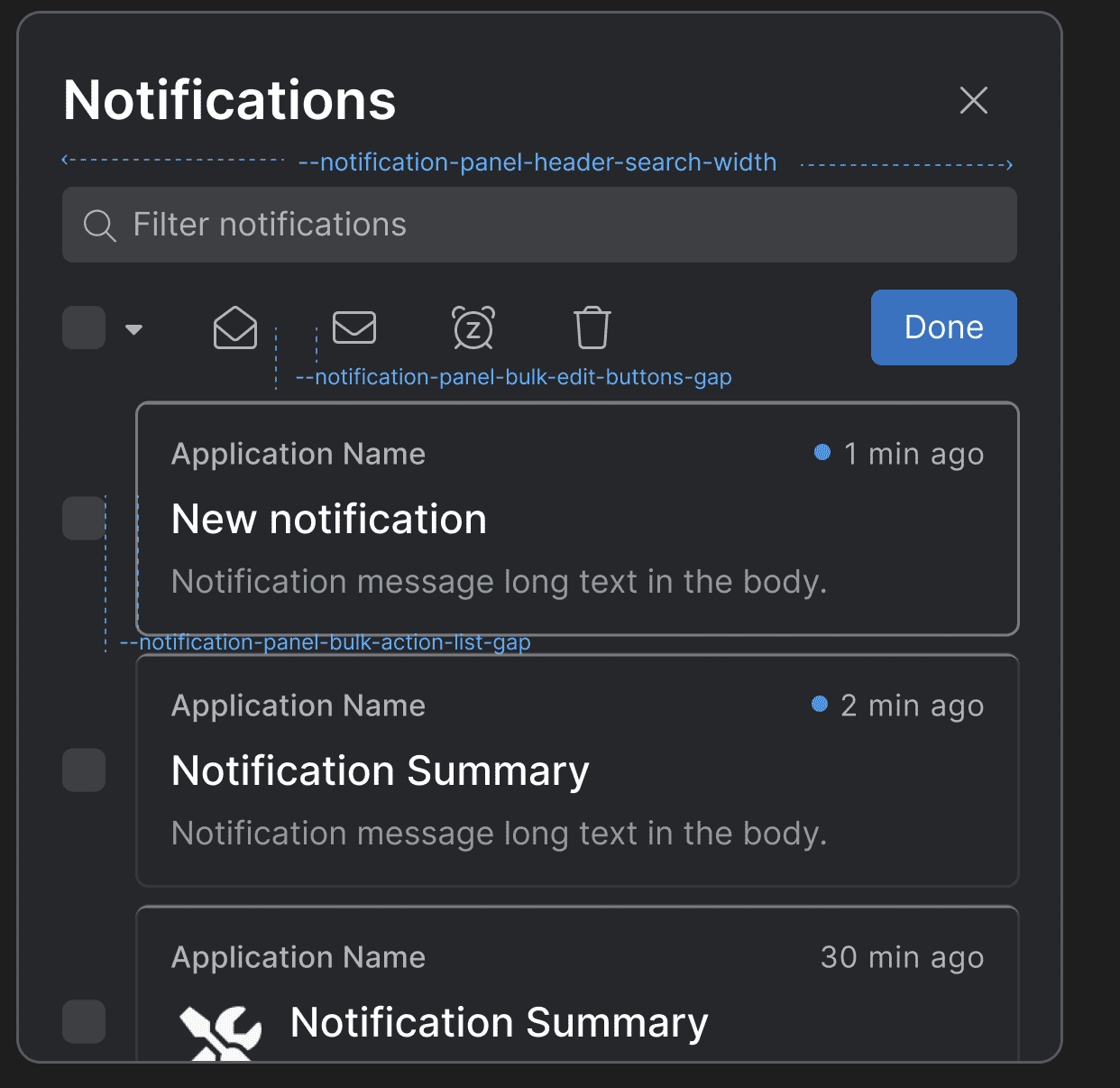
--notification-panel-bulk-action-list-gap |
Gap between the editable items when the "Bulk Edit" button is pressed. |
--notification-panel-bulk-edit-buttons-gap |
Gap between the buttons that appear in the Notification Panel header when the "Bulk Edit" button is pressed. |
--notification-panel-gap |
Gap between the header and the body of the Notification Panel. |
--notification-panel-header-actions-button-gap |
Gap between the "Sort by" and "View" dropdowns and between the "Clear All" and "Bulk Edit" buttons in the Notification Panel header. |
--notification-panel-header-actions-button-padding |
Padding for the action buttons in the Notification Panel header. |
--notification-panel-header-actions-width |
Width for the element that contains action buttons in the Notification Panel header. |
--notification-panel-header-caption-gap |
Gap between the caption, the badge, and the system buttons in the Notification Panel header. |
--notification-panel-header-search-gap |
Gap between the search bar and the search results. |
--notification-panel-header-search-width |
Width for the search bar in the Notification Panel header. |
--notification-panel-header-width |
Width for the Notification Panel header. |
--notification-panel-height |
Height for the Notification Panel. |
--notification-panel-width |
Width for the Notification Panel. |
Toasts Wrapper & Notification Stacks
| Variable | Description |
|---|---|
--notification-stack-badge-color |
Color for the badge that displays the number of stacked notifications. |
--notification-stack-button-border-radius |
Border radius for the "Clear All" button of the notification stack. |
--notification-stack-button-height |
Height for the "Clear All" button of the notification stack. |
--notification-stack-button-left-position |
Left offset for the "Clear All" button of the notification stack. |
--notification-stack-button-max-width |
Maximum width for the "Clear All" button of the notification stack. |
--notification-stack-button-top-position |
Top offset for the "Clear All" button of the notification stack. |
--notification-stack-button-width |
Width for the "Clear All" button of the notification stack. |
--notification-stack-effect-size |
Top, right, and left offset for the notification stack effect. |
--notification-stack-gap |
Gap between the notification stacks. |
--notification-stack-open-vertical-margin |
Vertical (top and bottom) margin for the notification stack when open. |
--notification-toasts-wrapper-faded-mask |
Faded mask for the toasts wrapper. |
--notification-toasts-wrapper-height |
Height for the toasts wrapper. |
--notification-toasts-wrapper-padding |
Padding for the toast wrapper. |
Notification Settings
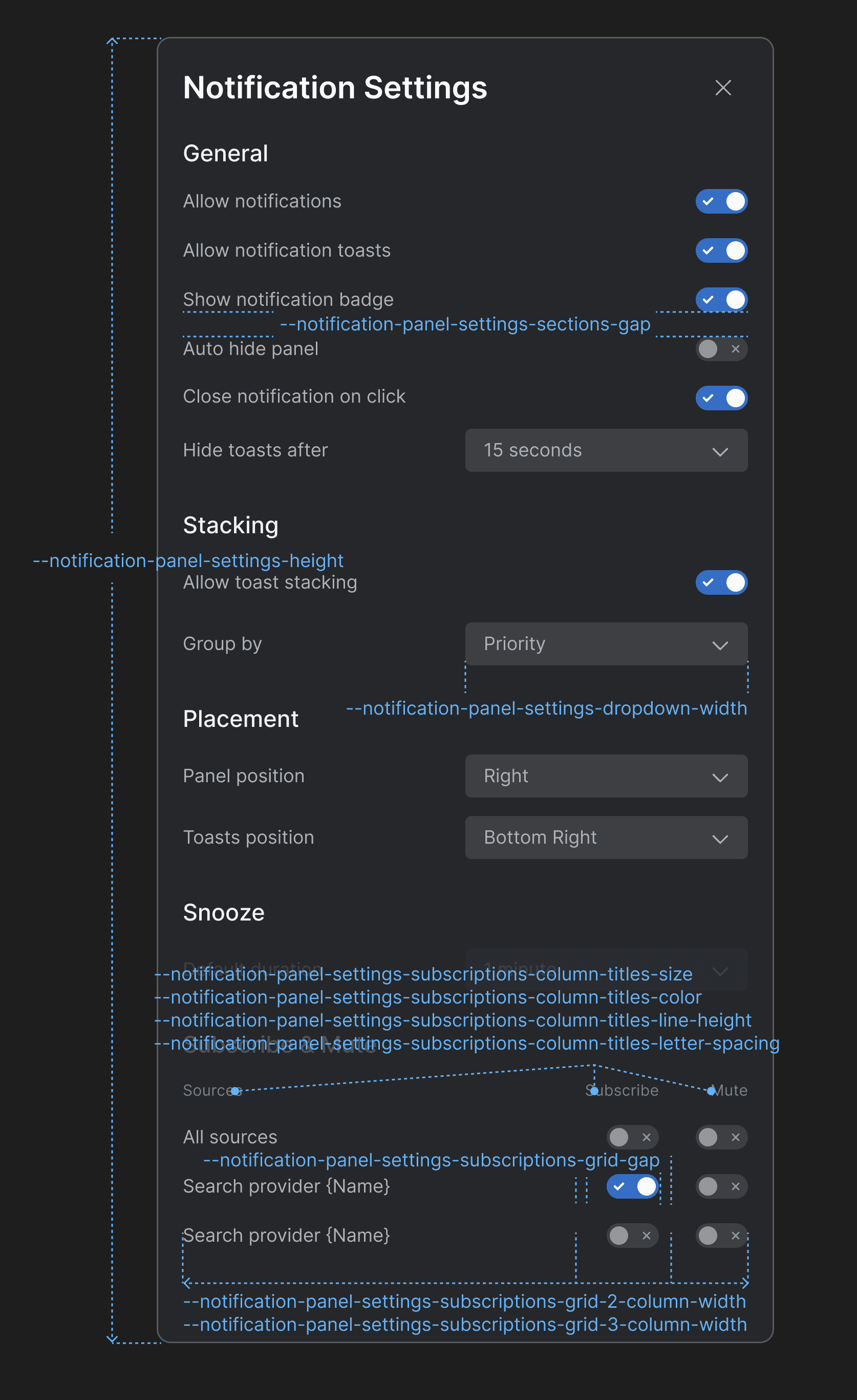
| Variable | Description |
|---|---|
--notification-panel-settings-dropdown-width |
Width for the dropdown menus in the Notification Settings panel. |
--notification-panel-settings-height |
Height for the Notification Settings panel. |
--notification-panel-settings-sections-gap |
Gap between the sections in the Notification Settings panel. |
--notification-panel-settings-subscriptions-column-titles-color |
Color for the column titles of the "Subscribe & Mute" section. |
--notification-panel-settings-subscriptions-column-titles-letter-spacing |
Letter spacing for the column titles of the "Subscribe & Mute" section. |
--notification-panel-settings-subscriptions-column-titles-line-height |
Line height for the column titles of the "Subscribe & Mute" section. |
--notification-panel-settings-subscriptions-column-titles-size |
Font size for the column titles of the "Subscribe & Mute" section. |
--notification-panel-settings-subscriptions-grid-2-column-width |
Column width for a grid layout with two columns in the "Subscribe & Mute" section. |
--notification-panel-settings-subscriptions-grid-3-column-width |
Column width for a grid layout with three columns in the "Subscribe & Mute" section. |
--notification-panel-settings-subscriptions-grid-gap |
Gap between the columns of the grid layout in the "Subscribe & Mute" section. |
Channel Selector
Available since io.Connect Desktop 9.10
CSS variables for overriding the Channel Selector styles.
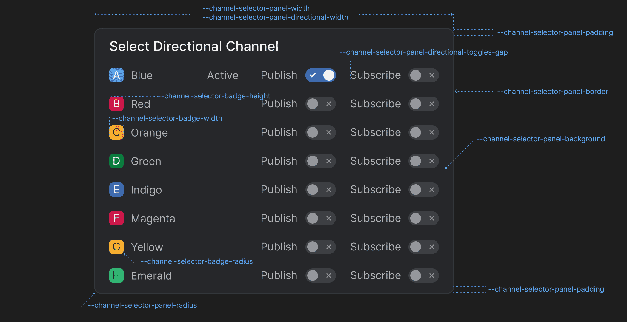
| Variable | Description |
|---|---|
--channel-selector-badge-height |
Height for the Channel Selector badge displayed in the Channel Selector panel. |
--channel-selector-badge-radius |
Border radius for the Channel Selector badge displayed in the Channel Selector panel. |
--channel-selector-badge-width |
Width for the Channel Selector badge displayed in the Channel Selector panel. |
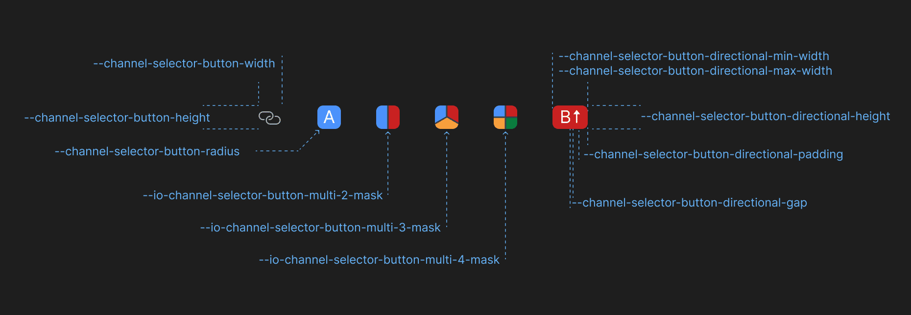
--channel-selector-button-directional-gap |
Gap between Channel letter and the Channel direction icon in the Channel Selector button when using directional Channels. |
--channel-selector-button-directional-height |
Height for the Channel Selector button when using directional Channels. |
--channel-selector-button-directional-max-width |
Maximum width for the Channel Selector button when using directional Channels. |
--channel-selector-button-directional-min-width |
Minimum width for the Channel Selector button when using directional Channels. |
--channel-selector-button-directional-padding |
Padding for the Channel Selector button when using directional Channels. |
--channel-selector-button-height |
Height for the Channel Selector button. |
--channel-selector-button-radius |
Border radius for the Channel Selector button. |
--channel-selector-button-width |
Width for the Channel Selector button. |
--channel-selector-panel-background |
Background color for the Channel Selector panel. |
--channel-selector-panel-border |
Border for the Channel Selector panel. |
--channel-selector-panel-directional-toggles-gap |
Gap between the direction labels and the respective toggles in the Channel Selector panel when using directional Channels. |
--channel-selector-panel-directional-width |
Width for the Channel Selector panel when using directional Channels. |
--channel-selector-panel-padding |
Padding for the Channel Selector panel. |
--channel-selector-panel-radius |
Border radius for the Channel Selector panel. |
--channel-selector-panel-title-background-hover |
Background color for the title of the Channel Selector panel when hovered. |
--channel-selector-panel-width |
Width for the Channel Selector panel. |
--io-channel-selector-button-multi-2-mask |
Mask for the Channel Selector button if two Channels are selected when using multiple Channels. |
--io-channel-selector-button-multi-3-mask |
Mask for the Channel Selector button if three Channels are selected when using multiple Channels. |
--io-channel-selector-button-multi-4-mask |
Mask for the Channel Selector button if four Channels are selected when using multiple Channels. |
Intent Resolver
Available since io.Connect Desktop 9.10
CSS variables for overriding the Intent Resolver styles.
| Variable | Description |
|---|---|
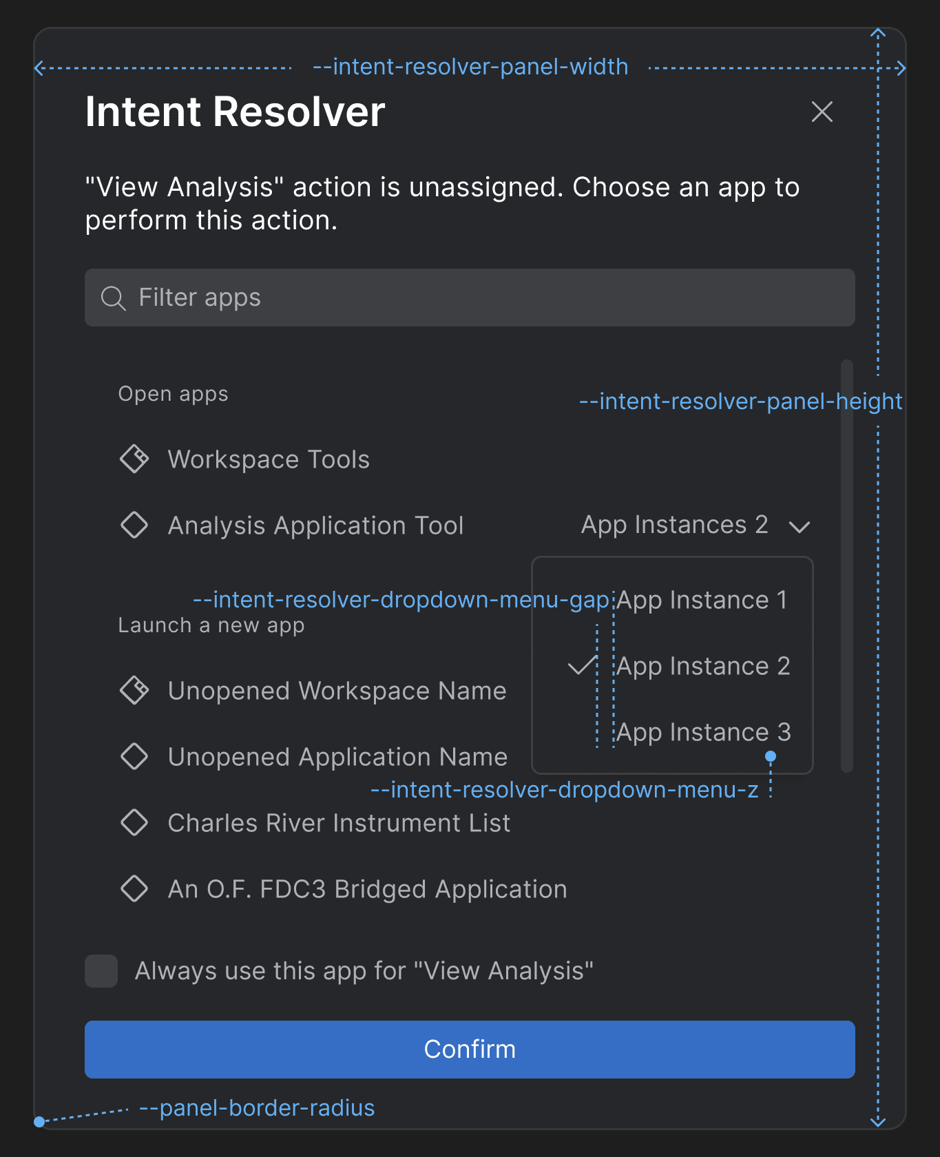
--intent-resolver-dropdown-menu-gap |
Gap between the items in the dropdown menu of the Intent Resolver panel for selecting an app instance. |
--intent-resolver-dropdown-menu-z |
Z-order for the dropdown menu of the Intent Resolver for selecting an app instance. |
--intent-resolver-panel-border-radius |
Border radius for the Intent Resolver panel. |
--intent-resolver-panel-height |
Height for the Intent Resolver panel. |
--intent-resolver-panel-padding |
Padding for the Intent Resolver panel. |
--intent-resolver-panel-width |
Width for the Intent Resolver panel. |
Feedback Form
Available since io.Connect Desktop 9.10
CSS variables for overriding the Feedback Form styles.
| Variable | Description |
|---|---|
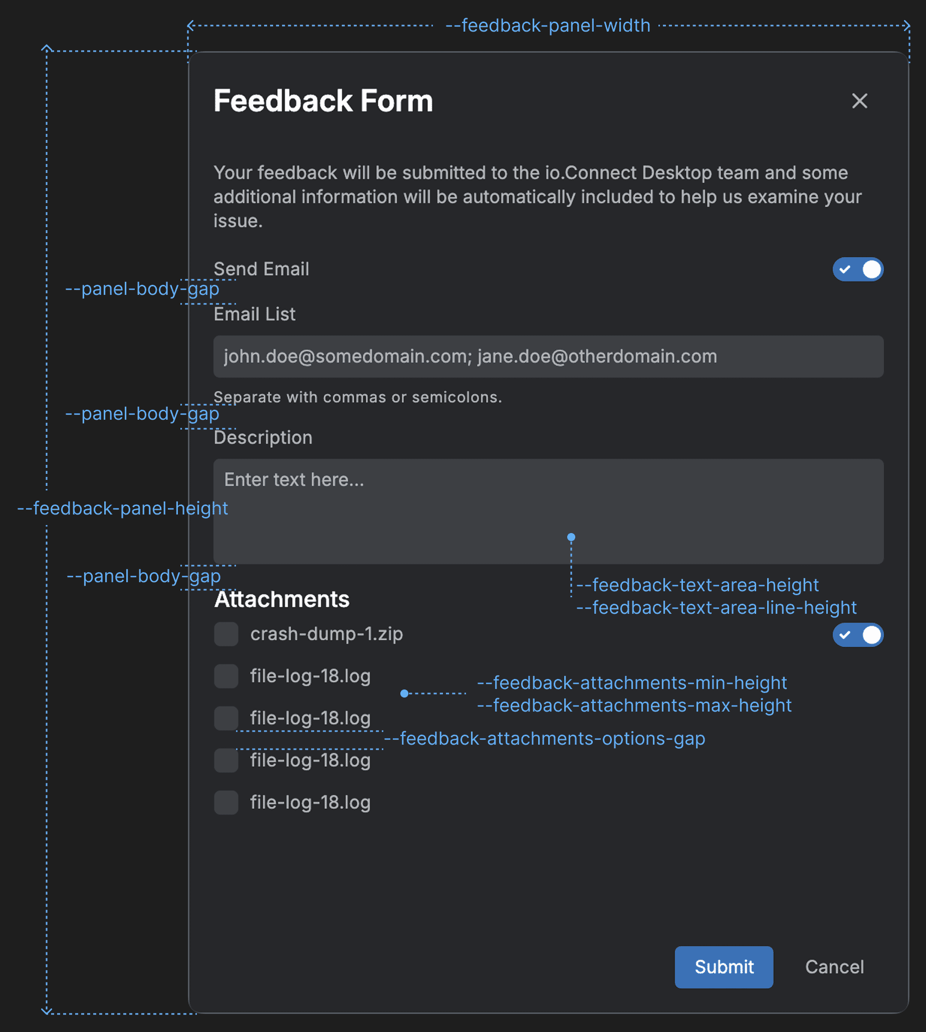
--feedback-attachments-items-gap |
Gap between the rows with attachment items. |
--feedback-attachments-max-height |
Maximum height for the "Attachments" section of the Feedback Form. |
--feedback-attachments-min-height |
Minimum height for the "Attachments" section of the Feedback Form. |
--feedback-error-color |
Color for error messages in the Feedback Form. |
--feedback-panel-height |
Height for the Feedback Form panel. |
--feedback-panel-width |
Width for the Feedback Form panel. |
--feedback-text-area-height |
Height for the text area input of the Feedback Form. |
--feedback-text-area-line-height |
Line height for the text in the text area input of the Feedback Form. |
Download Manager
Available since io.Connect Desktop 9.10
CSS variables for overriding the Download Manager styles.
Panel
| Variable | Description |
|---|---|
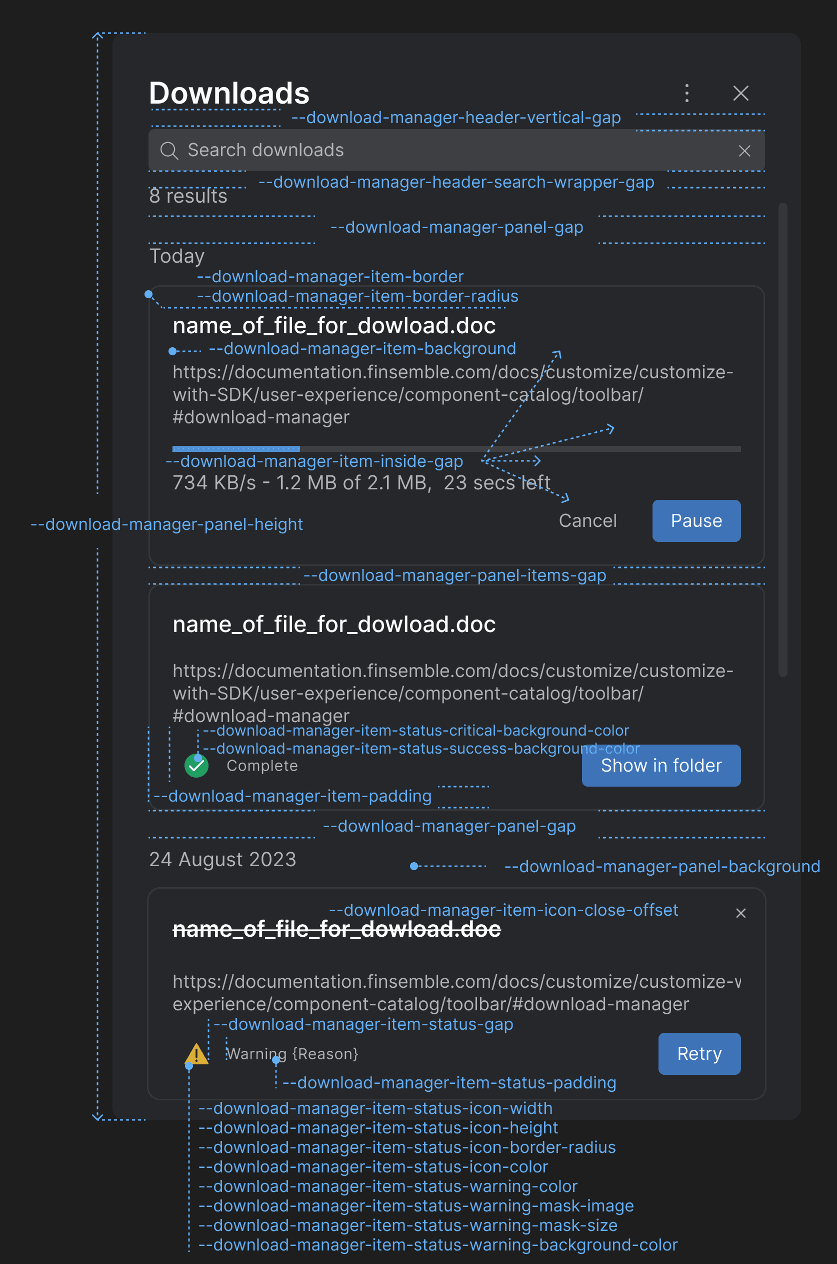
--download-manager-header-search-wrapper-gap |
Gap between the search bar and the element displaying the number of search results. |
--download-manager-header-vertical-gap |
Gap between the title and the search bar in the header of the Download Manager. |
--download-manager-item-background |
Background for the download items in the Download Manager. |
--download-manager-item-border |
Border for the download items in the Download Manager. |
--download-manager-item-border-radius |
Border radius for the download items in the Download Manager. |
--download-manager-item-icon-close-offset |
Top and right offset for the "Close" button icon of the download items in the Download Manager. |
--download-manager-item-inside-gap |
Gap between the header, body, and footer of the download items in the Download Manager. |
--download-manager-item-padding |
Padding for the download items in the Download Manager. |
--download-manager-item-status-critical-background-color |
Background color for the critical status icon in the footer of the download item. |
--download-manager-item-status-gap |
Gap between the status icon and the status text in the element displaying the download item status in the footer of the download item. |
--download-manager-item-status-icon-border-radius |
Border radius for the status icon in the footer of the download item. |
--download-manager-item-status-icon-color |
Color for the status icon in the footer of the download item. |
--download-manager-item-status-icon-height |
Height for the status icon in the footer of the download item. |
--download-manager-item-status-icon-width |
Width for the status icon in the footer of the download item. |
--download-manager-item-status-padding |
Padding for the element displaying the download item status in the footer of the download item. |
--download-manager-item-status-success-background-color |
Background color for the success status icon in the footer of the download item. |
--download-manager-item-status-warning-background-color |
Background color for the warning status icon in the footer of the download item. |
--download-manager-item-status-warning-border-radius |
Border radius for the warning status icon in the footer of the download item. |
--download-manager-item-status-warning-color |
Text color for the warning status icon in the footer of the download item. |
--download-manager-item-status-warning-mask-image |
Mask image for the warning status icon in the footer of the download item. |
--download-manager-item-status-warning-mask-size |
Mask size for the warning status icon in the footer of the download item. |
--download-manager-panel-background |
Background for the Download Manager panel. |
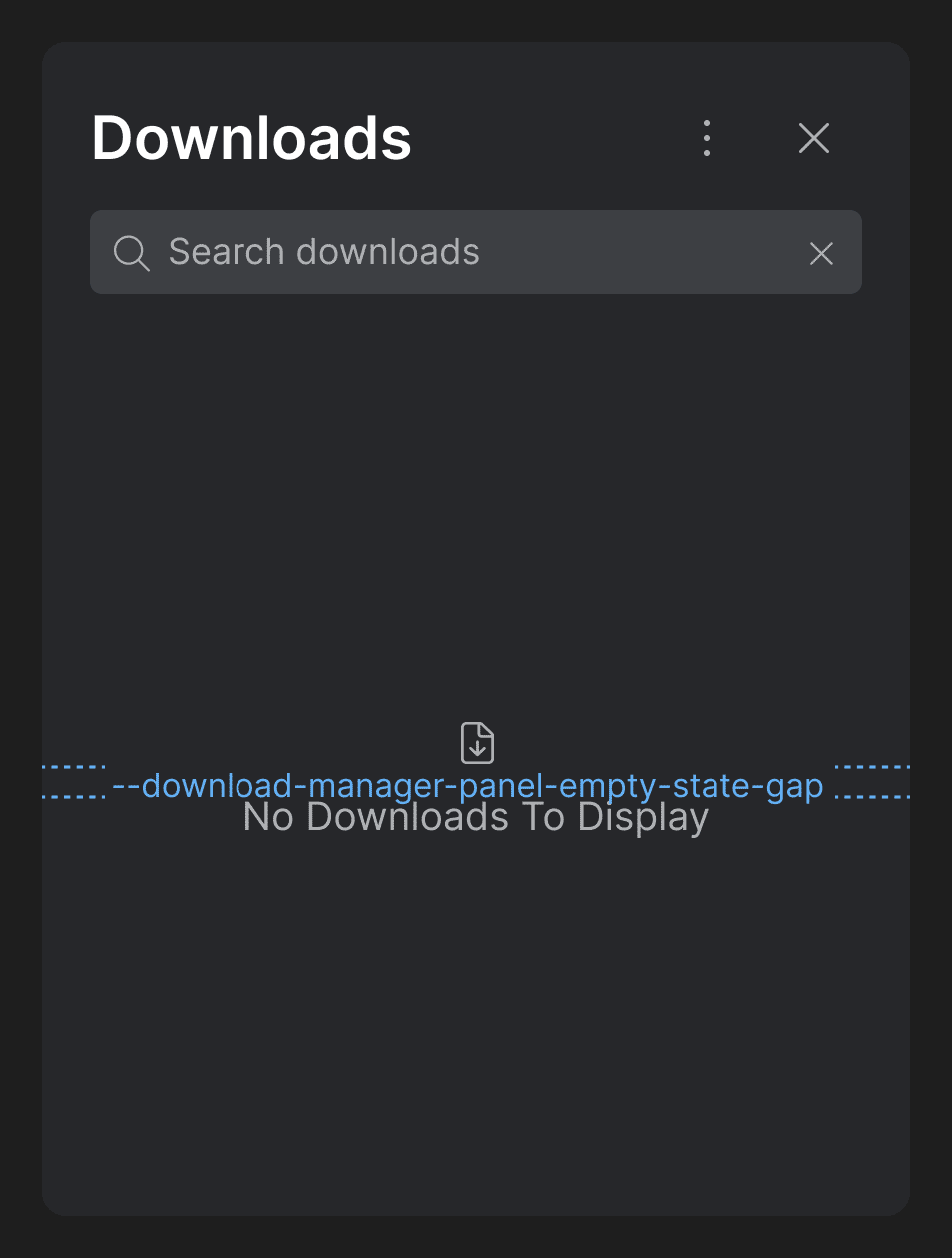
--download-manager-panel-empty-state-gap |
Gap between the icon and the text displayed in the Download Manager when it's empty. |
--download-manager-panel-gap |
Gap for the Download Manager panel. |
--download-manager-panel-height |
Height for the Download Manager panel. |
--download-manager-panel-items-gap |
Gap between the items in the Download Manager panel. |
Settings Panel
| Variable | Description |
|---|---|
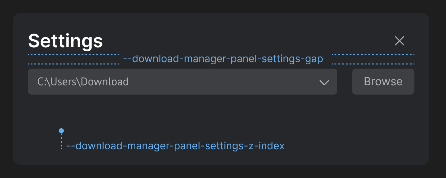
--download-manager-panel-settings-gap |
Gap between the header and the body of the Settings panel of the Download Manager. |
--download-manager-panel-settings-z-index |
Z-index for the Settings panel of the Download Manager. |
Popup
| Variable | Description |
|---|---|
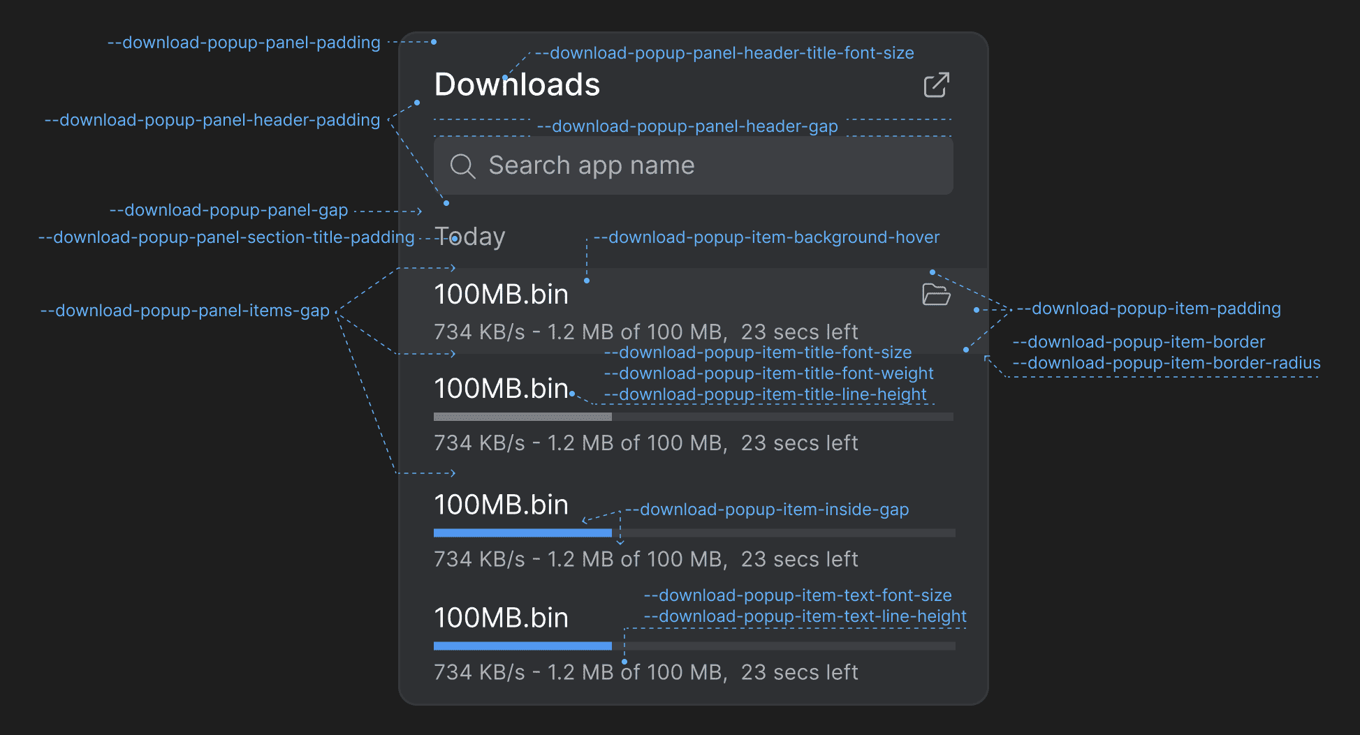
--download-popup-item-background-hover |
Background color for the download items on hover in the Download Manager popup. |
--download-popup-item-border |
Border for the download items in the Download Manager popup. |
--download-popup-item-border-radius |
Border radius for the download items in the Download Manager popup. |
--download-popup-item-inside-gap |
Gap between the header, body, and footer of the download items in the Download Manager popup. |
--download-popup-item-padding |
Padding for the download items in the Download Manager popup. |
--download-popup-item-text-font-size |
Font size for the text content in the footer of the download items in the Download Manager popup. |
--download-popup-item-text-line-height |
Line height for the text content in the footer of the download items in the Download Manager popup. |
--download-popup-item-title-font-size |
Font size for the titles of the download items in the Download Manager popup. |
--download-popup-item-title-font-weight |
Font weight for the titles of the download items in the Download Manager popup. |
--download-popup-item-title-line-height |
Line height for the titles of the download items in the Download Manager popup. |
--download-popup-panel-gap |
Gap for the Download Manager popup. |
--download-popup-panel-header-gap |
Gap for the header of the Download Manager popup. |
--download-popup-panel-header-padding |
Padding for the header of the Download Manager popup. |
--download-popup-panel-header-title-font-size |
Font size for the title in the header of the Download Manager popup. |
--download-popup-panel-items-gap |
Gap between the download items in the Download Manager popup. |
--download-popup-panel-padding |
Padding for the Download Manager popup. |
--download-popup-panel-section-title-padding |
Padding for the section titles of the Download Manager popup. |
Modals
CSS variables for overriding the styles of the io.Connect modal windows.
Alerts
| Variable | Description |
|---|---|
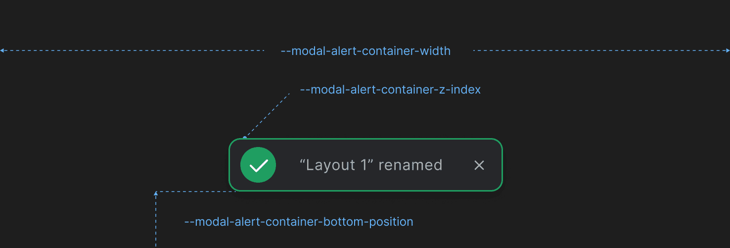
--modal-alert-container-bottom-position |
Distance from the bottom of the container in which the alert is displayed. |
--modal-alert-container-width |
Width for the container in which the alert is displayed. |
--modal-alert-container-z-index |
Z-index for the container in which the alert is displayed. |
Dialogs
CSS variables for customizing the styles of the io.Connect dialogs.
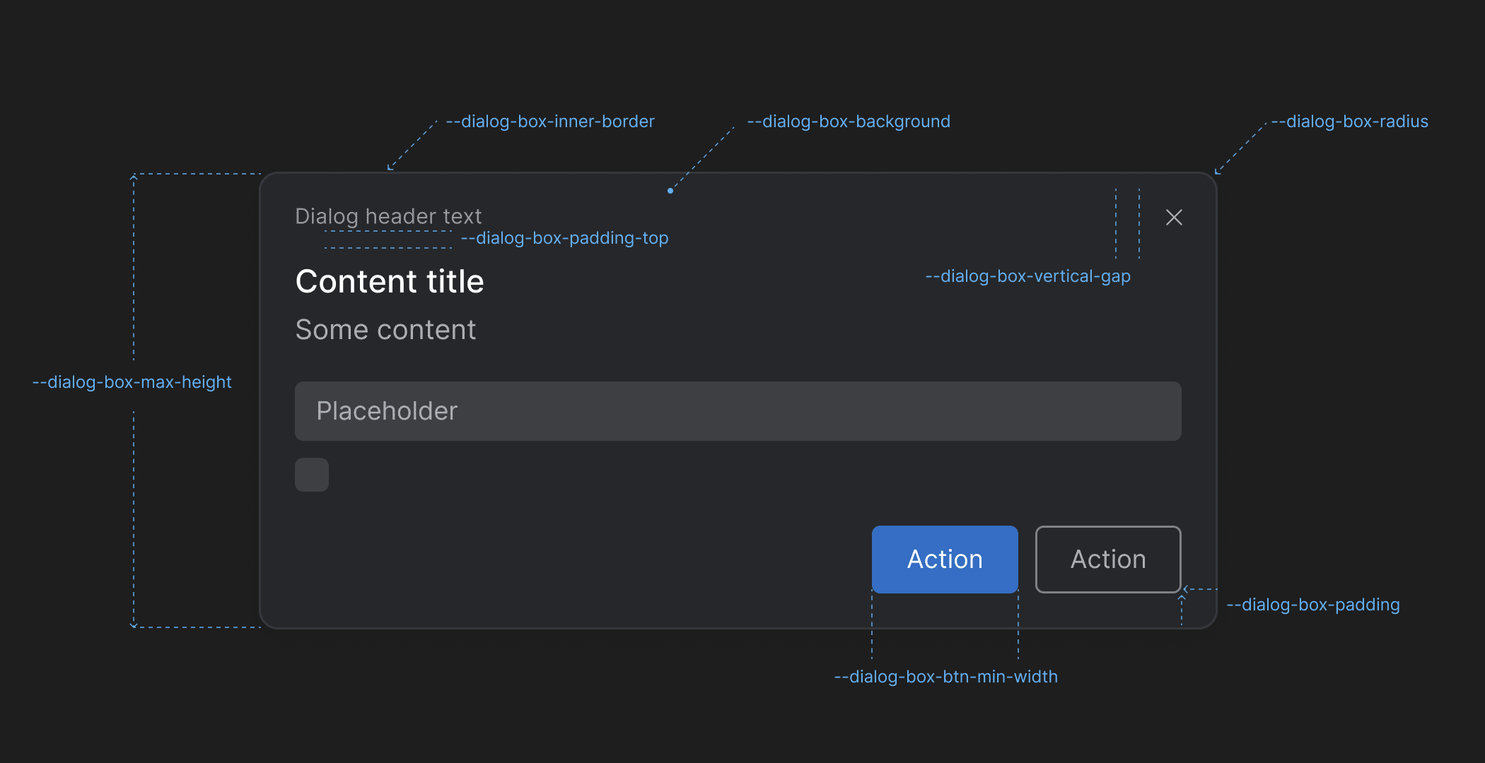
| Variable | Description |
|---|---|
--dialog-box-background |
Background for the dialogs. |
--dialog-box-btn-min-width |
Minimum width for the dialog buttons. |
--dialog-box-inner-border |
Inner border for the dialogs. |
--dialog-box-max-height |
Maximum height for the dialogs. |
--dialog-box-padding |
Padding for the dialogs. |
--dialog-box-padding-top |
Padding for the dialogs header. |
--dialog-box-radius |
Border radius for the dialogs. |
--dialog-box-vertical-gap |
Gap between the dialog heading and the "Close" button. |