
Configuration
Overview
⚠️ Note that this section is relevant only for the io.Connect Desktop 9.0 version stream. The io.Connect classic groups and the
themes.jsonfile have been deprecated in io.Connect Desktop 10.0.
By default, io.Connect Desktop has two built-in themes - dark and light. However, you can add more themes or configure the current ones by editing the themes.json file located in the <installation_location>/interop.io/io.Connect Desktop/Desktop/config folder.
⚠️ Note that configuring the io.Connect themes via the
themes.jsonfile is valid only if you are using the io.Connect classic groups. If you are using web groups, you can customize the themes via the style assets of the Web Group App. The only properties in thethemes.jsonfile valid both for classic and web groups are the properties of the"group"object that define group icons and group titles ("icon","iconURL","title","tabGroupIcon", and"tabGroupTitle").
The following sections describe some of the available theme properties.
ℹ️ For more details on the available theme settings, see the themes configuration schema.
Theme Properties
Use the themes.json file to set various theme properties - global theme properties, properties for individual tab windows, window groups.
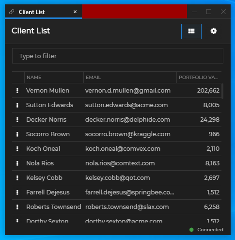
Global
The frame of an io.Connect Window (or a group of windows) is its outermost container - changing its thickness will change the visual width and height of the window (window group) without affecting the window content. The border of a window is the border of the actual app loaded inside the io.Connect Window and can be thought of as padding - if you increase the border size, the window content will shrink correspondingly.
⚠️ Note that io.Connect Windows with
"mode": "tab"and"mode": "flat"have borders and a frame, while windows with"mode": "html"only have a frame.
Setting the frame thickness and color of single io.Connect Windows:
{
    "properties": {
        "singleFrameThickness": 3,
        "frameColor": "#9c0000"
    }
}
The following example demonstrates how to set the window border size and color. For the purpose of conveying the difference between the window frame and the window border, the frame is also set:
{
    "properties": {
        "singleFrameThickness": 3,
        "frameColor": "#1e1e1e",
        "borderSize": 2,
        "borderColor": "#9c0000"
    }
}
It's possible to indicate visually that an io.Connect Window is on focus by setting thickness and color for a focus frame. For the focus frame to be visible in flat and tab windows, the border must not be set to 0. For the focus frame to be visible in HTML windows, both the border and the frame must not be set to 0. The following example demonstrates how to set the size and the color of the window focus frame:
{
    "properties": {
        "borderSize": 2,
        "focusFrameSize": 2,
        "focusFrameColor": "#9c0000"
    }
}
Setting the color of text in the io.Connect Window frame:
{
    "properties": {
        "textColor": "#9c0000"
    }
}
Setting the tooltip background and text color:
{
    "properties": {
        "tooltips": {
            "foregroundColor": "#ffffff",
            "backgroundColor": "#9c0000"
        }
    }
}
Setting the color of the sticky window edges:
{
    "properties": {
        "approachingEdgeColor": "#9c0000"
    }
}
Setting the background color of windows when loading:
{
    "properties": {
        "backgroundColor": "#9c0000"
    }
}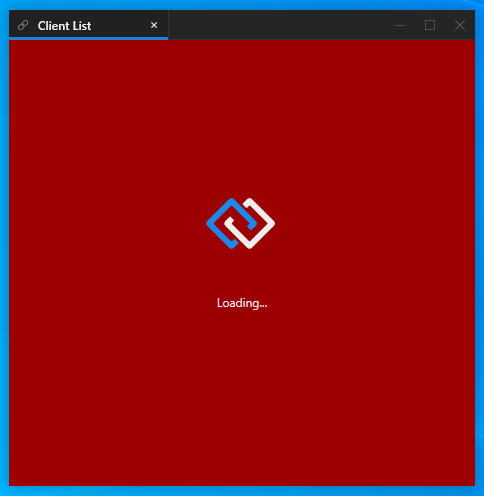
To set a custom loading animation for io.Connect Windows, specify a path to a XAML file - either absolute or relative to the <installation_location>/interop.io/io.Connect Desktop/Desktop/config folder:
{
    "properties": {
        "loadingAnimation": "../custom/spinner.xaml",
    }
}
Setting custom text, font, font size and text color for the io.Connect Window loader:
{
"properties": {
"loadingAnimation": "../custom/spinner.xaml",
"loadingText": "My custom loader text.",
"loadingTextFont": "Calibri",
"loadingTextFontSize": 20,
"loadingTextColor": "#eeeeee"
}
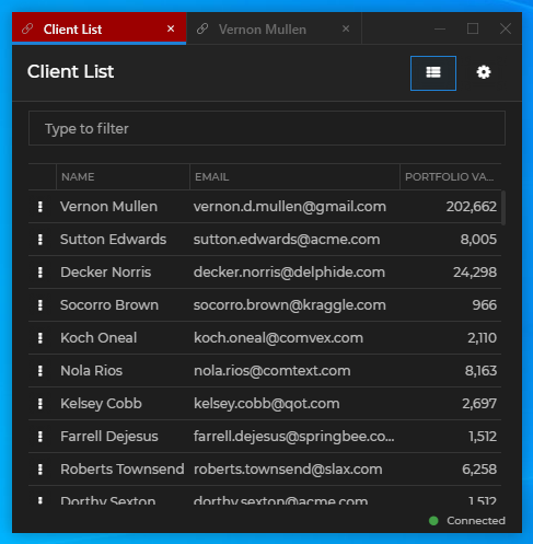
}Tab Windows
The theme properties for individual tab windows are located under the "tabs" key in the themes.json file.
Setting the color of the active tab:
{
    "properties": {
        "tabs": {
            "activeTabColor": "#9c0000"
        }
    }
}
Setting the color of inactive tabs:
{
    "properties": {
        "tabs": {
            "tabColor": "#9c0000"
        }
    }
}
Setting the color of tabs on hover:
{
    "properties": {
        "tabs": {
            "hoverTabColor": "#9c0000"
        }
    }
}
Setting the color of the tab header:
{
    "properties": {
        "tabs": {
            "headerColor": "#9c0000"
        }
    }
}
Setting the frame size and color of the active tab:
{
    "properties": {
        "tabs": {
            "activeTabFrameThickness": "0, 0, 1, 3",
            "activeTabFrameColors": "#343434, #343434, #9c0000, #9c0000"
        }
    }
}
Setting the size, color, hover color and tooltip of the tab "Close" button:
{
    "properties": {
        "tabs": {
            "tabCloseButtonSize": 10,
            "closeButton": {
                "color": "#696969",
                "hoverColor": "#9c0000",
                "tooltip": "Close the tab"
            }
        }
    }
}
Setting the hover foreground color of tab header buttons and the hover background color of the "Close" button:
{
    "properties": {
        "tabs": {
            "headerButtons": {
                "hoverForegroundColor": "#9c0000",
                "close": {
                    "hoverBackgroundColor": "#ffffff"
                }
            }
        }
    }
}
Setting the tooltips of the "Sticky" button and its foreground color when pressed and when hovered over in a pressed state:
{
    "properties": {
        "tabs": {
            "headerButtons": {
                "sticky": {
                    "pressedForegroundColor": "#9c0000",
                    "pressedHoverForegroundColor": "#ffffff",
                    "tooltip": "Turn on stickiness",
                    "pressedTooltip": "Turn off stickiness"
                }
            }
        }
    }
}
Window Groups
The theme properties for io.Connect Window groups are located under the "group" key in the themes.json file.
Setting the height of the group header and the font weight and size of the group title:
{
    "properties": {
        "group": {
            "titleFontWeight": "Bold",
            "titleSize": 14,
            "headerHeight": 20
        }
    }
}
Setting the size, hover foreground and background color of the buttons in the group header:
{
    "properties": {
        "group": {
            "buttons": {
                "iconSize": 12.0,
                "hoverForegroundColor": "#9c0000",
                 "close": {
                    "hoverBackgroundColor": "#ffffff"
                 }
            }
        }
    }
}
Setting a Windows taskbar icon and a title for the window group:
{
    "properties": {
        "group": {
            "icon": "custom-group-icon.ico",
            "title": "io.Connect Window Group"
        }
    }
}
⚠️ Note that the specified group icon file must be an ICO file and must be placed in the
<installation_location>/interop.io/io.Connect Desktop/Desktop/assets/imagesfolder.
Combining Windows Taskbar Icons
Available since io.Connect Desktop 9.9
When the user sticks two or more io.Connect web apps together to form a window group, the individual Windows taskbar icons are combined automatically into one icon representing the window group. The Windows taskbar icon used for window groups is customizable and you can use the same icon for the window groups as for any of your other apps.
To enable combining these icons in the Windows taskbar, use the "iconURL" property of the "group" object to provide the URL of the icon as specified in the definitions of your apps. This URL won't be used by the platform to retrieve the icon itself, but only to create an icon ID that the OS needs for grouping icons in the Windows taskbar. You still must provide the file name of the desired group icon by using the "icon" property of the "group" object and must make sure that your custom icon is present in the <installation_location>/interop.io/io.Connect Desktop/Desktop/assets/images folder.
To define an icon for your app, use the "icon" top-level key in the app definition file:
{
    "name": "my-app",
    "title": "My App",
    // Defining an icon for your app.
    "icon": "https://example.com/my-universal-icon.ico",
    "type": "window",
    "details": {
        "url": "https://example.com/my-app"
    }
}
To use the same icon as a Windows taskbar icon for window groups, place the icon file in the <installation_location>/interop.io/io.Connect Desktop/Desktop/assets/images folder and define the icon inside the "group" object for all available themes:
[
    {
        "name": "dark",
        "displayName": "Night",
        "properties": {
            "group": {
                "icon": "my-universal-icon.ico",
                "iconURL": "https://example.com/my-universal-icon.ico"
            }
        }
    }
    // Do this for all other available themes.
]
Now, all your apps and window groups that are using the same icon will be automatically combined in the Windows taskbar.
Tab Groups
Setting a Windows taskbar icon and a title for a tab group:
{
    "properties": {
        "group": {
            "tabGroupIcon": "tab-groups.ico",
            "tabGroupTitle": "io.Connect Tab Group"
        }
    }
}
⚠️ Note that the specified tab group icon file must be an ICO file and must be placed in the
<installation_location>/interop.io/io.Connect Desktop/Desktop/assets/imagesfolder.