
Modals
Overview
Available since io.Connect Desktop 9.9
The Modals API is accessible via the io.modals object.
Enabling Modals
To enable the Modals API in your apps, you must include and initialize the @interopio/modals-api library in your project. Initialize the @interopio/desktop library and pass the globally available IOModals() factory function to the libraries array of the configuration object. The IOModals() factory function, like the IODesktop() factory function, is injected in the global window object:
import IODesktop from "@interopio/desktop";
import IOModals from "@interopio/modals-api";

// Initializing the Modals API.
const config = {
    libraries: [IOModals]
};

const io = await IODesktop(config);

// Now you can access the Modals API via `io.modals`.
Alerts
The Alerts API is accessible via the io.modals.alerts object.
Displaying Alerts
To display an alert window, use the request() method and provide an AlertRequestConfig object as a required argument:
const alertOptions = {
    variant: "success",
    text: "Successfully initialized the Modals API!"
};

// Displaying an alert.
await io.modals.alerts.request(alertOptions);
It's required to specify the variant and text properties of the AlertRequestConfig object. The variant property accepts as a value "default", "success", "critical", "info", or "warning" and is used to define the alert style. The text property holds the text to be displayed in the alert.
Action on Click
To execute an action when the user clicks on an alert, use the clickInterop property of the AlertRequestConfig object. The clickInterop property accepts an InteropSettings object as a value which you can use to specify a name, arguments, and target for an already registered Interop method to invoke when the user clicks on the alert:
const alertSettings = {
    variant: "success",
    text: "Successfully initialized the Modals API!",
    // The specified Interop method will be invoked when the user clicks on the alert.
    clickInterop: {
        method: "MyInteropMethod"
    }
};

await io.modals.alerts.request(alertOptions);
Action on Close
To execute an action when the user closes an alert from its "Close" button, use the onCloseInterop property of the AlertRequestConfig object. The onCloseInterop property accepts an InteropSettings object as a value which you can use to specify a name, arguments, and target for an already registered Interop method to invoke when the user clicks on the alert:
const alertSettings = {
    variant: "success",
    text: "Successfully initialized the Modals API!",
    // The specified Interop method will be invoked when the user
    // closes the alert from the "Close" button.
    onCloseInterop: {
        method: "MyInteropMethod"
    }
};

await io.modals.alerts.request(alertOptions);
Action Buttons
To specify action buttons for your alert, use the actions property of the AlertRequestConfig object. The actions property accepts an array of Action objects describing the action buttons for the alert. It's required to provide an ID, a title, and an InteropSettings object for each action button:
const alertSettings = {
    variant: "success",
    text: "Successfully initialized the Modals API!",
    // Defining action buttons for the alert.
    actions: [
        {
            id: "my-action",
            title: "My Action",
            // The specified Interop method will be invoked when the user clicks on the action button.
            clickInterop: {
                method: "MyInteropMethod"
            }
        }
    ]
};

await io.modals.alerts.request(alertOptions);
Dialogs
The Dialogs API is accessible via the io.modals.dialogs object.
Displaying Dialogs
To display a dialog window, use the request() method and provide an DialogRequestConfig object as a required argument:
const dialogOptions = {
    templateName: "noInputsConfirmationDialog",
    variables: {
        title: "New Updates Available",
        heading: "Restart to update",
        text: "New updates are available for the io.Connect platform that require restart. Do you want to restart the platform now?",
        actionButtons: [
            { variant: "primary", text: "Restart", id: "restart" },
            { variant: "outline", text: "Remind me later", id: "remind-later" }
        ]
    }
};

// Displaying a dialog.
const response = await io.modals.dialogs.request(dialogOptions);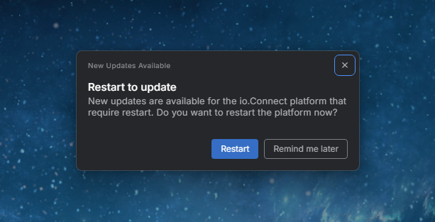
It's required to specify the templateName and variables properties of the DialogRequestConfig object.
The templateName property accepts as a value the name of any of the predefined io.Connect dialog templates ("noInputsConfirmationDialog", "singleCheckboxDialog", or "singleTextInputDialog").
The variables property accepts and object describing the variables expected by each predefined dialog template.
Dialog Response
The request() method for displaying a dialog resolves with a DialogResponse object which you can use to retrieve the details of the user interaction with the dialog and react accordingly. Depending on the content of your dialog, use this object to retrieve the input value, determine which dialog button was clicked, check whether the dialog was closed or whether the user pressed "Enter" without clicking a button, and more:
const dialogOptions = {
    templateName: "noInputsConfirmationDialog",
    variables: {
        title: "New Updates Available",
        heading: "Restart to update",
        text: "New updates are available for the io.Connect platform that require restart. Do you want to restart the platform now?",
        actionButtons: [
            { variant: "primary", text: "Restart", id: "restart" },
            { variant: "outline", text: "Remind me later", id: "remind-later" }
        ]
    }
};

const response = await io.modals.dialogs.request(dialogOptions);

// Determining the user interaction with the dialog.
const responseButtonID = response.responseButtonClicked?.id;

if (responseButtonID === "restart") {
    io.appManager.restart();
};

if (responseButtonID === "remind-later") {
    console.log("User postponed restart.");
};

if (response.isClosed) {
    console.log("User closed the dialog.");
};
Predefined Dialogs
The following predefined dialog templates are available:
| Template | Description |
|---|---|
"noInputsConfirmationDialog" |
Dialog that contains a heading, a title, text, and action buttons. |
"singleCheckboxDialog" |
Dialog that contains a heading, a title, text, action buttons, and a checkbox. |
"singleTextInputDialog" |
Dialog that contains a heading, a title, action buttons, and a text input field. |
No Inputs Confirmation Dialog
The "noInputsConfirmationDialog" dialog expects the following variables:
| Variable | Type | Description |
|---|---|---|
actionButtons |
object[] |
Required. List of action buttons to display in the dialog. |
heading |
string |
Required. Heading for the dialog. |
text |
string |
Required. Text for the dialog. |
title |
string |
Title for the dialog. |
Each object in the actionButtons array has the following properties:
| Property | Type | Description |
|---|---|---|
autofocus |
boolean |
If true, the button will be on focus. |
id |
string |
Required. ID for the button. |
text |
string |
Required. Text for the button. |
variant |
"default" | "primary" | "critical" | "outline" | "link" |
Required. Button variant. |
Single Checkbox Dialog
The "singleCheckboxDialog" dialog expects the following variables:
| Variable | Type | Description |
|---|---|---|
actionButtons |
object[] |
Required. List of action buttons to display in the dialog. |
checkbox |
object |
Required. Checkbox for the dialog. |
heading |
string |
Required. Heading for the dialog. |
text |
string |
Required. Text for the dialog. |
title |
string |
Title for the dialog. |
Each object in the actionButtons array has the following properties:
| Property | Type | Description |
|---|---|---|
autofocus |
boolean |
If true, the button will be on focus. |
id |
string |
Required. ID for the button. |
text |
string |
Required. Text for the button. |
variant |
"default" | "primary" | "critical" | "outline" | "link" |
Required. Button variant. |
The checkbox object has the following properties:
| Property | Type | Description |
|---|---|---|
id |
string |
Required. ID for the checkbox. |
initialValue |
boolean |
Initial value for the checkbox. |
label |
string |
Label for the checkbox. |
Single Text Input Dialog
The "singleTextInputDialog" dialog expects the following variables:
| Variable | Type | Description |
|---|---|---|
actionButtons |
object[] |
Required. List of action buttons to display in the dialog. |
heading |
string |
Required. Heading for the dialog. |
input |
object |
Required. Input for the dialog. |
title |
string |
Title for the dialog. |
Each object in the actionButtons array has the following properties:
| Property | Type | Description |
|---|---|---|
autofocus |
boolean |
If true, the button will be on focus. |
id |
string |
Required. ID for the button. |
text |
string |
Required. Text for the button. |
variant |
"default" | "primary" | "critical" | "outline" | "link" |
Required. Button variant. |
The input object has the following properties:
| Property | Type | Description |
|---|---|---|
id |
string |
Required. ID for the input. |
initialValue |
string |
Initial value for the input. |
label |
string |
Label for the input. |
placeholder |
string |
Placeholder text for the input. |
validation |
object |
Validation for the input. |
The validation object has the following properties:
| Property | Type | Description |
|---|---|---|
disabledButtonIds |
string[] |
Required. List of IDs of the buttons to be disabled until the validation procedure passes. |
errorMessage |
string |
Required. Errors message for incorrect user input. |
regex |
RegExp | string |
Required. Regular expression against which to match the user input. |