
Changelog
io.Connect Desktop 10.5
Release date: 09.10.2026
| Components | Version |
|---|---|
| Electron | 44.4.5 |
| Chromium | 152.0.7977.130 |
| Node.js | 24.21.0 |
The following libraries are bundled with io.Connect Desktop 10.5 and will be used for auto injection:
| Injected Library | Version |
|---|---|
@interopio/desktop |
6.23 |
@interopio/fdc3 |
2.11 |
Breaking Changes
Layout Sharing
The following breaking changes will affect your deployment only if the new Layout sharing is enabled:
Layout sharing must be enabled both in io.Connect Desktop and in io.Manager. If it's enabled in only one of them, or if the io.Manager version doesn't support it, io.Connect Desktop will display an error and won't start.
The existing Layouts stored in io.Manager will become available only after they have been migrated via the "Migrate legacy layouts" page available in the "Layouts" section of the io.Manager Admin UI, or via the
POST /advancedLayouts/migration/runendpoint of the io.Manager Server REST API. All io.Connect Desktop instances connected to io.Manager must be version 10.5 or later.The legacy Layouts API accessible via the
io.layoutsobject is unreliable - its methods for retrieving Layouts return empty arrays, its other methods (e.g., for saving, restoring, removing, and renaming Layouts) will throw errors, and its Layout events won't be raised. Apps must use the new Layouts API instead.ℹ️ For details on enabling Layout sharing in io.Manager, see the Configuration > Server > AdvancedLayoutsConfig section of the io.Manager documentation.
Window Drag & Click-Through Areas
Chromium 152 has promoted the
-webkit-app-regionCSS property to a standard CSS property. io.Connect Desktop preserves the previous behavior of the property - it still isn't inheritable, and thedrag,no-drag,transparent, andopaquevalues work as before.The only exception is the
nonevalue. Declaring-webkit-app-region: noneexplicitly on an element previously had no effect, but now marks the element as a solid, non-draggable area (the element will reportno-dragwhen inspected withgetComputedStyle()).The following table describes the changes in behavior when an element marked with
-webkit-app-region: noneis placed inside a transparent or a draggable parent area:
Parent Area Before Now Transparent The element used to be click-through. The element is now a solid, interactive area. Draggable The window could be dragged by the element. The window can't be dragged by the element. If this affects your apps, remove the explicit
-webkit-app-region: nonedeclarations from your styles. This will restore the previous behavior exactly.
io.Insights Request Instrumentation
The automatic tracing of
XMLHttpRequestandfetch()requests in web apps by io.Insights is now disabled by default. To enable it, set the"instrumentRequests"property of the"traces"object under the"otel"top-level key in thesystem.jsonsystem configuration file of io.Connect Desktop totrue:{ "otel": { "enabled": true, "traces": { "enabled": true, "instrumentRequests": true } } }When enabled, the request spans are now named by the HTTP request method (e.g.,
GET), according to the OpenTelemetry semantic conventions for HTTP client spans. To keep the previousinteropio.api.instrumentation.fetchandinteropio.api.instrumentation.xhrspan names, set the"spanNames"property of the"instrumentRequests"object to"product":{ "otel": { "enabled": true, "traces": { "enabled": true, "instrumentRequests": { "enabled": true, "spanNames": "product" } } } }The
"instrumentAppLoad"and"instrumentDocumentLoad"properties of the"traces"object have been deprecated. The app loading process is now traced automatically by the new app startup instrumentation, controlled by the"instrumentAppStartup"property.ℹ️ For more details, see the Configuration > io.Connect Desktop > Traces > Auto Instrumentation section of the io.Insights documentation.
Platform Styles
Due to the redesign of the Layouts panel in the Launchpad and overall improvement of the platform styles, the following CSS variables have been removed or replaced:
- Removed the CSS variables for the Layouts panel of the Launchpad:
--launchpad-layouts-check-icon-size,--launchpad-layouts-create-button-margin,--launchpad-layouts-header-height,--launchpad-layouts-header-padding,--launchpad-layouts-no-active-padding,--launchpad-layouts-separator-color,--launchpad-layouts-separator-margin,--launchpad-layouts-separator-size, and--launchpad-layouts-wrapper-margin. Use the new CSS variables for the Layouts footer instead.- Removed the
--launchpad-section-item-actions-desktop-gap,--launchpad-section-item-actions-margin, and--launchpad-section-item-actions-mobile-gapCSS variables.- Removed the
--workspace-popup-wsp-separatorCSS variable.- Replaced the
--workspace-popup-app-padding,--workspace-popup-wsp-title-lh, and--workspace-popup-wsp-title-paddingCSS variables with new CSS variables for the Workspace dialogs and popups.- Replaced the
--workspace-settings-h-paddingand--workspace-settings-v-paddingCSS variables with new CSS variables for the Workspace Settings panel.These changes affect the default Launchpad and Workspaces App of io.Connect Desktop, as well as custom ones that use
@interopio/components-react5.0 or later and@interopio/workspaces-ui-react5.0 or later respectively.
New Features
Layout Sharing
It's now possible for users to share Global and Workspace Layouts with other users and groups via io.Manager. Users can publish their Layouts and Workspaces with view or edit permissions, save private copies of shared and public Layouts, and organize them in folders.
The following demonstrates using the Launchpad and the Workspace tab menu UI options for publishing and managing Global and Workspace Layouts:
In io.Manager, Layouts are classified as private, shared, or public:
- Private Layouts are available only to their owner.
- Shared Layouts are available to their owner and to the users and groups with which they have been shared with view or edit permissions. Publishing a private Layout from the Launchpad or the Workspaces App creates a shared Layout.
- Public Layouts are available to all users and can be edited by their owner and by the users and groups that have been granted edit permissions for them in io.Manager. Public Layouts can't be created from the Launchpad or the Workspaces App - they can be created only via io.Manager or by apps using the new Layouts API.
The Launchpad and the Workspaces App don't distinguish between shared and public Layouts. The Launchpad displays both shared and public Layouts in the "Public" section. The Workspaces App marks shared and public Layouts as "Public Workspace".
⚠️ Note that, currently, the access to a public Layout can be restricted by adding users and groups with view permissions to it from the Launchpad or the Workspaces App. This converts the public Layout to a shared Layout in io.Manager. In io.Connect Desktop 10.6, this will be improved - public Layouts will always be available to all users, and it will be possible to add only users and groups with edit permissions to them.
The following table describes the different types of Layout sharing entities and their permissions:
Entity Permissions Owner Can restore the Layout, save changes to it, change its name, folder, icon, and description, change the users and groups with access to it and their permissions, and delete it for all users. The owner of a Layout can be changed only via io.Manager. Editor Users and groups with edit permissions for the Layout. Can restore the Layout, save changes to it, change its name, folder, icon, and description, change the users and groups with access to it and their permissions, and delete it for all users. Viewer Users and groups with view permissions for the Layout. Can restore the Layout and save a private copy of it, but don't have edit permissions - can't save changes to it, change its name, folder, icon, description, or the users and groups with access to it. Owners, editors, and viewers see different options in the Launchpad and the Workspaces App based on their permissions.
When Layout sharing is disabled, Layouts are identified by their name and type, as in previous versions. When Layout sharing is enabled, Layouts are identified by unique IDs. The name of a private Layout must be unique only among the private Layouts of the same type of its owner, while the name of a shared or a public Layout must be unique among all shared and public Layouts of the same type. This means that a user can have a private and a shared Layout with the same name, but publishing a Layout will fail if a shared or a public Layout with the same name and type already exists.
The protocol handler options for restoring Layouts and Workspaces now also accept Layout IDs.
Requirements
Layout sharing has the following requirements:
io.Manager 4.0 or later must be used as a Layout store. In the
system.jsonsystem configuration file of io.Connect Desktop, the"enabled"property of the"server"top-level key must be set totrueand the"layoutsStore"property of the"features"object must not be set tofalse(defaults totrue).Layout sharing (advanced Layouts) must be enabled both in io.Connect Desktop and in io.Manager. If it's enabled in only one of them, or if the io.Manager version doesn't support it, io.Connect Desktop will display an error and won't start.
All io.Connect Desktop instances connected to io.Manager must be version 10.5 or later. When Layout sharing is enabled in io.Manager, it provides only advanced Layouts to the platforms and rejects changes to legacy Layouts. The existing Layouts stored in io.Manager will become available as advanced Layouts only after they have been migrated via the "Migrate legacy layouts" page available in the "Layouts" section of the io.Manager Admin UI, or via the
POST /advancedLayouts/migration/runendpoint of the io.Manager Server REST API.Apps must use the new Layouts API available in
@interopio/desktop6.23 or later. When Layout sharing is enabled, the legacy Layouts API is unreliable - its methods for retrieving Layouts return empty arrays, its other methods (e.g., for saving, restoring, removing, and renaming Layouts) will throw errors, and its Layout events won't be raised. When Layout sharing is disabled, both Layouts APIs can be used simultaneously with all Layout stores.Custom Workspaces Apps must use
@interopio/workspaces-ui-react5.0 or later, and custom Launchpad apps must use@interopio/components-react5.0 or later in order to provide the Layout sharing options.Configuration
To enable Layout sharing, use the
"advancedLayouts"property of the"server"top-level key in thesystem.jsonsystem configuration file of io.Connect Desktop:{ "server": { "enabled": true, "url": "https://my-io-manager.com/api", "advancedLayouts": { "enabled": true } } }The
"advancedLayouts"object has the following properties:
Property Type Description "enabled"booleanIf true, will enable Layout sharing. Defaults tofalse.To enable Layout sharing in io.Manager, set the
enabledproperty of theadvancedLayoutsobject in the configuration object for initializing the io.Manager Server totrue, or set theAPI_ADVANCED_LAYOUTS_ENABLEDenvironment variable totrue.ℹ️ For more details, see the Configuration > Server > Configuration Object and Configuration > Server > Environment Variables sections of the io.Manager documentation.
The Layouts are refreshed from io.Manager at the interval specified in the
"fetchInterval"property of the"server"top-level key in thesystem.jsonsystem configuration file of io.Connect Desktop. The default value of"fetchInterval"is30seconds and it's not recommended to set it below this.Launchpad & Workspaces App
When Layout sharing is enabled, the "Layouts" and "Workspaces" sections of the redesigned Launchpad are divided into "Public" and "Private" sections. The "Public" section contains the public Layouts and the shared Layouts that have been published by you or shared with you. Layouts with a specified folder are grouped in folders.
The context menus of the Global and Workspace Layout items have been extended with the following options:
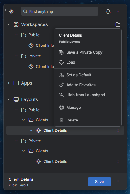
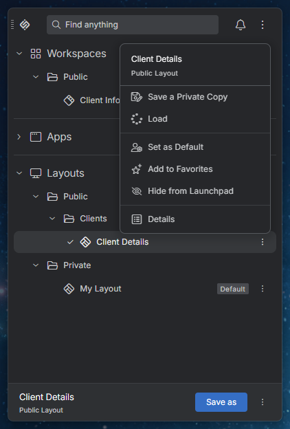
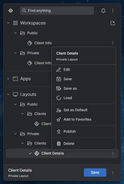
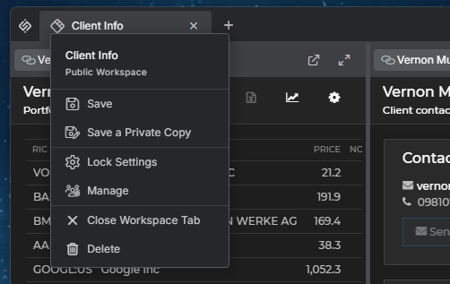
Option Description "Details" Available for shared and public Layouts to their viewers. Shows the details for the Layout. "Edit" Available for private Layouts to their owner. Allows changing the name, folder, icon, and description of the Layout. "Hide from Launchpad" / "Show in Launchpad" Available for shared and public Layouts to their owner, editors, and viewers. Hides or shows the Layout in the Launchpad. To see the hidden Layouts, enable the "Show hidden Layouts and Workspaces" setting in the "Layouts" section of the Platform Preferences panel. "Manage" Available for shared and public Layouts to their owner and editors. Allows changing the users and groups with access to the Layout, as well as its name, folder, icon, and description. Adding users or groups to a public Layout makes it a shared Layout in io.Manager. "Publish" Available for private Layouts to their owner. Allows sharing the Layout with the selected users and groups with view or edit permissions. Select the "Keep a private copy" option to keep your private Layout and publish a shared copy of it. "Save a Private Copy" Available for shared and public Layouts to their owner, editors, and viewers. Saves a copy of the Layout as a private one. When Layout sharing is enabled, the Workspace tab menu shows whether the Workspace is private or public and provides the following additional options:
Option Description "Details" Available for shared and public Workspaces to their viewers. Shows the details for the Workspace Layout. "Manage" Available for shared and public Workspaces to their owner and editors. Allows changing the users and groups with access to the Workspace Layout, as well as its name, folder, icon, and description. "Publish" Available for private Workspaces to their owner. Allows sharing the Workspace Layout with the selected users and groups with view or edit permissions. Select the "Keep a private copy" option to keep your private Workspace Layout and publish a shared copy of it. "Save a Private Copy" Available for shared and public Workspaces to their owner, editors, and viewers. Saves a copy of the Workspace Layout as a private one. The "Rename" and "Save As" options are available only for private Workspaces, while the "Save" and "Delete" options are available for private Workspaces and for public Workspaces you can edit.
Owners and editors have the following options available in the Launchpad for working with shared and public Global and Workspace Layouts:
Viewers have the following options available in the Launchpad for working with shared and public Global and Workspace Layouts:
Owners have the following options available in the Launchpad for working with private Global and Workspace Layouts:
Layouts API
A new fully asynchronous Layouts API accessible via the
io.layouts.v2object has been introduced. It identifies Layouts by ID and supports sharing Layouts. The existing Layouts API accessible via theio.layoutsobject is now considered a legacy API.The new Layouts API doesn't require any configuration. It's available automatically when the Layouts API is enabled in the
@interopio/desktoplibrary (the default) and works with all Layout stores, regardless of whether Layout sharing is enabled.⚠️ Note that the new Layouts API is designed to replace the legacy Layouts API. The legacy Layouts API is still supported, but will be entirely removed in a future release. It's highly recommended to migrate to the new Layouts API.
The following example demonstrates retrieving all Global Layouts with their context, finding a Layout by a value in its context, and restoring it by using the new Layouts API:
const options = { type: "Global", includeContext: true };

const layouts = await io.layouts.v2.getMany(options);
const layout = layouts.find(layout => layout.context?.clientId === 42);

// Layouts are identified by their `id` property.
await io.layouts.v2.restore(layout);
When Layout sharing is enabled, the
advancedLayoutsSupportedproperty of the API istrueand you can control the access to a Layout by using theupdateAccess()method, or theaccessInfoproperty of the options object for thesave()method:const isLayoutSharingSupported = io.layouts.v2.advancedLayoutsSupported; if (isLayoutSharingSupported) { // Retrieving the currently active Layout. const currentLayout = await io.layouts.v2.current.get(); const layoutId = { id: currentLayout.layout.id }; const accessInfo = { accessLevel: "shared", accessEntities: [ { entityType: "group", entityName: "Traders", accessLevel: "view" }, { entityType: "user", entityName: "john.doe", accessLevel: "edit" } ] }; await io.layouts.v2.updateAccess(layoutId, accessInfo); }⚠️ Note that when Layout sharing is enabled, the legacy Layouts API accessible via the
io.layoutsobject is unreliable and you must use the new Layouts API instead.ℹ️ For more details on using the new Layouts API, see the Capabilities > Windows > Layouts section.
Launchpad Redesign
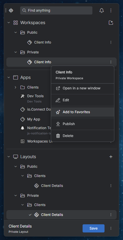
The Launchpad has been redesigned - the Global Layouts are now listed in a Layouts section similarly to apps and Workspaces instead of in a separate panel in the Launchpad. The Layouts section is always rendered after all default and custom sections and can't be hidden or repositioned. The currently active Global Layout is displayed in a footer at the bottom of the Launchpad.
Favorites are now added and removed via the context menu for each section item instead of via a dedicated button in the item list. Global Layouts can now also be added to the favorite items.
The buttons for creating a new Workspace and a new Global Layout are now located in the headers of the Workspaces and Layouts sections respectively.
ℹ️ For details on customizing the Launchpad sections and the Layouts footer, see the Developers > Platform Styles > Launchpad > Sections and Developers > Platform Styles > Launchpad > Layouts Footer sections respectively.
Launchpad Component
The io.Connect Launchpad is now available as a standalone React component that you can use to create a custom launcher for io.Connect Desktop. The
<Launchpad />component is provided by theIOLaunchpadDesktopobject of the@interopio/components-reactlibrary. This is the same component used by the default Launchpad of io.Connect Desktop.To get started quickly, use the Launchpad template built with the
<Launchpad />component. The template is also available as thelaunchpadtemplate app of the io.Connect seed project.The
<Launchpad />component renders a fully functional Launchpad without any additional configuration. Use itscomponentsprop to replace the default components in the areas before and after the search bar of the Launchpad. The default components (<DragHandle />,<LogoButton />,<ExtendedArea />,<NotificationsButton />, and<MainContextMenu />) are also exported, so you can compose them with your own components.The following example demonstrates creating a custom Launchpad with a custom logo and without the button for opening the Notification Panel:
import {
    ThemeProvider,
    PlatformPrefsProvider,
    IOActivePanelRenderer,
    IODownloadManager,
    IOLaunchpadDesktop,
    IONotifications
} from "@interopio/components-react";

const { PanelManagerProvider } = IOActivePanelRenderer;
const { DownloadManagerProvider } = IODownloadManager;
const { NotificationsProvider } = IONotifications;
const {
    LaunchpadProvider,
    LaunchpadBodyPopupProvider,
    PanelPopupProvider,
    Launchpad,
    DragHandle,
    LogoButton,
    ExtendedArea,
    MainContextMenu
} = IOLaunchpadDesktop;

// Components before the search bar.
const BeforeSearch = () => (
    <>
        <DragHandle />
        <LogoButton iconSrc="./my-logo.png" />
    </>
);

// Components after the search bar.
const AfterSearch = () => (
    <>
        <ExtendedArea />
        <MainContextMenu />
    </>
);

// Define the components outside the render function to prevent unnecessary re-mounting.
const components = { header: { BeforeSearch, AfterSearch } };

const MyLaunchpad = () => {
    return (
        <ThemeProvider>
            <PlatformPrefsProvider>
                <NotificationsProvider>
                    <DownloadManagerProvider>
                        <PanelManagerProvider>
                            <LaunchpadProvider>
                                <LaunchpadBodyPopupProvider>
                                    <PanelPopupProvider>
                                        <Launchpad components={components} />
                                    </PanelPopupProvider>
                                </LaunchpadBodyPopupProvider>
                            </LaunchpadProvider>
                        </PanelManagerProvider>
                    </DownloadManagerProvider>
                </NotificationsProvider>
            </PlatformPrefsProvider>
        </ThemeProvider>
    );
};

export default MyLaunchpad;
The Launchpad must be rendered within the
<IOConnectProvider />component of the io.Connect React Hooks library and the required CSS files must be imported. For a complete setup, see the Launchpad template.After implementing your custom Launchpad, you must create an app definition for it and configure io.Connect Desktop to use it instead of the default Launchpad. For more details, see the Capabilities > Launchers > Custom Launcher > Configuration section.
⚠️ Note that the
IOLaunchpadDesktopobject is available as of@interopio/components-react4.6. To provide the Layout sharing options in your custom Launchpad, you must use@interopio/components-react5.0 or later and@interopio/desktop6.23 or later.
Placeholder App
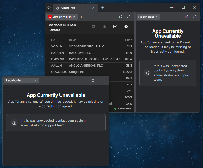
When a Global Layout or a Workspace is restored, some of the apps saved in it may no longer be available - e.g., if the user permissions have changed, or if the app definitions have been removed or renamed. It's now possible to display a placeholder app instead of each missing app. The placeholder app informs the user which app couldn't be loaded, occupies the position of the missing app, and preserves the structure of the window groups and Workspaces.
To enable the placeholder app, use the
"placeholderApp"property of the"windows"top-level key in thesystem.jsonsystem configuration file of io.Connect Desktop:{ "windows": { "placeholderApp": { "enabled": true } } }The placeholder app replaces missing apps of type
"window"in window groups and in Workspaces. It also replaces the Workspaces App itself when a Global Layout containing it is restored and the app definition of the Workspaces App is missing.When a Layout containing a placeholder app is saved, the original app is saved in it with its latest position and state, and with its original URL, context, and Channel. When the original app becomes available again, it will be restored instead of the placeholder app.
The placeholder app is a built-in app named
"io-connect-placeholder-app". To use a custom placeholder app, create an app definition for it with the same name and add it to any of the app stores of io.Connect Desktop. Your app definition will replace the default one:{ "name": "io-connect-placeholder-app", "title": "My Placeholder App", "type": "window", "allowMultiple": true, "hidden": true, "details": { "url": "https://my-placeholder-app.com" } }The name and the context of the missing app are available in the
originalAppproperty of the window context of the placeholder app.Customizing the Placeholder App
The components of the default placeholder app are available via the
IOPlaceholderAppobject of the@interopio/components-reactlibrary. Use its<PlaceholderAppPage />component to build a custom placeholder app. You can replace or remove the<Header />and<SupportPanel />components of the page via thecomponentsproperty. Use theusePlaceholderAppStartupContext()hook to retrieve the details about the missing app.The following example demonstrates creating a placeholder app with a custom header and without the support panel:
import { IOConnectProvider } from "@interopio/react-hooks";
import IODesktop from "@interopio/desktop";
import { IOPlaceholderApp, ThemeProvider } from "@interopio/components-react";
import "@interopio/components-react/dist/styles/features/placeholder-app/styles.css";

const { PlaceholderAppPage, Header, usePlaceholderAppStartupContext } = IOPlaceholderApp;

// Custom header showing the name of the missing app.
const CustomHeader = () => {
    const appName = usePlaceholderAppStartupContext()?.originalApp?.name ?? "The app";

    return <Header title="App Unavailable" message={`${appName} isn't available. Please, contact your administrator.`} />;
};

const App = () => {
    return (
        <IOConnectProvider settings={{ desktop: { factory: IODesktop } }}>
            <ThemeProvider>
                <PlaceholderAppPage components={{ Header: CustomHeader, SupportPanel: undefined }} />
            </ThemeProvider>
        </IOConnectProvider>
    );
};

export default App;
ℹ️ For details on customizing the styles of the placeholder app, see the Developers > Platform Styles > Placeholder App section.
⚠️ Note that the
IOPlaceholderAppobject is available as of@interopio/components-react5.0.
Print Preview
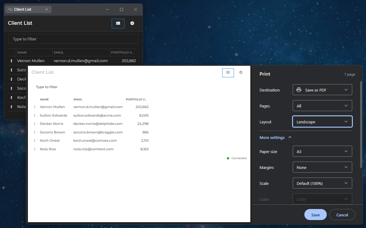
It's now possible to use a built-in print preview in io.Connect Windows. When enabled, pressing
CTRL + P(CMD + Pon macOS) opens the print preview as a modal window. It shows the pages to be printed and allows the user to select a destination (a printer or saving as a PDF file) and change the print settings. PressingCTRL + SHIFT + P(CMD + SHIFT + Pon macOS) opens the OS print dialog.
To enable the print preview globally, use the
"printPreview"property of the"windows"top-level key in thesystem.jsonsystem configuration file of io.Connect Desktop. To enable it per app, use the"printPreview"property of the"details"top-level key in the app definition:{ "windows": { "printPreview": { "enabled": true } } }The
"printPreview"object has the following properties:
Property Type Description "enabled"booleanIf true, pressingCTRL + Pwill open the print preview. Defaults tofalse."height"numberHeight in pixels for the print preview window. Defaults to 1190."width"numberWidth in pixels for the print preview window. Defaults to 1180.⚠️ Note that when the print preview is enabled, it takes precedence over the
"print"and"printToPdfSettings"settings. The print preview can be opened only with the keyboard shortcut - callingwindow.print()programmatically won't open it.
Tab Overflow for Workspaces
It's now possible to enable tab overflow for Workspaces. When there isn't enough space to display all Workspace tabs in the Workspaces App header, the Workspace tabs shrink to a minimum width and then become scrollable. A "More Workspaces" button appears in the header, allowing users to select or close any of the Workspaces whose tabs are out of view to the left and to the right of the visible Workspace tabs.
By default, tab overflow for Workspaces is disabled. To enable it, set the
"workspaceTabsOverflow"property of the"details"top-level key in the app definition of the Workspaces App totrue:{ "details": { "workspaceTabsOverflow": true } }ℹ️ For details on customizing the tab overflow for Workspaces, see the Developers > Platform Styles > Workspaces > Tab Overflow section.
The
@interopio/workspaces-ui-reactlibrary provides a default Workspace Tabs Overflow component and a default "More Workspaces" button, which are available as the<WorkspaceTabsOverflowPopup />and<WorkspaceTabsOverflowButton />components. You can reuse them in your custom Workspaces App, or replace the default Workspace Tabs Overflow component entirely.The "More Workspaces" button is part of the System Buttons component. If you replace the System Buttons component, use the
<WorkspaceTabsOverflowButton />component and pass it theworkspaceTabsOverflowprop of the System Buttons component in order to preserve the "More Workspaces" button:import Workspaces, { WorkspaceTabsOverflowButton, MinimizeFrameButton, MaximizeFrameButton, CloseFrameButton } from "@interopio/workspaces-ui-react"; import CustomButton from "./CustomButton"; const CustomSystemButtons = ({ workspaceTabsOverflow }) => { return ( <> {/* Preserves the default "More Workspaces" button for tab overflow. */} <WorkspaceTabsOverflowButton {...workspaceTabsOverflow} /> <CustomButton /> <MinimizeFrameButton /> <MaximizeFrameButton /> <CloseFrameButton /> </> ); }; const App = () => { return ( <Workspaces components={{ header: { SystemButtonsComponent: CustomSystemButtons } }} /> ); }; export default App;To replace the default Workspace Tabs Overflow component, use the
WorkspaceTabsOverflowComponentproperty of thepopupsobject within thecomponentsprop of the<Workspaces />component. The custom component receives the lists of Workspaces whose tabs are out of view to the left and to the right of the visible tabs, as well as functions for selecting and closing a Workspace.The following example demonstrates a reference implementation of the Workspace Tabs Overflow component that lists all Workspaces whose tabs are out of view:
const MyTabsOverflowPopup = ({ hiddenTabsToTheLeft, hiddenTabsToTheRight, onSelectWorkspace, onCloseWorkspace }) => {
    const hiddenTabs = [...hiddenTabsToTheLeft, ...hiddenTabsToTheRight];

    return (
        <ul>
            {hiddenTabs.map(({ id, title }) => (
                <li key={id}>
                    <span onClick={() => onSelectWorkspace(id)}>{title}</span>
                    <button onClick={() => onCloseWorkspace(id)}>Close</button>
                </li>
            ))}
        </ul>
    );
};

export default MyTabsOverflowPopup;
The following example demonstrates how to replace the default Workspace Tabs Overflow component with your custom component:
import Workspaces from "@interopio/workspaces-ui-react";
import MyTabsOverflowPopup from "./MyTabsOverflowPopup";

const App = () => {
    return (
        <Workspaces
            components={{
                popups: {
                    WorkspaceTabsOverflowComponent: MyTabsOverflowPopup
                }
            }}
        />
    );
};

export default App;
⚠️ Note that custom Workspaces Apps must use
@interopio/workspaces-ui-react5.0 or later in order to support tab overflow for Workspaces.
Workspace Tab Menu
The Workspace tab menu has been redesigned and now displays the name of the Workspace Layout. The "Save" option now saves the Workspace in its current Layout, while the new "Save As" option saves it under a new name. The new "Rename" and "Delete" options allow users to rename and delete the Workspace Layout. The "Settings" option has been renamed to "Lock Settings". When Layout sharing is enabled, the Workspace tab menu provides additional options for sharing the Workspace Layout.
ℹ️ For details on customizing the Workspace tab menu, see the Developers > Platform Styles > Workspaces > Dialogs & Popups > General section.
⚠️ Note that custom Workspaces Apps must use
@interopio/workspaces-ui-react5.0 or later in order to provide the redesigned Workspace tab menu.
App Restrictions for Workspaces
You can now restrict the apps that users can add to a Workspace via the "Add Apps" popup of the Workspaces App, as well as the apps whose windows users can drag and drop in the Workspace.
To define app restrictions for a Workspace, use the
appRestrictionsproperty of theWorkspaceConfigobject. You can use theappRestrictionsproperty in theconfigobject of theWorkspaceDefinitionobject when creating a new Workspace, as well as in theconfigobject under thestateobject inside thecomponentsarray of theWorkspaceLayoutobject when defining a Workspace Layout statically.The
appRestrictionsproperty accepts anAppRestrictionsobject in which you can specify rules for individual apps and a default rule for all apps. The rules for individual apps will override the default rule. Each rule may have the following properties:
Property Type Description allowDropbooleanIf true(default), users will be able to drag and drop windows of the app in the Workspace.allowInApplicationPopupbooleanIf true(default), the app will be listed in the "Add Apps" popup of the Workspace.The following example demonstrates defining app restrictions when creating a Workspace:
const definition = {
    children: [
        {
            type: "group",
            children: [
                {
                    type: "window",
                    appName: "client-list"
                }
            ]
        }
    ],
    config: {
        title: "My Workspace",
        appRestrictions: {
            // Rules for individual apps that will override the default rule.
            apps: [
                { appName: "client-portfolio", allowInApplicationPopup: true, allowDrop: true }
            ],
            // Default rule for all apps.
            default: { allowInApplicationPopup: false, allowDrop: false }
        }
    }
};

const workspace = await io.workspaces.createWorkspace(definition);
The app restrictions details for a Workspace are available via the
appRestrictionsproperty of theWorkspaceandWorkspaceSummaryobjects when retrieving information about a Workspace.⚠️ Note that app restrictions for Workspaces require
@interopio/workspaces-api5.0 or later. Custom Workspaces Apps must use@interopio/workspaces-ui-react5.0 or later in order to apply the restrictions in the "Add Apps" popup.
Copying Cookies Between Browser Sessions
The Cookies API has been extended with a
copy()method for copying cookies, includingHttpOnlyones, between the default browser session and the isolated browser sessions of apps. This allows you, for instance, to transfer a token refreshed in an isolated browser session to the default browser session.The following example demonstrates copying the cookies for a domain from an isolated browser session to the default one:
const options = {
    from: { partition: "persist:my-app" },
    to: "default",
    domains: ["login.example.com"]
};

await io.cookies.copy(options);
The object passed to the
copy()method has the following properties:
Property Type Description domainsstring[]Required. Domains whose cookies to copy. Each value matches the specified domain and its subdomains. from"default"|objectRequired. Browser session from which to copy the cookies. Set to "default"for the default browser session, or to an object with apartitionproperty for an isolated browser session.to"default"|objectRequired. Browser session to which to copy the cookies. Set to "default"for the default browser session, or to an object with apartitionproperty for an isolated browser session.The
copy()method is also available via thecookiesproperty of theiodesktopobject injected in the globalwindowobject.⚠️ Note that cookies with the same name, domain, and path in the target browser session are overwritten, regardless of which value is newer.
Updating Interop Methods
It's now possible to update the properties of an already registered Interop method by using the
updateMethod()method of the Interop API. Pass the name of the method and an object with the properties to update. Omitted properties will retain their current values:const methodName = "MyMethod"; const update = { displayName: "My Method", description: "Calculates the sum of two numbers.", version: 2 }; await io.interop.updateMethod(methodName, update);You can update the
displayName,description,objectTypes,version, andflagsproperties of the method. Theflagsobject will be replaced entirely. Interop streams can't be updated.To get notified when an app updates the properties of an Interop method it offers, use the
serverMethodUpdated()method:const handler = ({ server, method }) => { console.log(`Interop server "${server.application}" has updated method "${method.name}".`); }; io.interop.serverMethodUpdated(handler);
Search Keywords & Approximate Matching
The default search provider of io.Connect Desktop now matches the individual keywords in the search query. An item is returned only if all keywords are matched, and each keyword can match any part of a word (e.g.,
"cli port"and"ie folio"will both find "Client Portfolio"). Items matching the entire query are ranked first.To return results even when the search query contains minor typos, set the
"approximateMatching"property of the"searchProvider"top-level key in thesystem.jsonsystem configuration file of io.Connect Desktop totrue:{ "searchProvider": { "approximateMatching": true } }
Applications View
The Applications View accessible from the tray menu of io.Connect Desktop has been updated:
- A new "Recover" action is available for each app. It ends the process of an unresponsive app, displays an error page in the app window, and creates a crash dump that can be collected by the Feedback Form for investigation if the user chooses to submit a report. The unsaved app data will be lost, and any other windows sharing the same process will be affected too.
- The platform windows and processes are listed in a separate collapsible "Platform" section.
To open the Applications View programmatically, invoke the
"T42.GD.Execute"Interop method with an"open-utility-page"command:const methodName = "T42.GD.Execute"; const args = { command: "open-utility-page", args: { name: "applications" } }; await io.interop.invoke(methodName, args);⚠️ Note that the "Recover" action is designed for unresponsive apps. Using it on a Workspaces App or a Web Group App may close it or leave it unresponsive, and depending on the platform mode, the app windows in it may also be closed or remain open. The handling of Workspaces Apps and Web Group Apps will be improved in io.Connect Desktop 10.6.
io.Insights
Per-App Configuration
It's now possible to override the io.Insights platform settings for specific apps by using the
"insights"top-level key in the app definition. It accepts the same properties as the"otel"top-level key in thesystem.jsonfile of io.Connect Desktop and they are merged with the platform settings:{ "name": "my-app", "insights": { "serviceName": "my-app-service", "additionalAttributes": { "team": "trading" }, "traces": { "clickstream": true } } }Starting New User Journey & Clickstream Traces
The
userJourneyMarker()andclickstreamMarker()methods now accept an optional third Boolean argument. Iftrue, the marker span will start a new User Journey or Clickstream trace and the subsequent spans will be nested under it:io.insights.traces.userJourneyMarker("myApp.newSession", data, true);Request Metrics
The
"instrumentRequests"property of the"traces"object under the"otel"top-level key now accepts an object with settings, which allows you to publish metrics for theXMLHttpRequestandfetch()requests in your apps:{ "otel": { "traces": { "instrumentRequests": { "enabled": true, "requestTotalDurationMetric": true, "responseBytesMetric": true } } } }The following metrics can be enabled:
Property Metric Description "requestBodyDownloadDurationMetric"io.insights.http.client.response.download.durationTime from receiving the response headers until the response body is fully received. "requestBodyDownloadThroughputMetric"io.insights.http.client.response.download.throughputDownload throughput of the response body in bytes per second. "requestBytesMetric"http.client.request.body.sizeSize of the request body. "requestFirstByteDurationMetric"io.insights.http.client.request.ttfb.durationTime from sending the request until receiving the response headers. "requestTotalDurationMetric"http.client.request.durationTime from sending the request until the response body is fully received. "responseBytesMetric"http.client.response.body.sizeSize of the response body. The
"requestFirstByteDurationMetric"metric is recorded for every request, including failed ones, so you can use its sample count to measure the number of requests. The"requestTotalDurationMetric","requestBodyDownloadDurationMetric", and"requestBodyDownloadThroughputMetric"metrics are recorded only for successful requests whose response body has been fully received.The
"instrumentRequests"object also has the following new properties:
Property Description "platform"If true, the HTTP requests made by io.Connect Desktop itself will also be traced and the enabled metrics will be published for them. Defaults tofalse."trace"If false, only the enabled metrics will be published, without publishing spans for the requests. Defaults totrue.Tracking Events Before Initialization
io.Insights can now capture requests, errors, and WebSocket connections that occur in your app before the
@interopio/desktoplibrary has been initialized, and publish them after the initialization. To enable this, add theinsights-early.jspreload script distributed with io.Connect Desktop to the app definition and enable the respective instrumentation:{ "details": { "preloadScripts": [ "file://%GDDIR%/assets/preloads/insights-early.js" ] } }Auto Instrumentation
The following new properties of the
"traces"object under the"otel"top-level key are available for auto instrumentation of web apps:
Property Description "instrumentAppStartup"If true(default), the app startup will be traced automatically, including the document loading phases, the slowest resource loads, and Web Vitals."instrumentErrors"If true, uncaught errors and unhandledPromiserejections will be published as spans. Defaults tofalse."instrumentEventLoop"If true, slow input events and long tasks blocking the main thread will be published as spans. Defaults tofalse."instrumentNavigation"If true, in-page navigations will be published as spans. Defaults tofalse."instrumentResources"If true, resource loads (scripts, stylesheets, images, fonts) will be published as spans. Defaults tofalse."instrumentWebSockets"If true, WebSocket connections, including the connection to the io.Connect Gateway, will be published as spans. Defaults tofalse."instrumentWebVitals"If true, the CLS, INP, and LCP Web Vitals for the session will be published as spans. Defaults tofalse.App Window Startup Spans
The app startup traces published by io.Connect Desktop now contain additional spans for the phases of creating an app window - e.g., creating the window and its host, starting to load the app, and waiting for the window to be shown. Use these spans to determine how much time each phase takes when the user opens an app.
The following spans are nested under the
interopio.desktop.app.startspan of the app:
Span Description interopio.desktop.app.start.browserWindowHost.createBrowserWindowCoreCreating the Electron browser window and the web contents of the app. interopio.desktop.app.start.browserWindowHost.initCoreInitializing the browser window hosting the app. interopio.desktop.app.start.createHostCreating and initializing the host of the app window. interopio.desktop.app.start.startLoadingStarting to load the app. interopio.desktop.app.start.stickyBrowserViewInitInitializing the view hosting the app (on macOS). interopio.desktop.app.start.stickyBrowserWindow.startLoadingShowing the window and starting to load the app (on Windows). interopio.desktop.app.start.stickyBrowserWindow.waitForShownWaiting for the window to be shown (on Windows). Window Event Spans
The events of io.Connect Windows and the events of their web content are now also available as spans. These spans are disabled by default, because their main purpose is to be used for low-level debugging.
To enable them, use the
"filters"property of the"traces"object under the"otel"top-level key:{ "otel": { "traces": { "filters": [ { "source": "interopio.desktop.events", "enabled": true } ] } } }The window event spans are named
interopio.desktop.events.bw.<event-name>, where<event-name>is the name of the window event (e.g.,interopio.desktop.events.bw.FocusChanged,interopio.desktop.events.bw.BoundsChanged) or of an internal window lifecycle event (e.g.,interopio.desktop.events.bw.on-desktop-client-ready,interopio.desktop.events.bw.on-crash).The following web content event spans are available:
Span Description interopio.desktop.events.wch.did-fail-loadThe web page failed to load. interopio.desktop.events.wch.did-finish-loadThe web page finished loading. interopio.desktop.events.wch.did-navigateThe window navigated to a new web page. interopio.desktop.events.wch.did-navigate-in-pageAn in-page navigation occurred (e.g., the URL hash changed). interopio.desktop.events.wch.render-process-goneThe renderer process of the web page crashed or was terminated. Node.js App Startup Traces
The traces published by Node.js apps started by io.Connect Desktop are now nested under the app startup trace published by the platform. This works automatically for Node.js apps that use the
@interopio/desktoplibrary with enabled traces.ℹ️ For more details on all available configuration options for io.Insights, see the Configuration > io.Connect Desktop section of the io.Insights documentation and the
otel.jsonschema.
Platform Styles
Added CSS variables for customizing the styles of the following io.Connect Desktop apps and UI components:
Launchpad Sections
Use the following CSS variables for customizing the styles of the Launchpad sections:
Variable Description --launchpad-section-header-min-heightMinimum height for the headers of the Launchpad sections. --launchpad-section-header-paddingPadding for the headers of the Launchpad sections. --launchpad-section-item-border-radiusBorder radius for the items in the Launchpad sections. --launchpad-section-item-marginMargin for the items in the Launchpad sections. --launchpad-section-item-paddingPadding for the items in the Launchpad sections. ⚠️ Note that some CSS variables for the Launchpad sections have been deprecated.
Launchpad Layouts Footer
Use the following CSS variables for customizing the styles of the Layouts footer of the Launchpad:
Variable Description --launchpad-layouts-footer-active-layout-buttons-gapGap between the action buttons for the active Layout in the Layouts footer. --launchpad-layouts-footer-active-layout-details-gapGap between the details of the active Layout in the Layouts footer. --launchpad-layouts-footer-background-colorBackground color for the Layouts footer. --launchpad-layouts-footer-border-topTop border for the Layouts footer. --launchpad-layouts-footer-dot-separator-colorColor for the dot separator in the Layouts footer. --launchpad-layouts-footer-heading-colorColor for the heading of the Layouts footer. --launchpad-layouts-footer-heading-line-heightLine height for the heading of the Layouts footer. --launchpad-layouts-footer-heading-sizeFont size for the heading of the Layouts footer. --launchpad-layouts-footer-heading-weightFont weight for the heading of the Layouts footer. --launchpad-layouts-footer-info-colorColor for the info text in the Layouts footer. --launchpad-layouts-footer-info-font-sizeFont size for the info text in the Layouts footer. --launchpad-layouts-footer-info-line-heightLine height for the info text in the Layouts footer. --launchpad-layouts-footer-paddingPadding for the Layouts footer. --launchpad-layouts-footer-save-button-widthWidth for the "Save" button in the Layouts footer. ⚠️ Note that some CSS variables for the Launchpad Layouts have been deprecated.
Workspace Tab
Use the following CSS variable for customizing the styles of the Workspace tabs:
Variable Description --workspace-tab-overflow-min-widthMinimum width to which the Workspace tabs shrink before they become scrollable. Applies only when tab overflow for Workspaces is enabled. Tab Overflow for Workspaces
Use the following CSS variables for customizing the styles of the tab overflow for Workspaces elements:
Variable Description --workspace-tabs-overflow-button-marginMargin for the "More Workspaces" button. --workspace-tabs-overflow-panel-h-paddingHorizontal padding for the "More Workspaces" panel. --workspace-tabs-overflow-panel-max-heightMaximum height for the "More Workspaces" panel. --workspace-tabs-overflow-panel-v-paddingVertical padding for the "More Workspaces" panel. --workspace-tabs-overflow-scroll-axisPadding along the scrollbar for the Workspace tabs. --workspace-tabs-overflow-scroll-colorColor for the scroll handle for the Workspace tabs. --workspace-tabs-overflow-scroll-color-activeColor for the scroll handle for the Workspace tabs when active. --workspace-tabs-overflow-scroll-color-hoverColor for the scroll handle for the Workspace tabs when hovered. --workspace-tabs-overflow-scroll-fade-sizeWidth of the fade-out effect at the edges of the Workspace tabs area when there are Workspace tabs out of view. --workspace-tabs-overflow-scroll-perpendicularPadding across the scrollbar for the Workspace tabs. --workspace-tabs-overflow-scroll-sizeSize of the scroll handle for the Workspace tabs. Workspace Dialogs & Popups
Use the following CSS variables for customizing the styles of the Workspace dialogs and popups:
Variable Description --workspace-dialog-heading-colorColor for the heading in the Workspace dialogs. --workspace-dialog-heading-font-sizeFont size for the heading in the Workspace dialogs. --workspace-dialog-heading-font-weightFont weight for the heading in the Workspace dialogs. --workspace-dialog-heading-lhLine height for the heading in the Workspace dialogs. --workspace-popup-add-workspace-button-paddingPadding for the "Create New Workspace" button in the "Add Workspace" popup. --workspace-popup-add-workspace-title-lhLine height for the title of the "Add Workspace" popup. --workspace-popup-add-workspace-title-paddingPadding for the title of the "Add Workspace" popup. --workspace-popup-app-button-widthWidth for the buttons in the "Add Apps" popup. --workspace-popup-app-padding-horizontalHorizontal padding for the "Add Apps" popup. --workspace-popup-app-padding-verticalVertical padding for the "Add Apps" popup. --workspace-popup-border-radiusBorder radius for the Workspace popups. --workspace-popup-panel-horizontal-paddingHorizontal padding for the Workspace popups. --workspace-popup-panel-vertical-paddingVertical padding for the Workspace popups. --workspace-popup-scroll-perpendicularPadding across the scrollbar in the Workspace popups. --workspace-popup-scroll-sizeSize of the scroll handle in the Workspace popups. --workspace-popup-title-colorColor for the title in the Workspace tab menu. --workspace-popup-title-gapGap between the title and the Layout type (private or public) in the Workspace tab menu when Layout sharing is enabled. --workspace-popup-title-paddingPadding for the title in the Workspace tab menu. ⚠️ Note that some CSS variables for the Workspace dialogs and popups have been deprecated.
Workspace Layout Sharing Panels
Use the following CSS variables for customizing the styles of the Workspace Layout sharing panels opened via the "Publish", "Manage", and "Details" options of the Workspace tab menu:
Variable Description --workspace-layout-sharing-body-gapGap between the fields in the body of the Layout sharing panels. --workspace-layout-sharing-h-paddingHorizontal padding for the Layout sharing panels. --workspace-layout-sharing-panel-gapGap between the header, body, and footer of the Layout sharing panels. --workspace-layout-sharing-v-paddingVertical padding for the Layout sharing panels. --workspace-layout-sharing-widthWidth for the Layout sharing panels. Workspace Settings Panel
Use the following CSS variables for customizing the styles of the Workspace Settings panel:
Variable Description --workspace-settings-paddingPadding for the Workspace Settings panel. --workspace-settings-title-paddingPadding for the title of the Workspace Settings panel. ⚠️ Note that some CSS variables for the Workspace Settings panel have been deprecated.
Placeholder App
Use the following CSS variables for customizing the styles of the placeholder app:
Variable Description --placeholder-app-align-itemsHorizontal alignment of the content of the placeholder app. --placeholder-app-backgroundBackground color for the placeholder app. --placeholder-app-colorText color for the placeholder app. --placeholder-app-content-max-widthMaximum width for the message and the support panel. --placeholder-app-gapGap between the header and the support panel. --placeholder-app-header-gapGap between the title and the message in the header. --placeholder-app-indicator-badgeFill color for the circle of the icon displayed when the missing app is a Workspaces App. --placeholder-app-indicator-gapAdditional space below the icon displayed when the missing app is a Workspaces App. --placeholder-app-indicator-glyphFill color for the glyph of the icon displayed when the missing app is a Workspaces App. --placeholder-app-indicator-sizeSize (width and height) for the icon displayed when the missing app is a Workspaces App. --placeholder-app-justify-contentVertical alignment of the content of the placeholder app. --placeholder-app-message-colorColor for the message. --placeholder-app-message-line-heightLine height for the message. --placeholder-app-min-heightMinimum height for the placeholder app. Set to 0to embed the placeholder app in a smaller container.--placeholder-app-padding-horizontalHorizontal padding for the placeholder app. --placeholder-app-padding-verticalVertical padding for the placeholder app. --placeholder-app-support-backgroundBackground color for the support panel. --placeholder-app-support-borderBorder for the support panel. --placeholder-app-support-border-radiusBorder radius for the support panel. --placeholder-app-support-colorText color for the support panel. --placeholder-app-support-gapGap between the icon and the text of the support panel. --placeholder-app-support-icon-badgeFill color for the circle of the support panel icon. --placeholder-app-support-icon-glyphFill color for the glyph of the support panel icon. --placeholder-app-support-icon-sizeSize (width and height) for the support panel icon. --placeholder-app-support-line-heightLine height for the text of the support panel. --placeholder-app-support-paddingPadding for the support panel. --placeholder-app-support-text-alignText alignment for the support panel. --placeholder-app-text-alignText alignment for the placeholder app. --placeholder-app-title-font-weightFont weight for the title of the placeholder app.
FDC3
The io.Connect Intents and Channels APIs have been extended with the following features in order to enhance the support for the FDC3 3.0 standard.
Intent Metadata
It's now possible to pass metadata when raising Intents. Use the
metadataproperty of theIntentRequestobject to provide the metadata. It will be passed as a third argument to the Intent handler registered with theregister()method:// Registering an Intent handler. const handler = (context, caller, metadata) => console.log(metadata); await io.intents.register("ViewOrder", handler); // Raising an Intent with metadata. const intentRequest = { intent: "ViewOrder", context: { type: "fdc3.order", data: { id: "ORD-42" } }, metadata: { correlationId: "req-8f2c" } }; await io.intents.raise(intentRequest);⚠️ Note that Intent handlers registered with the
addIntentListener()method don't receive the metadata.Selected Intent in Filtered Intent Handlers
The
FilterHandlersResultobject returned by thefilterHandlers()method now has anintentproperty. When the Intent Resolver is opened and the user selects an Intent handler, theintentproperty holds the name of the Intent selected by the user:const filter = { contextTypes: ["fdc3.instrument"], openResolver: true }; const { handlers, intent } = await io.intents.filterHandlers(filter); console.log(`The user selected the "${intent}" Intent handled by "${handlers[0].applicationName}".`);Context Metadata for Channels
It's now possible to publish metadata together with FDC3 contexts in Channels. The
fdc3property of the options object for thepublish()method now accepts an object withenabledandmetadataproperties:const context = { type: "fdc3.instrument", id: { ticker: "AAPL" } }; const options = { name: "Red", fdc3: { enabled: true, metadata: { timestamp: Date.now() } } }; await io.channels.publish(context, options);The metadata is available in the
fdc3Metadataproperty of the Channel context data when retrieving the Channel context or subscribing for updates:const handler = (data) => console.log(data.fdc3, data.fdc3Metadata); io.channels.subscribe(handler);
Improvements & Bug Fixes
Upgraded to Electron 44.4.5 (Chromium 152).
Improved the dialog modality in the default platform mode. Dialogs are now modal on all supported operating systems - a dialog for a specific window blocks the window group or the Workspaces App instance containing the window, and a global dialog (e.g., for shutting down the platform or for unsaved Layout changes) blocks all io.Connect windows, including the ones opened while the dialog is displayed. The blocked windows are covered with an overlay and don't receive user input until the dialog is closed.
Improved the
moveResize()method for frameless io.Connect Windows on Windows. When you pass only some of the bounds properties, the omitted ones now keep their exact values, so the window no longer shifts or grows by a pixel on each call on displays with fractional scaling. The bounds of frameless windows reported by thegetBounds()method, theboundsproperty, and theonBoundsChanged()event are now retrieved from the OS and may differ by a pixel from the ones reported in earlier versions.Improved the handling of Intents raised with a target app. The Intent Resolver is now displayed as soon as the target app has a running instance, allowing the user to choose between the running instance and starting a new one.
Improved the local Layout store to prevent collisions between Layouts whose names differ only in letter case. The Layout files are now named after the Layout and a hash of its ID (e.g.,
MyLayout_1a2b3c4d.json), and the existing Layout files are renamed automatically on platform startup. If you place Layout files directly in the Layout store folder, make sure to use the new file names.As of
@interopio/workspaces-api5.0, the return types of thegetFrame(),getWorkspace(),getWindow(), andgetBox()methods of the Workspaces API and of thegetBox(),getRow(),getColumn(),getGroup(), andgetWindow()methods of aWorkspaceinstance now includeundefined. This reflects the existing runtime behavior when no element matches the predicate. TypeScript projects withstrictNullChecksenabled must now handle theundefinedcase explicitly.