
Changelog
io.Connect Desktop 9.10
Release date: 29.10.2025
| Components | Version |
|---|---|
| Electron | 38.2.2 |
| Chromium | 140.0.7339.133 |
| Node.js | 22.19.0 |
The following libraries are bundled with io.Connect Desktop 9.10 and will be used for auto injection:
| Injected Library | Version |
|---|---|
@interopio/desktop |
6.14 |
@interopio/fdc3 |
2.5 |
Deprecated Platform Apps
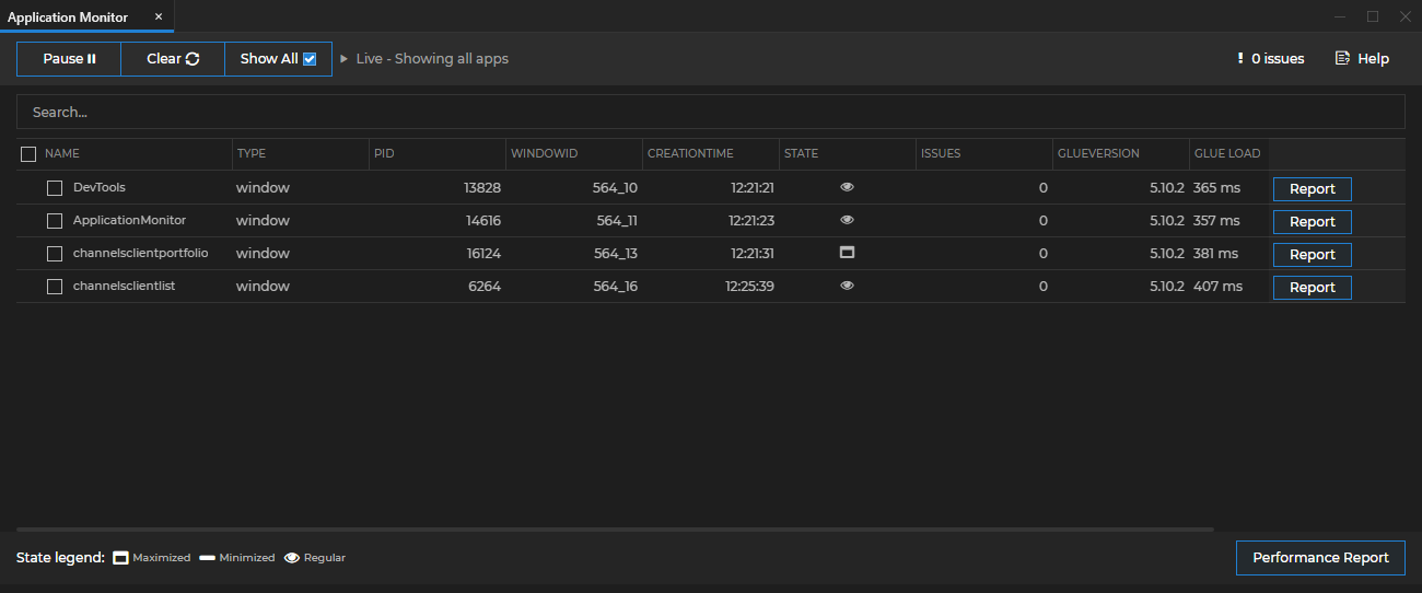
Application Monitor & Performance Report
The Application Monitor and the Performance Report apps that were previously part of the io.Connect Dev Tools have been deprecated. Fixes for these app won't be available and they won't be distributed as part of the io.Connect platform starting from this release onward. If you are using an extensible installer configuration that includes these apps, you must make sure to remove them from the configuration file when upgrading to io.Connect Desktop 9.10 or later.
The Application Monitor and the Performance Report tools will still work in all minor and fix versions that are part of the io.Connect Desktop 9.0 stream, but may stop working with later major version streams.
Legacy Application Monitor:
Legacy Performance Report:
New Features
io.Insights Metrics
New default metrics have been added to io.Insights and some of the existing metrics have been improved.
Changed Metric Types
The
"app_duration","app_startup","workspace_startup", and"layout_startup"default metrics are now of typeGaugeinstead ofHistogram.Metrics Recalibration
The
"app_crash"metric is now published when the following conditions are met:
- For web apps, when the process renderer is gone.
- For native apps, when the process is killed, when the process exits with a non-zero exit code, or when the process is terminated due to a fatal error. You can use the
"reason"attribute to determine the cause for the crash.The value of the
"reason"attribute of the"app_crash"metric is derived from the following sources:
- For web apps, the value of this attribute is derived from the value of the
reasonproperty of theRenderProcessGoneDetailsElectron object.- For native apps, the value of this attribute can be:
"crashed"- when the process exited with a non-zero exit code;- the signal sent to the process - when the process was terminated or killed and the exit event includes a signal;
- the message from the error event - when the process couldn't be started or controlled due to a fatal OS-level error;
The measuring points for the
"app_startup"metric have been adjusted to reflect more correctly the measured process:
- For web apps running in the Electron container of io.Connect Desktop, this metric measures the interval from receiving the request for starting the app until the
"did-finish-load"Electron event is fired. This ensures that the web page has been fully loaded. For native apps running in io.Connect Desktop and using the io.Connect libraries, this metric measures the interval from receiving the request for starting the app until the Interop instance of the app is ready. This metric isn't published for native apps that don't use the io.Connect libraries, as in this case, a reliable signal for completing the app initialization process isn't available.- For web apps running in io.Connect Browser, this metric measures the interval from receiving the request for starting the app until the io.Connect API has been initialized in it.
The measuring points for the
"platform_startup"metrics have been adjusted to reflect more correctly the measured process:
- For io.Connect Desktop, this metric measures the moment from starting the actual executable file (not the gilding executable) and includes the entire platform startup sequence until the moment the shell app starts loading.
- For io.Connect Browser, this metric measures the time it takes for the
@interopio/browser-platformlibrary to initialize.New Workspaces Metrics
The following improvements and additions were made to the default published metrics related to Workspaces:
- The
"workspace_startup"startup metric was recalibrated and now measures the entire process of loading a Workspace - the time from receiving the request for opening a Workspace until the time all apps in it have been loaded.- The
"workspace_startup"startup metric was enriched with additional sub-metrics (published in parallel with"workspace_startup") in order to measure more accurately the various stages of loading a Workspace - initializing the Workspaces App (the"workspace_startup_frame"sub-metric - published only when the Workspace is being loaded in a new Workspaces App instance), loading the<Workspaces />component (the"workspace_startup_component"sub-metric - always published), and loading the apps in the Workspace (the"workspace_startup_apps"sub-metric - always published).- The
"workspace_startup_frame"is published only when the Workspace is being loaded in a new Workspaces App instance. You can determine this by using the newly added"includesFrameCreation"attribute of the"workspace_startup"metric.- The
"workspace_startup_frame"metric is published in parallel with the following sub-metrics that measure the separate stages of initializing a Workspaces App instance - creating the underlying browser window (the"workspace_startup_frame_init"sub-metric), loading the web page of the Workspaces App (the"workspace_startup_frame_page_load"sub-metric), and loading the<Workspaces />component (the"workspace_startup_frame_workspace_render"sub-metric).- Besides the already available
"layout"attribute, all Workspaces metrics now have two new additional attributes -"complexLoad"and"includesFrameCreation".The following table describes the new Workspaces metrics:
Metric Instrument Type Unit Description "workspace_startup"Gaugemilliseconds The total time it took to load a Workspace. Measures the interval from initiating the request for creating or restoring the Workspace until all visible apps in it have been loaded. For web apps, this means that the DOMContentLoadedevent has been fired. For native apps (io.Connect Desktop only), this means that the app has completed its window registration within the io.Connect framework. For io.Connect Browser, this metric doesn't measure the time for initializing a Workspaces App instance, only the time for loading the actual Workspace in it. For io.Connect Desktop, this is the root metric for measuring Workspace startup times and it's published in parallel with several sub-metrics that measure the separate intervals for completing the consecutive stages of loading a Workspace. You can use the"includesFrameCreation"attribute to determine whether the measurement includes the time for initializing a Workspaces App instance. If the Workspace is created or restored in a new Workspaces App instance, the"workspace_startup_frame"metric and its sub-metrics will also be published in parallel with"workspace_startup". The"workspace_startup_component"and the"workspace_startup_apps"metrics are always published in parallel with"workspace_startup"regardless of whether a new Workspaces App instance has been created."workspace_startup_apps"Gaugemilliseconds The time it took to load all apps in the Workspace. For web apps, this means that the DOMContentLoadedevent has been fired. For native apps, this means that the app has completed its window registration within the io.Connect framework. Measures the interval from initiating the loading of the first app in the Workspace until all apps have been loaded. You can use the"complexLoad"attribute to determine whether all apps in the Workspace have been started as new app instances, or one or more of them has been included in the Workspace as an already existing window."workspace_startup_component"Gaugemilliseconds The time it took to create and render the <Workspaces />component within an already existing Workspaces App instance (i.e., when the Workspace is created or restored in an already existing Workspaces App instance). Measures the interval from initiating the initialization of the<Workspaces />component inside the Workspaces App instance until the component is fully rendered and interactive."workspace_startup_frame"Gaugemilliseconds The total time it took to load the Workspace App instance. This is measured from initiating the request for creating or restoring the Workspace until the Workspaces App instance has been fully loaded and the <Workspaces />component has been rendered. This metric is published only when a new Workspaces App instance is being created and is published in parallel with the following sub-metrics that measure the separate intervals for completing the consecutive stages of initializing a Workspaces App instance:"workspace_startup_frame_init","workspace_startup_frame_page_load", and"workspace_startup_frame_workspace_render"."workspace_startup_frame_init"Gaugemilliseconds Published in parallel with the "workspace_startup_frame"metric. Measures the interval from initiating the creation of the underlying browser window until the browser window is ready for loading the web page of the Workspaces App instance."workspace_startup_frame_page_load"Gaugemilliseconds Published in parallel with the "workspace_startup_frame"metric. Measures the interval from initiating the navigation to the web page of the Workspaces App instance (after the underlying browser window has been created) until theDOMContentLoadedevent is fired for the web page."workspace_startup_frame_workspace_render"Gaugemilliseconds Published in parallel with the "workspace_startup_frame"metric. Measures the interval from initiating the initialization of the<Workspaces />component inside the Workspaces App instance (after the web page of the Workspaces App instance has already been loaded) until the component is fully rendered and interactive.The following table describes the new additional attributes for all Workspaces metrics:
Attribute Description "complexLoad"Differentiates between launching Workspaces in which all apps are loaded as new instances (this is the normal loading scenario, i.e. the value of "complexLoad"will be"false"), and Workspaces in which one or more of the app windows are already existing windows that have been included in the Workspace (this is the complex loading scenario, i.e. the value of"complexLoad"will be"true"). If"complexLoad"is"true", the time for loading the Workspace may be slightly or significantly decreased and it's important to keep in mind that this won't be due to performance optimizations, but due to loading one or more already existing app instances into the Workspace which is a faster procedure than starting new app instances."includesFrameCreation"If the value of this attribute is "true", this means that the measurement includes the time it took to initialize a Workspaces App instance (e.g., if the Workspace has been loaded into an already existing Workspaces App instance, the value of this attribute will be"false").
Workspaces Frame Visibility
The
isVisible(),hide(), andshow()methods have been added to theFrameinstance in the Workspaces API. These methods enable you to retrieve and control the visibility state of the Workspaces App instance:// Checking the current visibility state of the Workspaces App instance. const isFrameVisible = await myFrame.isVisible(); if (isFrameVisible) { // Hiding the Workspaces App instance. await myFrame.hide(); } else { // Optional settings for showing the Workspaces App instance. // Settings `activate` to `true` will make the Workspaces Frame window gain focus, restore its normal state // (e.g., if it has been previously minimized), and bring it in front of other existing windows. const frameShowSettings = { activate: true }; // Showing the Workspaces App instance. await myFrame.show(frameShowSettings); }You can also specify the visibility state of the Workspaces App instance by using the
isVisibleproperty of theNewFrameConfigwhen creating or restoring Workspaces and when creating emptyFrameinstances:// Creating a hidden empty `Frame`. const definition = { frameConfig: { isVisible: false } }; const emptyFrame = await io.workspaces.createEmptyFrame(definition);
Platform Initialization Success & Failure Signals
In certain scenarios, you may want your app that has been started in one of the early boot sequence stages to receive a signal from the io.Connect platform when the platform has been successfully initialized or in case of initialization failure.
To receive such signals, register an Interop method and name it
"T42.Platform.Events". If registered, this method will be invoked by the platform when it initializes successfully or in case of failure.Registering the
"T42.Platform.Events"Interop method:const methodName = "T42.Platform.Events"; const handler = ({ eventType, timestamp, data }) => { console.log(`Platform initialization ${eventType === "platform-started" ? "successful" : "failed"}.`); if (data.error) { console.log(`Error message: ${data.error.message}, error stack: ${data.error.stack}.`); } }; await io.interop.register(methodName, handler);Each invocation of the method will return data in the shape of an object with the following properties:
Property Type Description dataobjectData object containing event details. In case of successful platform initialization, this will be an empty object. In case of platform initialization failure, this will be an object with an errorobject property. Theerrorobject will havemessageandstackstring properties containing the error message and the error stack respectively.eventType"platform-started"|"platform-failed"Type of the platform event (i.e., whether the platform was started successfully or failed to initialize). timestampstringTimestamp of the platform event.
Intent Handler Exclusion List
To exclude Intent handlers from the results when using the
filterHandlers()method, use theexcludeListproperty of theHandlerFilterobject and pass an array ofHandlerExclusionCriteriaas a value.It's possible to exclude Intent handlers by app name and by app instance ID:
const filter = {
    intent: "ViewChart",
    openResolver: false,
    // Excluding an app by its name and a running instance of another app from the Intent handler result.
    excludeList: [
        {
            // This will exclude the app, but won't exclude any running instances of it.
            applicationName: "my-app-name"
        },
        {
            // This will exclude a running instance of an app, but won't exclude the app itself.
            instanceId: "my-other-app-instance-id"
        }
    ]
};

const result = await io.intents.filterHandlers(filter);
Disabling the Feedback Form
The io.Connect Feedback Form opens automatically in case of a platform crash and can also be opened by users from the io.Connect Desktop tray menu and from the "Feedback" button of running app instances.
To prevent this behavior, you can now use the
"enabled"property of the"issueReporting"top-level key in thesystem.jsonsystem configuration file of io.Connect Desktop:{ "issueReporting": { // Disabling the Feedback Form. "enabled": false } }
Independent Zoom Factors for Same-Origin Apps
The default zoom behavior for web apps (as is in all standard web browsers) is that all apps within the same domain have the same zoom factor. Now, it's possible to instruct the platform to use individual zoom levels for same-origin apps.
To configure the zoom behavior for same-origin apps globally, use the
"mode"property of the"zoom"object under the"windows"top-level key in thesystem.jsonsystem configuration file of io.Connect Desktop. It accepts"domain"(default) and"window"as values.The following example demonstrates how to configure io.Connect Desktop to use individual zoom levels for same-origin apps:
{
    "windows": {
        "zoom": {
            "enabled": true,
            "mode": "window"
        }
    }
}
To define zoom behavior settings per app, use the
"mode"property of the"zoom"object under the"details"top-level key in the app definition. The app definition settings will override the global system configuration:{ "details": { "zoom": { "enabled": true, "mode": "domain" } } }
Window Resizing Areas for Native Apps
The
"hasSizeAreas"property of the"details"top-level key in the app definition is now valid for native apps as well.The following example demonstrates how to remove the resizing areas of a native app running in io.Connect Desktop:
{
    "name": "my-exe-app",
    "title": "My EXE App",
    "type": "exe",
    "details": {
        "path": "%GDDIR%/../PathToWPFApplication/",
        "command": "WPFApplication.exe",
        "hasSizeAreas": false
    }
}
App Preferences REST Store Settings
It's now possible to specify the number of retries and a backoff factor when configuring an app preferences store provided by a REST service. The following properties are now available in
"rest"mode:
Property Type Description "restBackoffFactor"numberExponential backoff factor in milliseconds used for determining the waiting interval between retries when fetching data from the REST store. The waiting interval is calculated with the <restBackoffFactor>*2^<retry>formula and is limited to a maximum of 5 minutes between retries. Valid only in"rest"mode. Defaults to1000."restRetries"numberNumber of retries when fetching data from the REST store. Valid only in "rest"mode. Defaults to3.The following example demonstrates configuring the backoff factor and the number of retries for connecting to an app preferences store provided by a REST service:
{
    "applicationPreferences": {
        "store": {
            "type": "rest",
            "restURL": "https://my-rest-service.com/app-preferences",
            "restClientAuth": "no-auth",
            "restBackoffFactor": 2000,
            "restRetries": 5
        }
    }
}
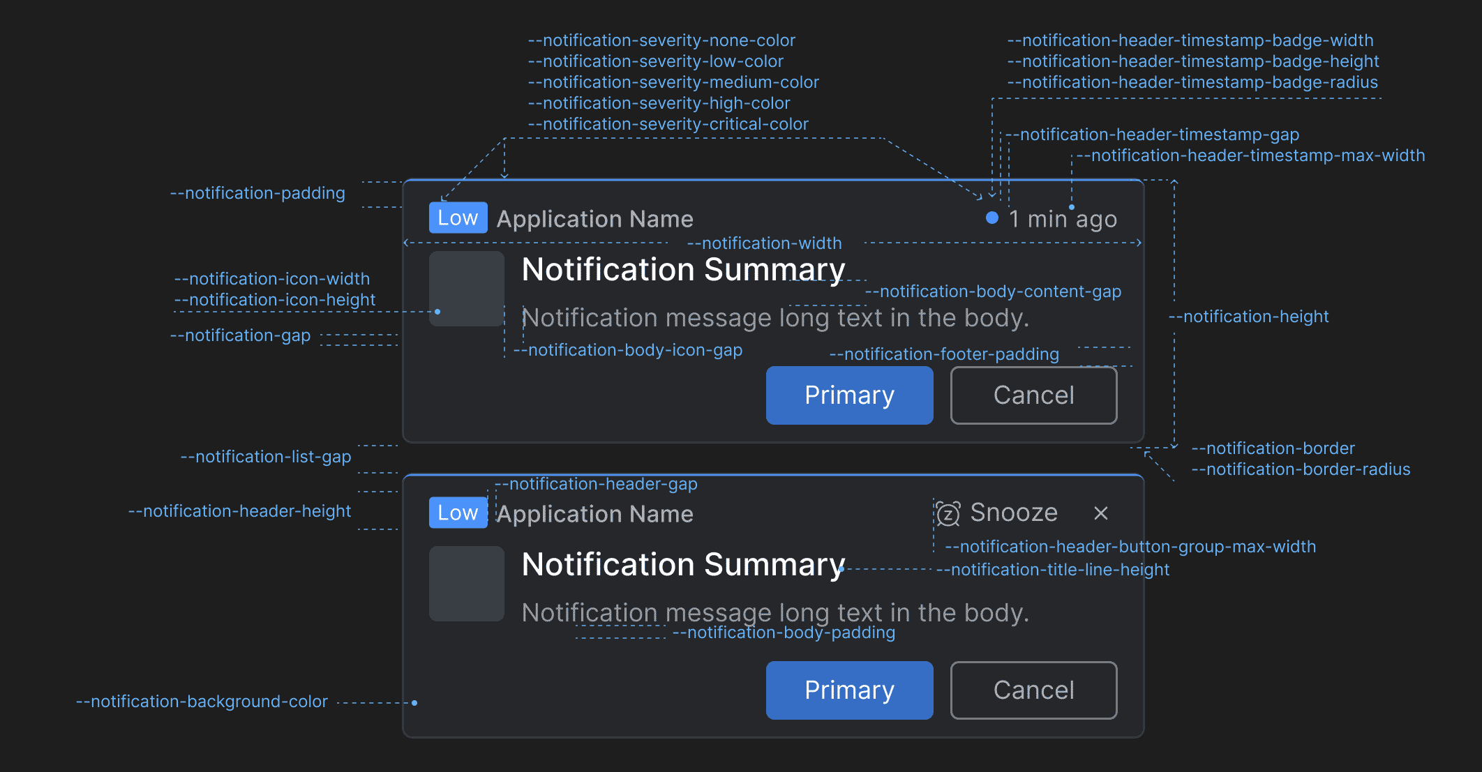
CSS Variables for Customizing the io.Connect Platform
Added CSS variables for customizing the styles of the following io.Connect Desktop apps and UI components:
Notifications
Use the following CSS variables for customizing the styles of the io.Connect Desktop notifications:
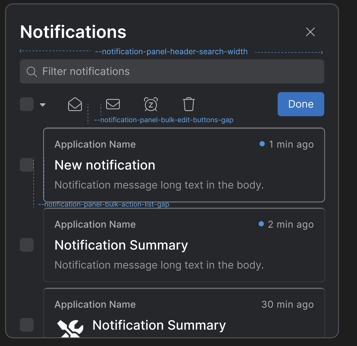
Variable Description --notification-background-colorBackground color for the notifications. --notification-body-content-gapGap between the title and the text in the notification body content. --notification-body-icon-gapGap between the notification icon and the notification body content. --notification-body-paddingPadding for the notification body. --notification-borderBorder for the notifications. --notification-border-radiusBorder radius for the notifications. --notification-footer-paddingPadding for the notification footer. --notification-gapGap between the header, the body, and the footer of the notifications. --notification-header-button-group-max-widthMaximum width for the action buttons ("Snooze", "Close") in the notification header. --notification-header-gapGap between elements in the notification header. --notification-header-heightHeight for the notification header. --notification-header-timestamp-badge-heightHeight for the timestamp badge in the notification header. --notification-header-timestamp-badge-radiusBorder radius for the timestamp badge in the notification header. --notification-header-timestamp-badge-widthWidth for the timestamp badge in the notification header. --notification-header-timestamp-gapGap between the timestamp badge and the timestamp in the notification header. --notification-header-timestamp-max-widthMaximum width for the timestamp in the notification header. --notification-heightHeight for the notifications. --notification-icon-heightHeight for the icon displayed in the notification. --notification-icon-widthWidth for the icon displayed in the notification. --notification-paddingPadding for the notifications. --notification-severity-critical-colorColor for notifications with severity "Critical". --notification-severity-high-colorColor for notifications with severity "High". --notification-severity-low-colorColor for notifications with severity "Low". --notification-severity-medium-colorColor for notifications with severity "Medium". --notification-severity-none-colorColor for notifications with severity "None". --notification-title-line-heightLine height for the title in the notification. --notification-widthWidth for the notifications. Notification Panel
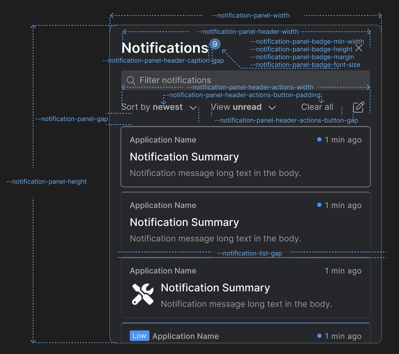
Use the following CSS variables for customizing the styles of the Notification Panel:
Variable Description --notification-list-gapGap between notifications in the notification list of the Notification Panel and the toasts wrapper. --notification-panel-badge-font-sizeFont size for the Notification Panel badge. --notification-panel-badge-heightHeight for the Notification Panel badge. --notification-panel-badge-marginMargin for the Notification Panel badge. --notification-panel-badge-min-widthMinimum width for the Notification Panel badge. --notification-panel-bulk-action-list-gapGap between the editable items when the "Bulk Edit" button is pressed. --notification-panel-bulk-edit-buttons-gapGap between the buttons that appear in the Notification Panel header when the "Bulk Edit" button is pressed. --notification-panel-gapGap between the header and the body of the Notification Panel. --notification-panel-header-actions-button-gapGap between the "Sort by" and "View" dropdowns and between the "Clear All" and "Bulk Edit" buttons in the Notification Panel header. --notification-panel-header-actions-button-paddingPadding for the action buttons in the Notification Panel header. --notification-panel-header-actions-widthWidth for the element that contains action buttons in the Notification Panel header. --notification-panel-header-caption-gapGap between the caption, the badge, and the system buttons in the Notification Panel header. --notification-panel-header-search-gapGap between the search bar and the search results. --notification-panel-header-search-widthWidth for the search bar in the Notification Panel header. --notification-panel-header-widthWidth for the Notification Panel header. --notification-panel-heightHeight for the Notification Panel. --notification-panel-widthWidth for the Notification Panel. Toasts Wrapper & Notification Stacks
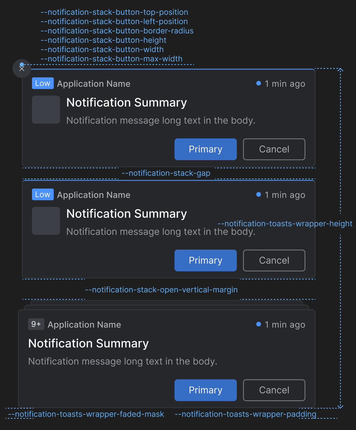
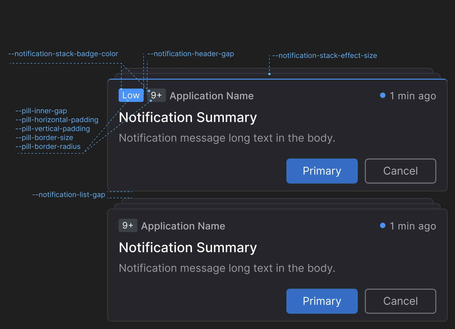
Use the following CSS variables for customizing the styles of the toasts wrapper and the notification stacks:
Variable Description --notification-stack-badge-colorColor for the badge that displays the number of stacked notifications. --notification-stack-button-border-radiusBorder radius for the "Clear All" button of the notification stack. --notification-stack-button-heightHeight for the "Clear All" button of the notification stack. --notification-stack-button-left-positionLeft offset for the "Clear All" button of the notification stack. --notification-stack-button-max-widthMaximum width for the "Clear All" button of the notification stack. --notification-stack-button-top-positionTop offset for the "Clear All" button of the notification stack. --notification-stack-button-widthWidth for the "Clear All" button of the notification stack. --notification-stack-effect-sizeTop, right, and left offset for the notification stack effect. --notification-stack-gapGap between the notification stacks. --notification-stack-open-vertical-marginVertical (top and bottom) margin for the notification stack when open. --notification-toasts-wrapper-faded-maskFaded mask for the toasts wrapper. --notification-toasts-wrapper-heightHeight for the toasts wrapper. --notification-toasts-wrapper-paddingPadding for the toast wrapper. Notification Settings
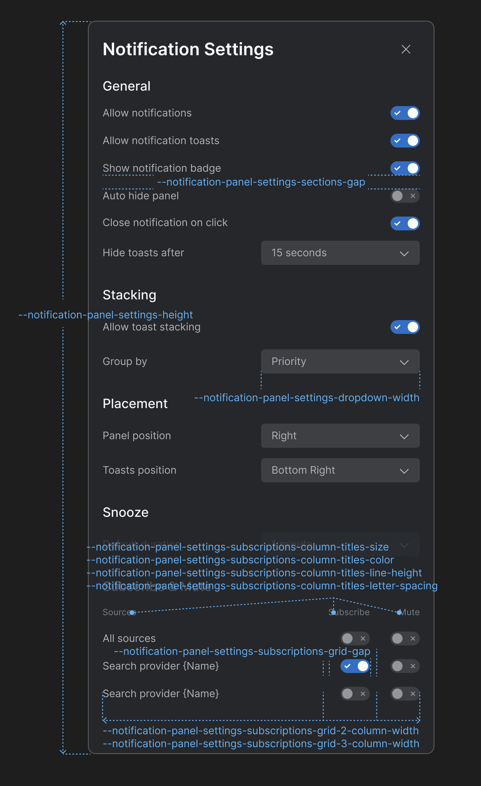
Use the following CSS variables for customizing the styles of the Notification Settings panel:
Variable Description --notification-panel-settings-dropdown-widthWidth for the dropdown menus in the Notification Settings panel. --notification-panel-settings-heightHeight for the Notification Settings panel. --notification-panel-settings-sections-gapGap between the sections in the Notification Settings panel. --notification-panel-settings-subscriptions-column-titles-colorColor for the column titles of the "Subscribe & Mute" section. --notification-panel-settings-subscriptions-column-titles-letter-spacingLetter spacing for the column titles of the "Subscribe & Mute" section. --notification-panel-settings-subscriptions-column-titles-line-heightLine height for the column titles of the "Subscribe & Mute" section. --notification-panel-settings-subscriptions-column-titles-sizeFont size for the column titles of the "Subscribe & Mute" section. --notification-panel-settings-subscriptions-grid-2-column-widthColumn width for a grid layout with two columns in the "Subscribe & Mute" section. --notification-panel-settings-subscriptions-grid-3-column-widthColumn width for a grid layout with three columns in the "Subscribe & Mute" section. --notification-panel-settings-subscriptions-grid-gapGap between the columns of the grid layout in the "Subscribe & Mute" section. Channel Selector
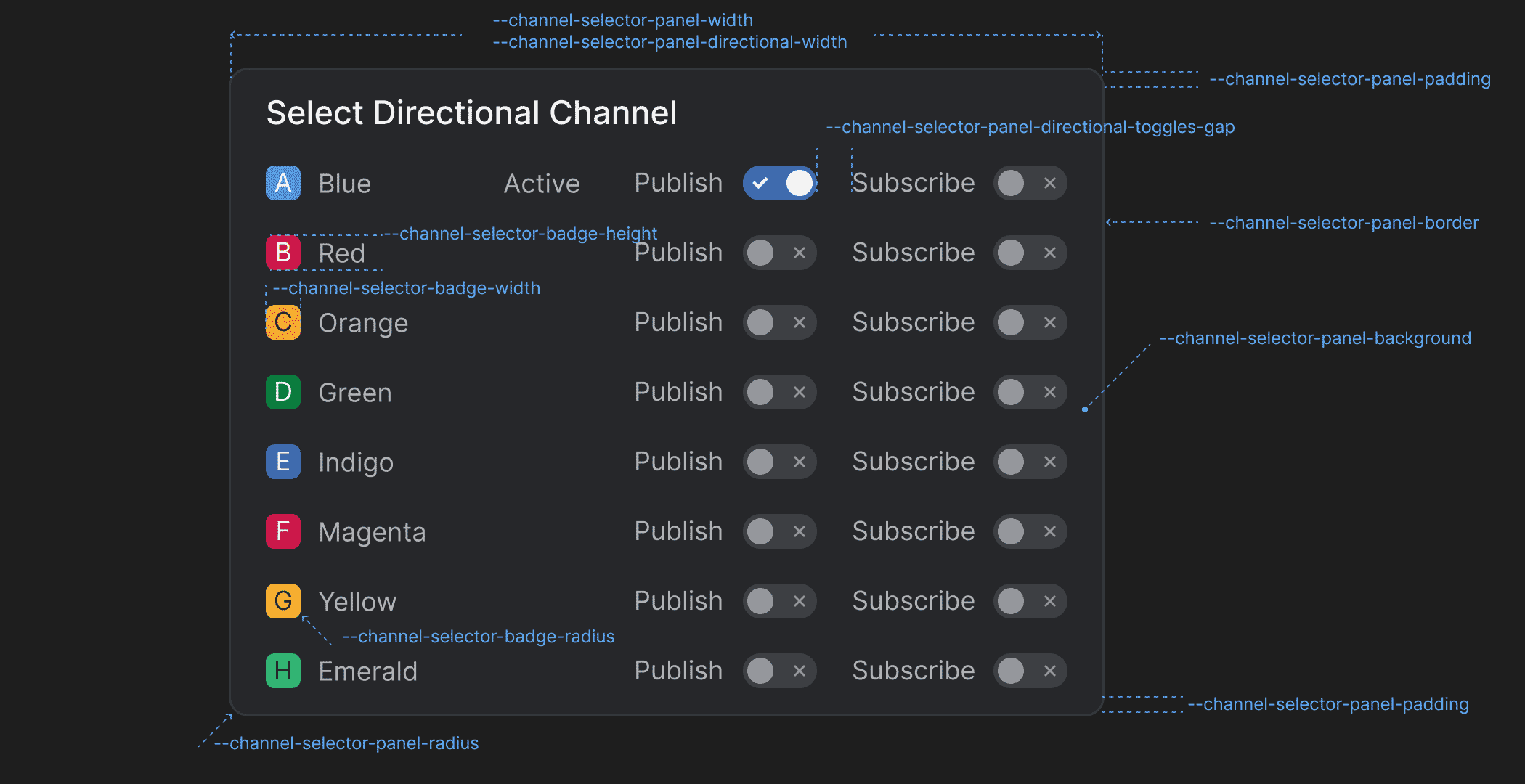
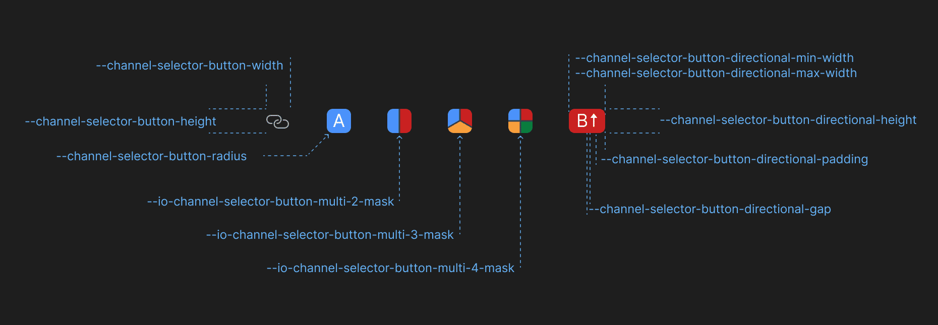
Use the following CSS variables for customizing the styles of the Channel Selector:
Variable Description --channel-selector-badge-heightHeight for the Channel Selector badge displayed in the Channel Selector panel. --channel-selector-badge-radiusBorder radius for the Channel Selector badge displayed in the Channel Selector panel. --channel-selector-badge-widthWidth for the Channel Selector badge displayed in the Channel Selector panel. --channel-selector-button-directional-gapGap between Channel letter and the Channel direction icon in the Channel Selector button when using directional Channels. --channel-selector-button-directional-heightHeight for the Channel Selector button when using directional Channels. --channel-selector-button-directional-max-widthMaximum width for the Channel Selector button when using directional Channels. --channel-selector-button-directional-min-widthMinimum width for the Channel Selector button when using directional Channels. --channel-selector-button-directional-paddingPadding for the Channel Selector button when using directional Channels. --channel-selector-button-heightHeight for the Channel Selector button. --channel-selector-button-radiusBorder radius for the Channel Selector button. --channel-selector-button-widthWidth for the Channel Selector button. --channel-selector-panel-backgroundBackground color for the Channel Selector panel. --channel-selector-panel-borderBorder for the Channel Selector panel. --channel-selector-panel-directional-toggles-gapGap between the direction labels and the respective toggles in the Channel Selector panel when using directional Channels. --channel-selector-panel-directional-widthWidth for the Channel Selector panel when using directional Channels. --channel-selector-panel-paddingPadding for the Channel Selector panel. --channel-selector-panel-radiusBorder radius for the Channel Selector panel. --channel-selector-panel-title-background-hoverBackground color for the title of the Channel Selector panel when hovered. --channel-selector-panel-widthWidth for the Channel Selector panel. --io-channel-selector-button-multi-2-maskMask for the Channel Selector button if two Channels are selected when using multiple Channels. --io-channel-selector-button-multi-3-maskMask for the Channel Selector button if three Channels are selected when using multiple Channels. --io-channel-selector-button-multi-4-maskMask for the Channel Selector button if four Channels are selected when using multiple Channels. Intent Resolver
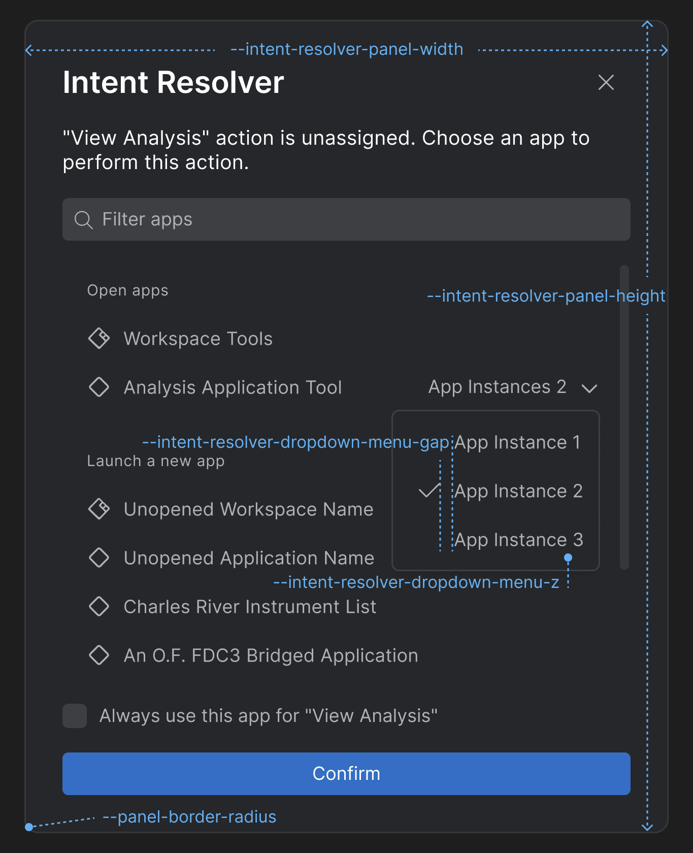
Use the following CSS variables for customizing the styles of the Intent Resolver:
Variable Description --intent-resolver-dropdown-menu-gapGap between the items in the dropdown menu of the Intent Resolver panel for selecting an app instance. --intent-resolver-dropdown-menu-zZ-order for the dropdown menu of the Intent Resolver for selecting an app instance. --intent-resolver-panel-border-radiusBorder radius for the Intent Resolver panel. --intent-resolver-panel-heightHeight for the Intent Resolver panel. --intent-resolver-panel-paddingPadding for the Intent Resolver panel. --intent-resolver-panel-widthWidth for the Intent Resolver panel. Feedback Form
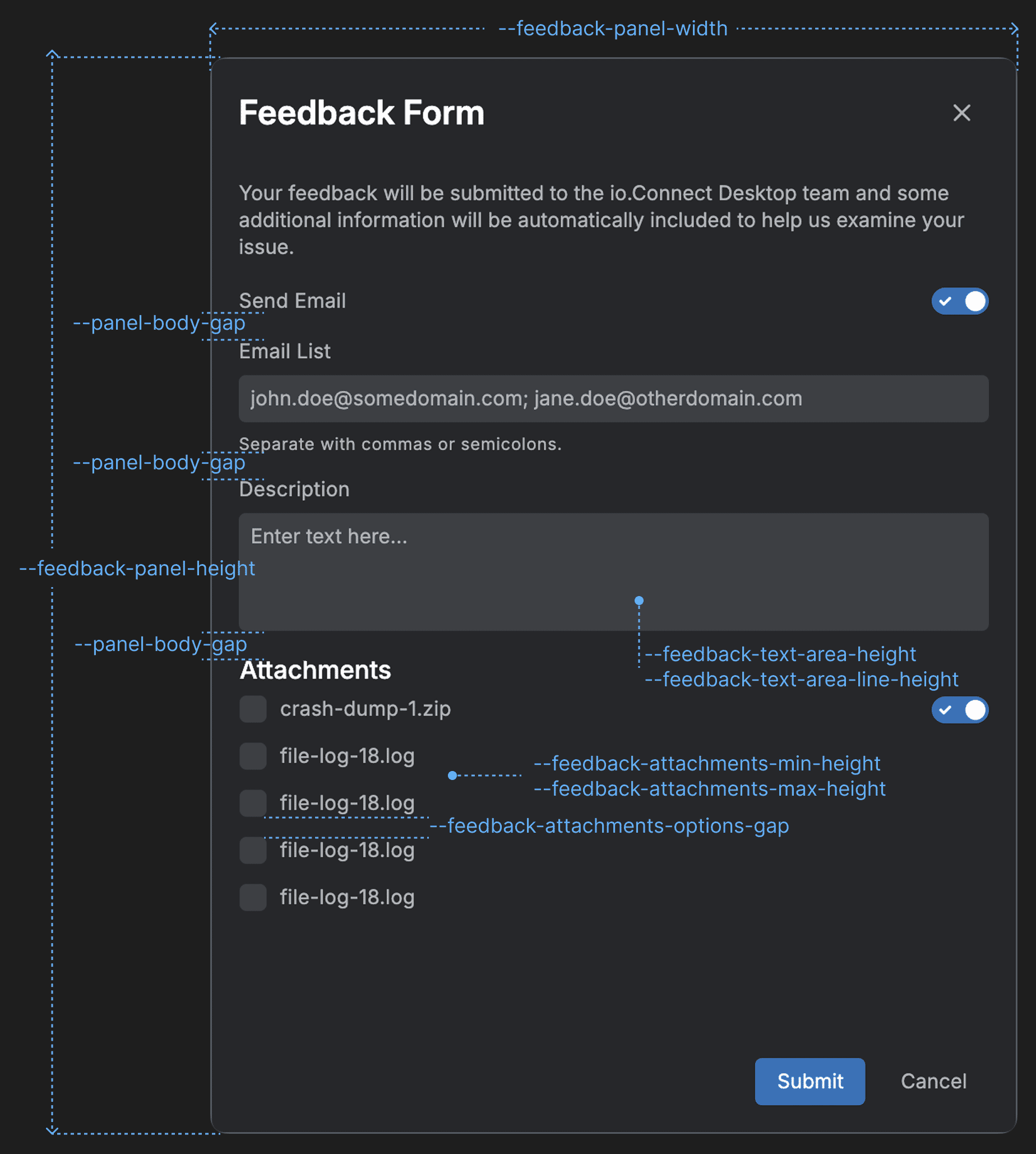
Use the following CSS variables for customizing the styles of the Feedback Form:
Variable Description --feedback-attachments-items-gapGap between the rows with attachment items. --feedback-attachments-max-heightMaximum height for the "Attachments" section of the Feedback Form. --feedback-attachments-min-heightMinimum height for the "Attachments" section of the Feedback Form. --feedback-error-colorColor for error messages in the Feedback Form. --feedback-panel-heightHeight for the Feedback Form panel. --feedback-panel-widthWidth for the Feedback Form panel. --feedback-text-area-heightHeight for the text area input of the Feedback Form. --feedback-text-area-line-heightLine height for the text in the text area input of the Feedback Form. Download Manager Panel
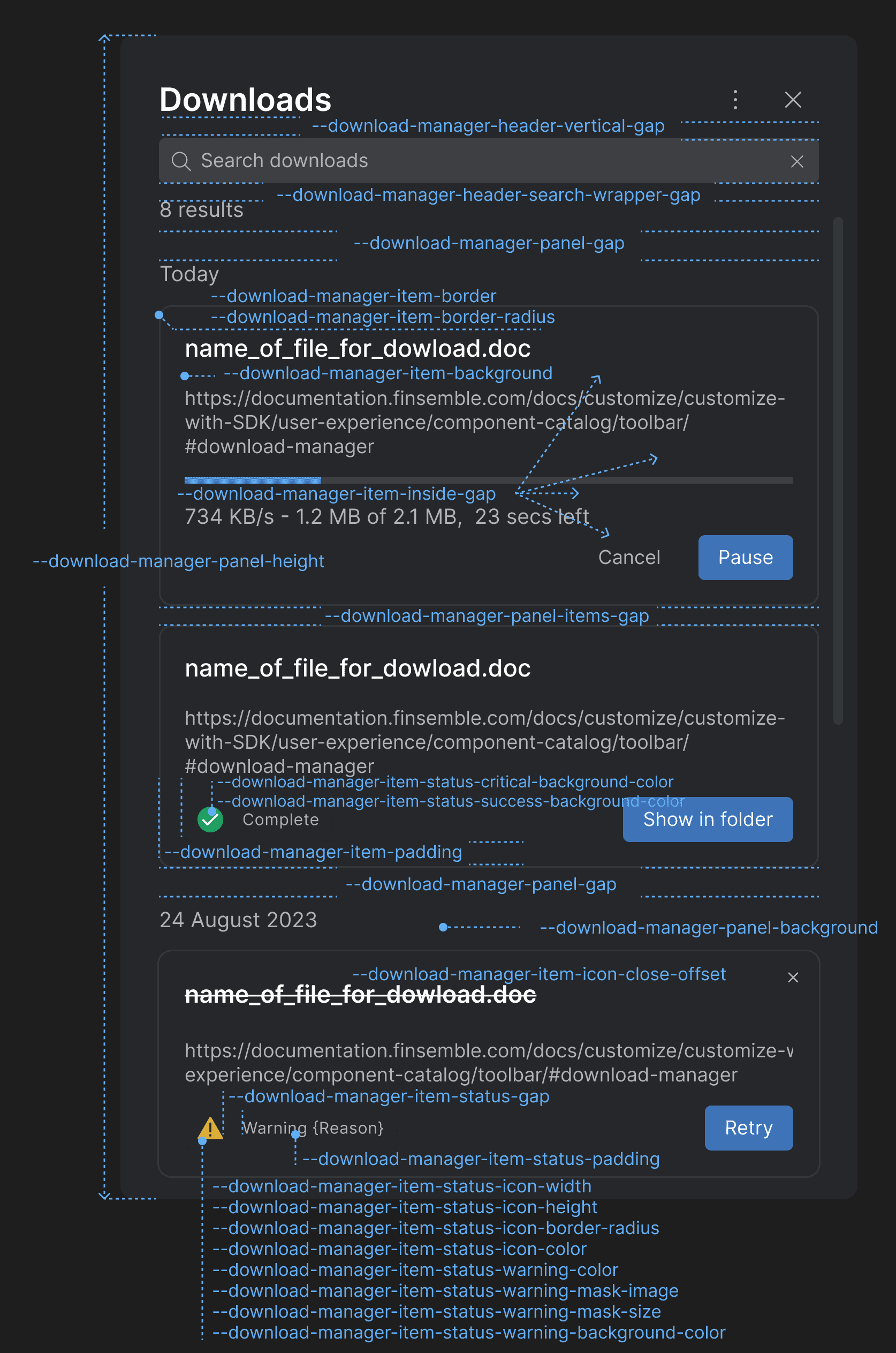
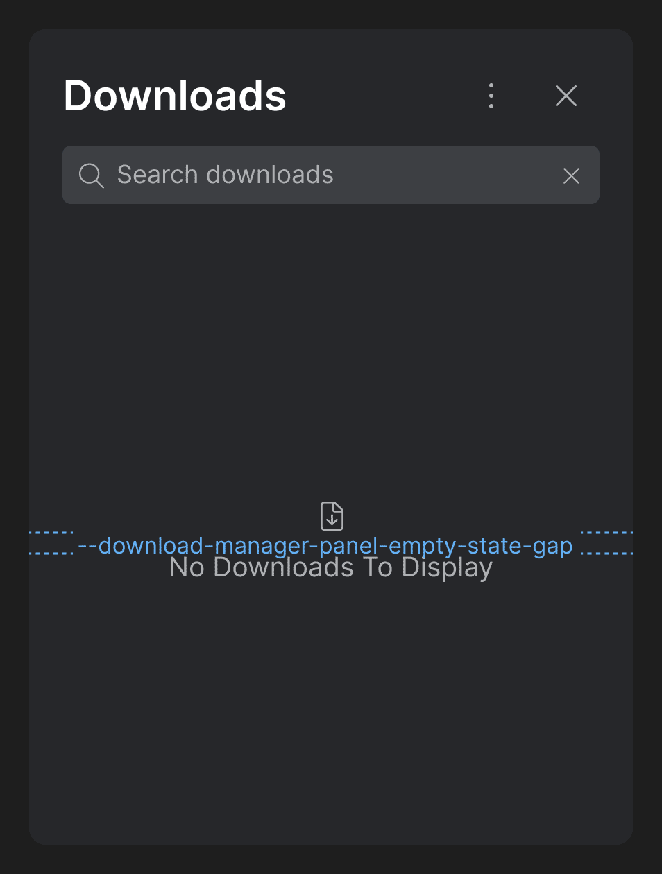
Use the following CSS variables for customizing the styles of the Download Manager Panel:
Variable Description --download-manager-header-search-wrapper-gapGap between the search bar and the element displaying the number of search results. --download-manager-header-vertical-gapGap between the title and the search bar in the header of the Download Manager. --download-manager-item-backgroundBackground for the download items in the Download Manager. --download-manager-item-borderBorder for the download items in the Download Manager. --download-manager-item-border-radiusBorder radius for the download items in the Download Manager. --download-manager-item-icon-close-offsetTop and right offset for the "Close" button icon of the download items in the Download Manager. --download-manager-item-inside-gapGap between the header, body, and footer of the download items in the Download Manager. --download-manager-item-paddingPadding for the download items in the Download Manager. --download-manager-item-status-critical-background-colorBackground color for the critical status icon in the footer of the download item. --download-manager-item-status-gapGap between the status icon and the status text in the element displaying the download item status in the footer of the download item. --download-manager-item-status-icon-border-radiusBorder radius for the status icon in the footer of the download item. --download-manager-item-status-icon-colorColor for the status icon in the footer of the download item. --download-manager-item-status-icon-heightHeight for the status icon in the footer of the download item. --download-manager-item-status-icon-widthWidth for the status icon in the footer of the download item. --download-manager-item-status-paddingPadding for the element displaying the download item status in the footer of the download item. --download-manager-item-status-success-background-colorBackground color for the success status icon in the footer of the download item. --download-manager-item-status-warning-background-colorBackground color for the warning status icon in the footer of the download item. --download-manager-item-status-warning-border-radiusBorder radius for the warning status icon in the footer of the download item. --download-manager-item-status-warning-colorText color for the warning status icon in the footer of the download item. --download-manager-item-status-warning-mask-imageMask image for the warning status icon in the footer of the download item. --download-manager-item-status-warning-mask-sizeMask size for the warning status icon in the footer of the download item. --download-manager-panel-backgroundBackground for the Download Manager panel. --download-manager-panel-empty-state-gapGap between the icon and the text displayed in the Download Manager when it's empty. --download-manager-panel-gapGap for the Download Manager panel. --download-manager-panel-heightHeight for the Download Manager panel. --download-manager-panel-items-gapGap between the items in the Download Manager panel. Download Manager Settings Panel
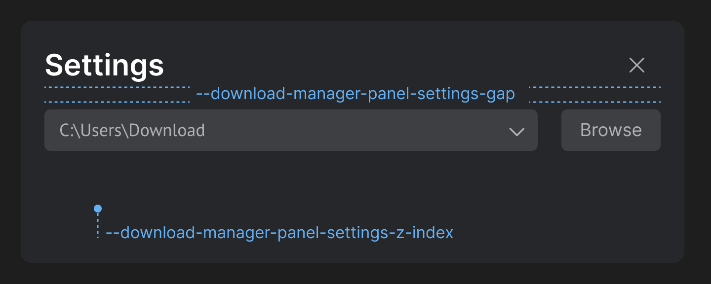
Use the following CSS variables for customizing the styles of the Download Manager Settings panel:
Variable Description --download-manager-panel-settings-gapGap between the header and the body of the Settings panel of the Download Manager. --download-manager-panel-settings-z-indexZ-index for the Settings panel of the Download Manager. Launchpad Platform Preferences Panel
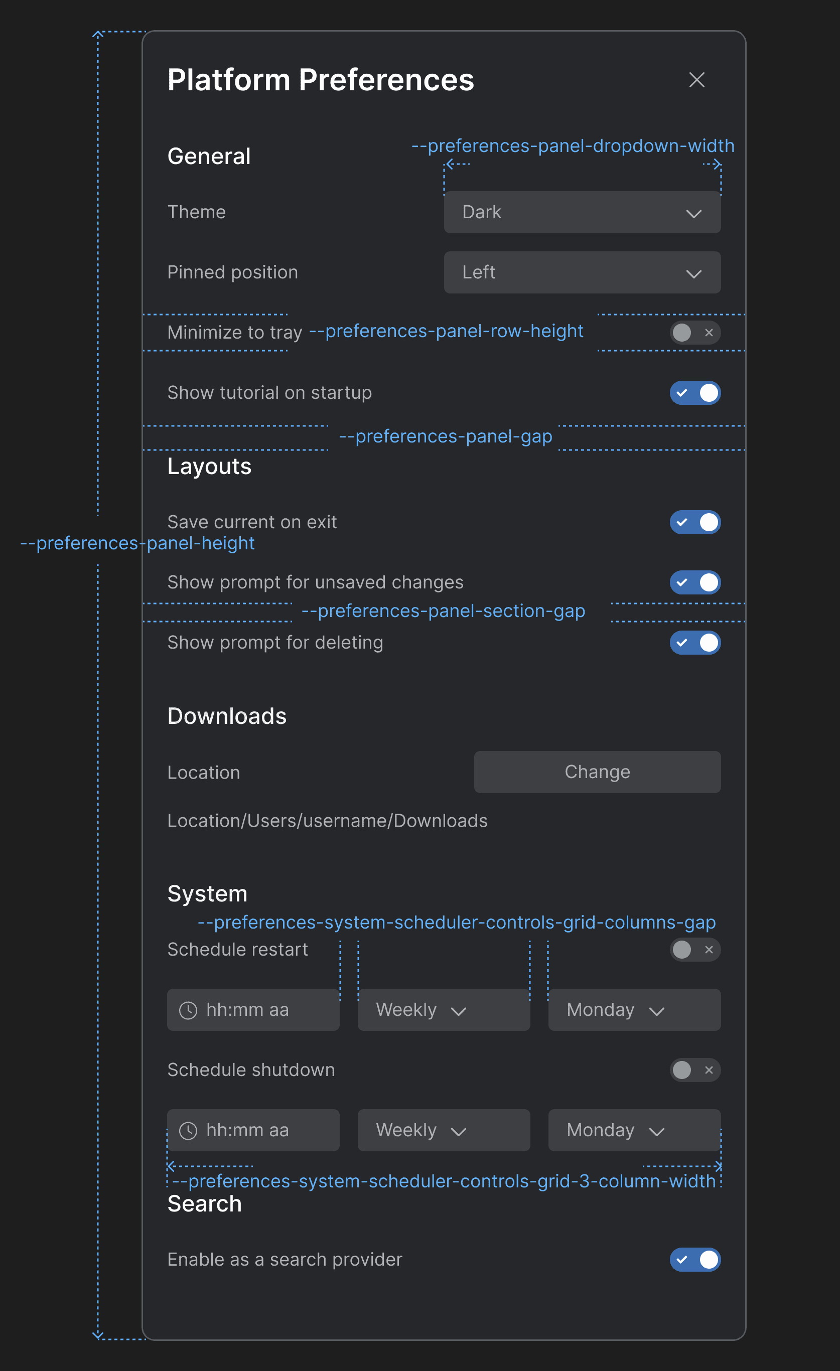
Use the following CSS variables for customizing the styles of the Launchpad Platform Preferences panel:
Variable Description --preferences-panel-dropdown-widthWidth for the dropdowns menus in the Platform Preferences panel. --preferences-panel-gapGap between the header and the body of the Platform Preferences panel. --preferences-panel-heightHeight for the Platform Preferences panel. --preferences-panel-row-heightHeight for each row in the sections of the Platform Preferences panel. --preferences-panel-section-gapGap between the items in each section of the Platform Preferences panel. --preferences-system-scheduler-controls-grid-3-column-widthColumn width for a grid layout with three columns in the "System" section. --preferences-system-scheduler-controls-grid-columns-gapGap between the columns of the grid layout containing the scheduler controls in the "System" section. Launchpad Profile Panel
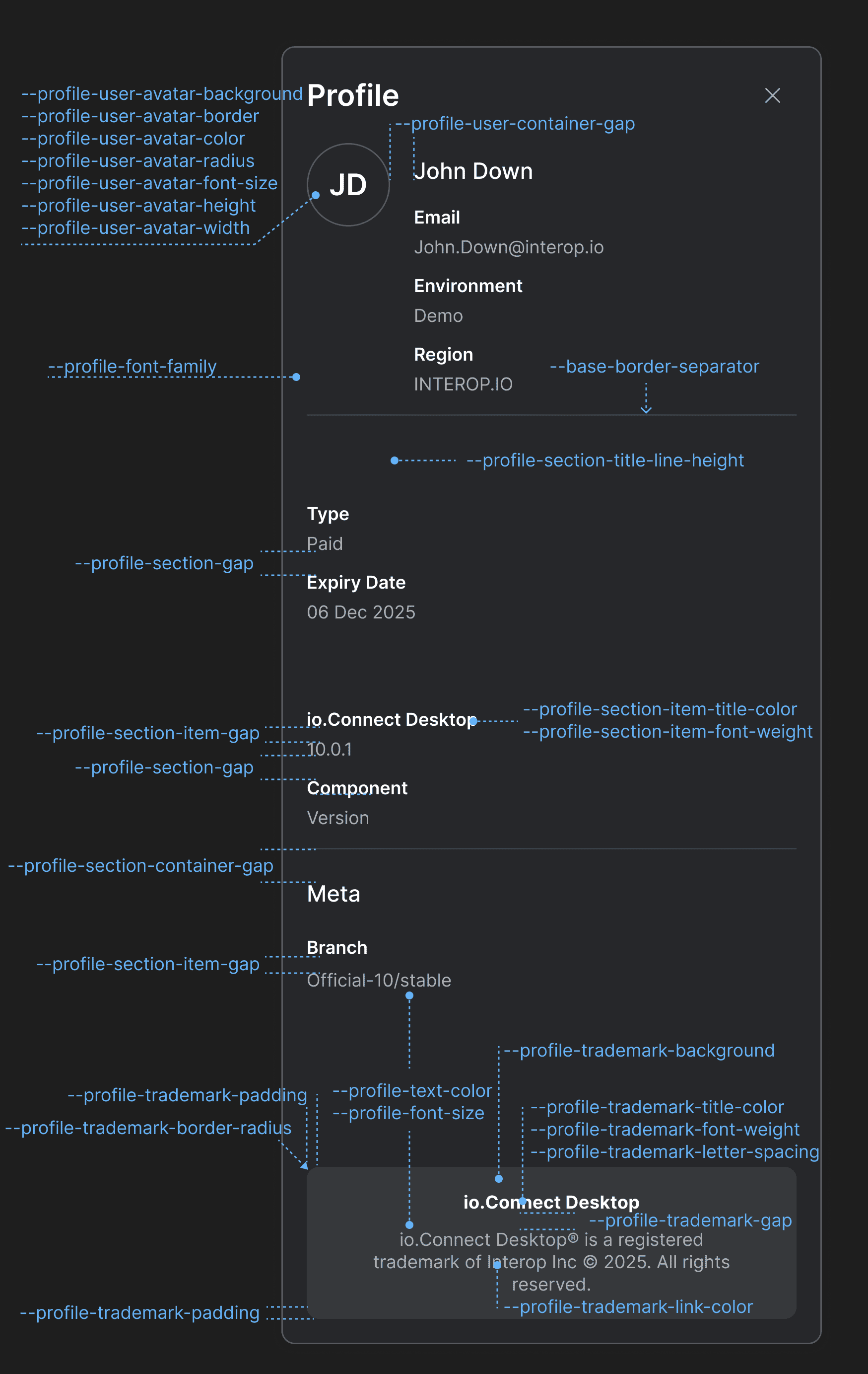
Use the following CSS variables for customizing the styles of the Launchpad Profile panel:
Variable Description --profile-font-familyFont family for the Profile panel. --profile-font-sizeFont size for the Profile panel. --profile-section-container-gapGap between sections in the Profile panel. --profile-section-gapGap between the items in each section of the Profile panel. --profile-section-item-gapGap between the title and the value of a section item. --profile-section-item-title-colorColor for the title of a section item. --profile-section-item-title-font-weightFont weight for the title of a section item. --profile-section-title-line-heightLine height for the titles of the Profile panel sections. --profile-text-colorText color for the Profile panel. --profile-trademark-backgroundBackground color for the trademark section. --profile-trademark-border-radiusBorder radius for the trademark section. --profile-trademark-gapGap between the title and the text of the trademark section. --profile-trademark-letter-spacingLetter spacing for title and the text of the trademark section. --profile-trademark-link-colorColor for the link in the trademark section. --profile-trademark-paddingPadding for the trademark section. --profile-trademark-title-colorColor for the title of the trademark section. --profile-trademark-title-font-weightFont weight for the title of the trademark section. --profile-user-avatar-backgroundBackground color for the user avatar. --profile-user-avatar-borderBorder for the user avatar. --profile-user-avatar-colorColor for the user avatar initials. --profile-user-avatar-font-sizeFont size for the user avatar initials. --profile-user-avatar-heightHeight for the user avatar. --profile-user-avatar-radiusBorder radius for the user avatar. --profile-user-avatar-widthWidth for the user avatar. --profile-user-container-gapGap between the user avatar and the user info section.
Improvements & Bug Fixes
Upgraded to Electron 38.2.2 (Chromium 140).
Improved handling of clicks on the window header for native apps registered as io.Connect Windows.
Improved handling of Channels for apps running outside of io.Connect Desktop.
Improved handling of theme names in the Launchpad.
Fixed not displaying a dialog to the user for changes made to a Layout when restarting or shutting down io.Connect Desktop.
Fixed an intermittent issue related to searching in web pages with
CTRL + Fthat would cause the search window to become inactive.Fixed an issue related to inconsistencies in reporting memory and CPU measurements for apps running in io.Connect Desktop.